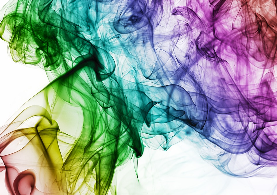
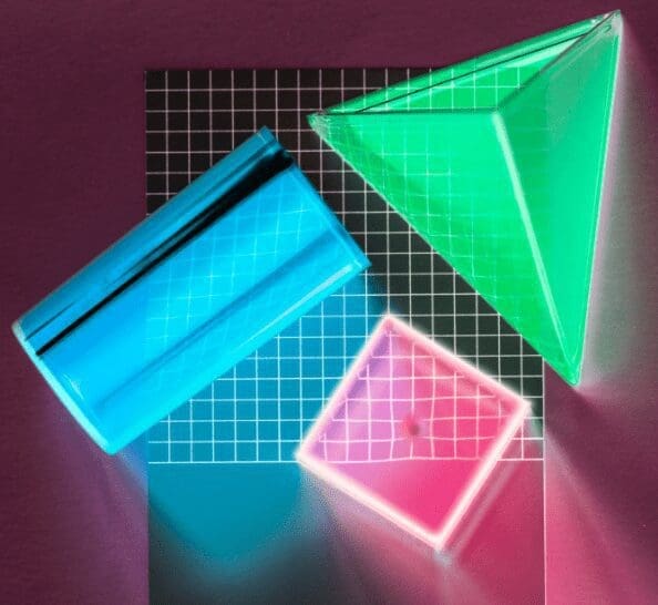
As we move deeper into 2025, vibrant color gradients continue to dominate the digital design landscape. From Instagram’s iconic logo to the latest AI-generated brand identities, these flowing color transitions offer a visually striking way to make your brand stand out online. But before your new business jumps on this trend, our team at Fusion Marketing has an important caution to share.
![]()
The Allure of the Gradient
“More and more people are using AI to design their logos, and I’m okay with that. I think we should be utilizing every tool in the toolbox,” explains John Hofmann, Founder of Fusion Marketing. “But we need to be mindful that much like a calculator doesn’t have all the nuances to get me through filing my taxes, neither does an AI image generator. Regardless of who or how you plan on developing your brand, I hope you do your best to think through the entire process.”
Gradients are everywhere in 2025’s digital sphere. Heat map-inspired transitions, bold multi-color flows, and subtle two-tone shifts are appearing across websites, social media, and digital advertisements. It’s easy to see why they’re appealing:
- They create visual interest and depth
- They feel modern and tech-forward
- They can evoke specific emotions through color psychology
- They stand out in a crowded digital marketplace
Many new businesses, particularly those using AI design tools, are incorporating these striking visual elements into their core brand identity. And on screen, they look fantastic.
The Physical Reality Check
Here’s where things get complicated. While your gradient-heavy logo might look stunning on your website and social media profiles, reproducing that same visual impact in the physical world presents significant challenges:
Embroidery Limitations
Have you considered how your logo will look embroidered on staff uniforms or promotional caps? Gradient effects are nearly impossible to reproduce accurately through embroidery. When clients approach us with gradient-heavy logos for embroidery projects, they face difficult decisions:
- Convert to a single solid color (losing the gradient effect entirely)
- Create hard color separations (fundamentally changing the design)
- Simplify to a limited color palette (compromising the original vision)
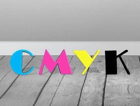
The Multi-Color Cost Factor
For products like t-shirts, promotional items, and signage, there’s another consideration: cost. As John Hofmann, Founder of Fusion Marketing, explains:
“A lot of times we’re looking at pad printing or silkscreen for tangible items like t-shirts and other promotional items. If you’ve never been through the process before, you might not be aware that each color on a t-shirt has to be applied individually. It’s not like the printer at your office where you just print something in full color. And as we all know, humans are really expensive, so there are hard costs associated with applying each color to your design. A six-color front on a T-shirt is going to cost a lot more than if it was one or two colors.”
Those beautiful multi-color gradients that look so good digitally can translate to significantly higher production costs when applied to physical items.
The Consistency Challenge
Brand consistency is crucial for building recognition. Ideally, your logo should look the same across all touchpoints:
- Your website and digital presence
- Business cards and stationery
- Promotional products
- Vehicle graphics
- Signage and environmental branding
With gradient-based logos, achieving this consistency becomes extraordinarily difficult. While Pantone matching helps ensure color consistency with solid colors, reproducing exact gradient transitions across different materials and printing processes is often impossible.
Smart Solutions for Gradient-Loving Brands
If you’re attracted to the visual appeal of gradients, you don’t have to abandon them entirely. Here are some practical recommendations:
1. Create Solid-Color Variations
“If your heart is deadset on having a gradient colored logo, you should definitely be creating solid color variations of it because I promise the need is going to come up at some point in the future,” advises Hofmann.
Develop a comprehensive brand guide that includes:
- Your full-gradient version (for digital use)
- A simplified 1-2 color version (for physical applications)
- Black and white versions (for documents and single-color needs)
2. Use Gradients in Supporting Elements
“Instead of having a gradient in your logo, maybe you can include gradients inside of your overall branding. Maybe as a background, or other supporting elements,” Hofmann suggests.
This approach gives you the best of both worlds:
- A simple, reproducible logo that works across all mediums
- The visual interest of gradients in your broader brand expression
- Lower production costs for branded merchandise
- Greater consistency across touchpoints
3. Consider Long-Term Applications
Before finalizing your brand identity, consider all the potential applications you might need in the future:
- Will you need vehicle graphics?
- Do you plan to create uniforms or branded apparel?
- Will you be creating environmental signage?
- What promotional products might you want to create?
Making Informed Branding Decisions
The most successful brands balance aesthetic appeal with practical considerations. While digital-only businesses might successfully implement gradient-heavy branding, businesses with physical locations or products need to think more holistically.
“There’s definitely a place for AI inside of business,” Hofmann notes, “but we also need to have a come-to-Jesus moment and realize that it’s not going to take a lot of subtleties into consideration in the same way that a brand specialist would.”
At Fusion Marketing, we’ve helped countless new businesses develop brand identities that work beautifully across all mediums. The key is thinking through these practical considerations from the start, rather than facing costly redesigns later.
If you’re in the process of establishing your brand identity, we’re happy to provide guidance on creating a visual system that’s both striking and practical. After all, your brand isn’t just a pretty face – it’s a hardworking business asset that needs to perform in every environment.
This article was created through an interview with John Hofmann, Founder of Fusion Marketing, conducted by KITT, Fusion’s automation assistant.