
Portfolio → Case Studies → Four Schools, One District, and a Brand That Finally Looks Like Family
Case Study
Four Schools, One District, and a Brand That Finally Looks Like Family
Client
Eastpointe Community Schools
Industry
Main Services
Timeline
Q4 2025 to Q2 2026
Background
Eastpointe Community Schools runs four K-5 buildings: Bellview, Crescentwood, Forest Park, and Pleasantview. Each one has its own neighborhood and its own personality. Forest Park had spent years building a real culture around its bears. Crescentwood, the smallest and farthest west, feels quieter and more close-knit. Pleasantview runs competitive and proud. And the whole district is anchored by a shamrock, a shamrock that shows up in the city’s identity and the district’s own circular logo.
This one came to us through the community, not a cold pitch. Caitlyn Kienitz, the district’s Communications and Marketing Coordinator, was searching for a local logo designer when she connected a name she kept seeing in Eastpointe community groups to a marketing agency right in the district’s backyard. Her reasoning was simple. Work with someone who already knows the community and cares about it as much as the schools do.
The Challenge
The four schools shared no visual system, and some barely had a mascot identity to begin with. Bellview and Crescentwood were carrying the same mascot and the same colors as each other. Pleasantview’s colors were a genuine mystery. Ask five people and you got blue, red and black, green and gold, or a shrug. Nobody could say what they’d ever officially been.
That’s a familiar spot for any organization that grew building by building. Pieces that don’t line up. No single source of truth. And no clean answer when a teacher, a parent volunteer, or a print shop needs a logo file. For a district actively trying to build community, that inconsistency was working against the goal.
The design problem underneath was the fun part. Each school needed to feel like its own place. But the district needed to read as one. Too much uniformity kills each school’s pride. Too little and you’ve got four unrelated logos that happened to land in the same town.
The Approach
We started with the community’s own voice. The district surveyed staff, parents, and students at every building, and it didn’t just ask about colors and animals. It asked what two or three qualities each school wanted its mascot to stand for. Those answers drove everything.
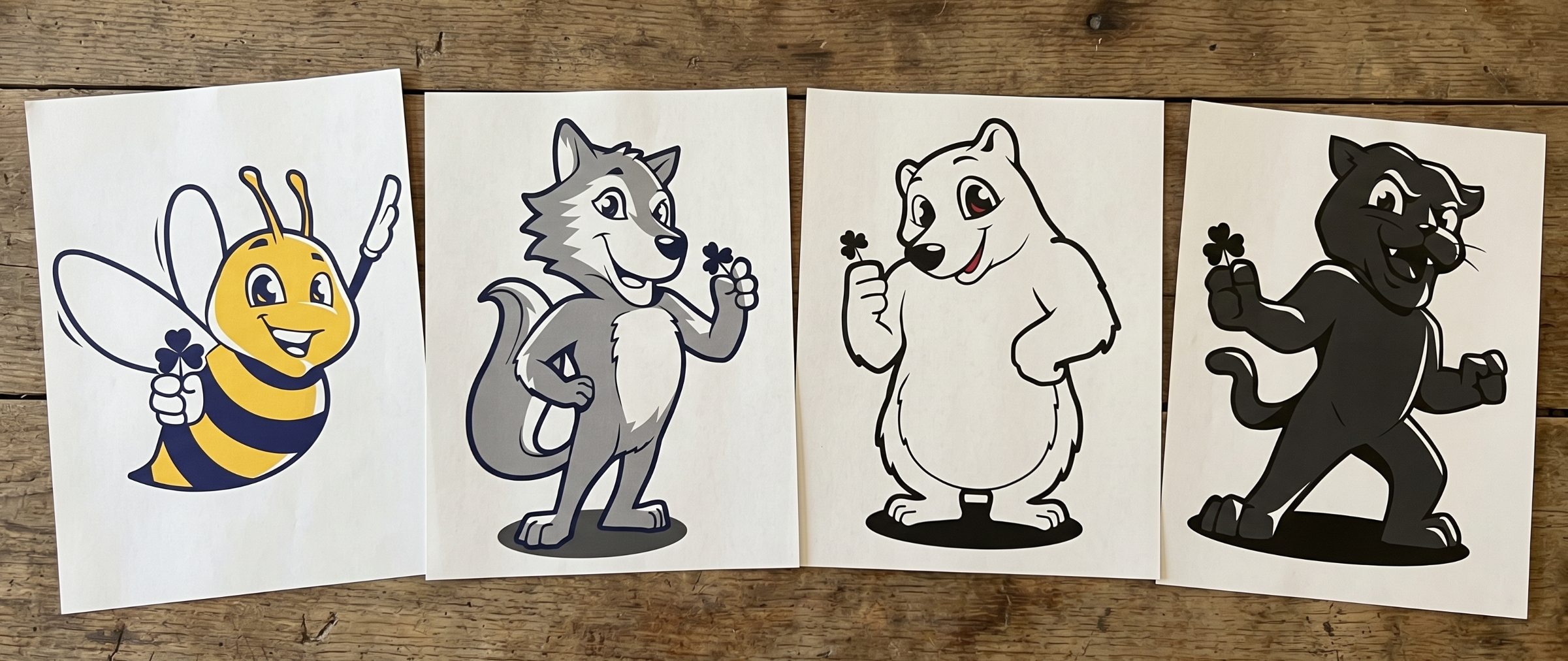
Forest Park’s bear came back protective and strong, the way a bear looks after its cubs. Bellview’s bee reflected the hardworking, busy-as-a-bee energy that kept surfacing. Crescentwood landed on the coyote, paired with teamwork, compassion, and grit. Pleasantview stayed fierce and competitive as the panthers.
From there, the guiding idea was simple: siblings, not twins. Every mascot shares the same illustration style, the same badge construction, and the same energy. So the four schools clearly belong to one family. Then color, animal, and attitude keep each one distinct. Crescentwood took navy and slate to suit a coyote’s coolness. Bellview took royal blue and gold for the bee. Forest Park kept the red and black it had already earned, and Pleasantview built its panther on deep green and gray.
The shamrock is what quietly holds the set together. Instead of bolting a district logo onto each mark, we worked the shamrock in two ways. It’s the badge shape behind each lockup, echoing the district’s circular shamrock. And it’s a small shamrock held by each mascot. That’s the thread that says “same district” without shouting over any school’s identity.
Every school got a complete system built for real use. A full-color primary lockup for when you have the room. The mascot isolated for social profiles and left-chest embroidery. An isolated text mark for when the words need to carry the load, the same way Nike moves between its swoosh, its wordmark, and the two together. We built grayscale versions of all of it for single-color printing and low-contrast placements, and we prepared print-ready and web-ready files for every variation.
The Work
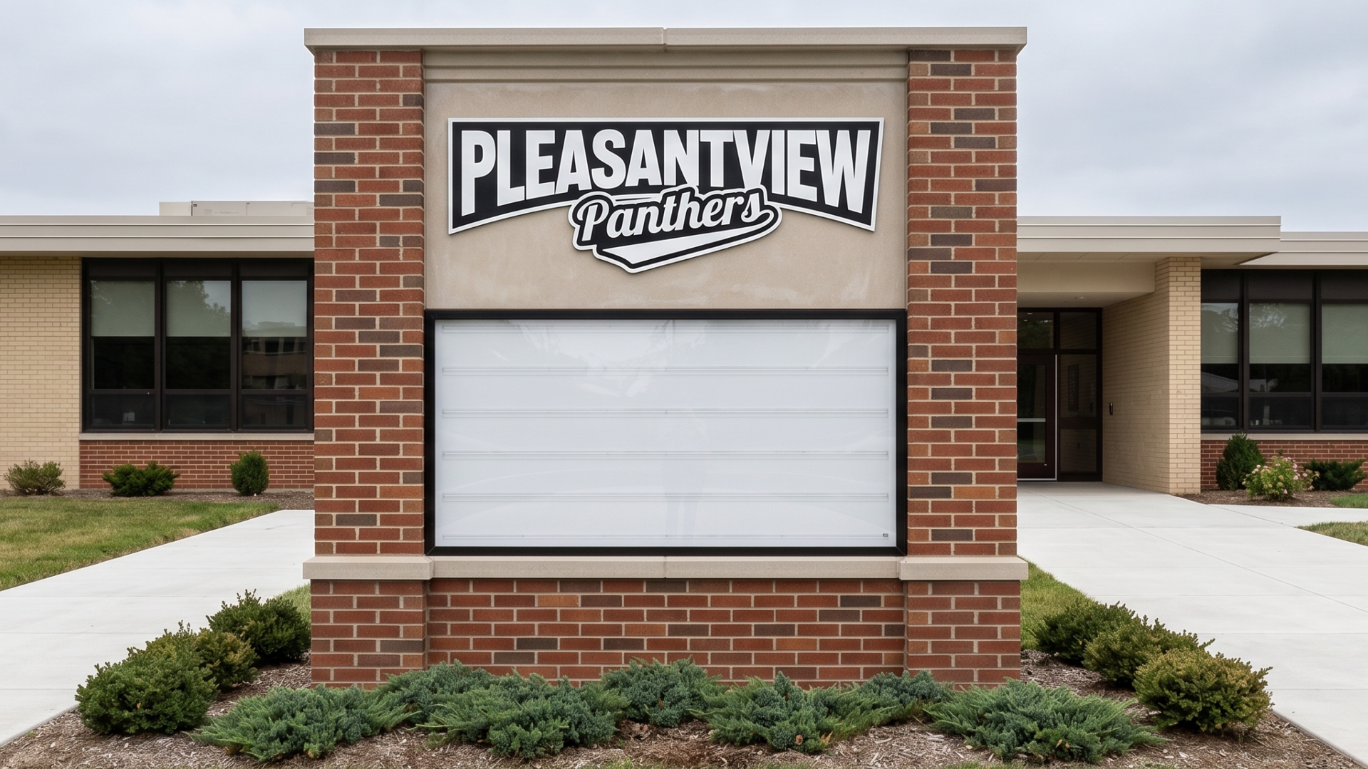
Readable at a glance, from anywhere in the parking lot.
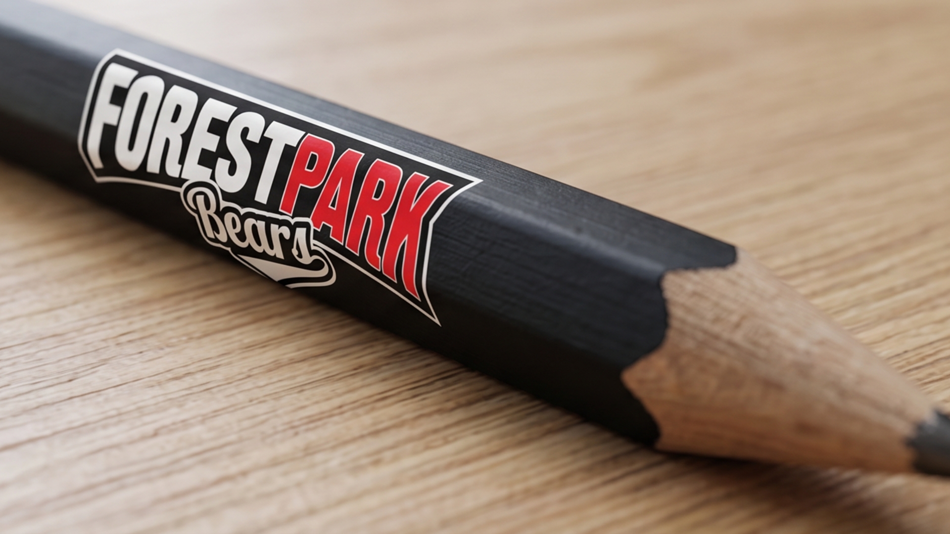
Same energy at any size.
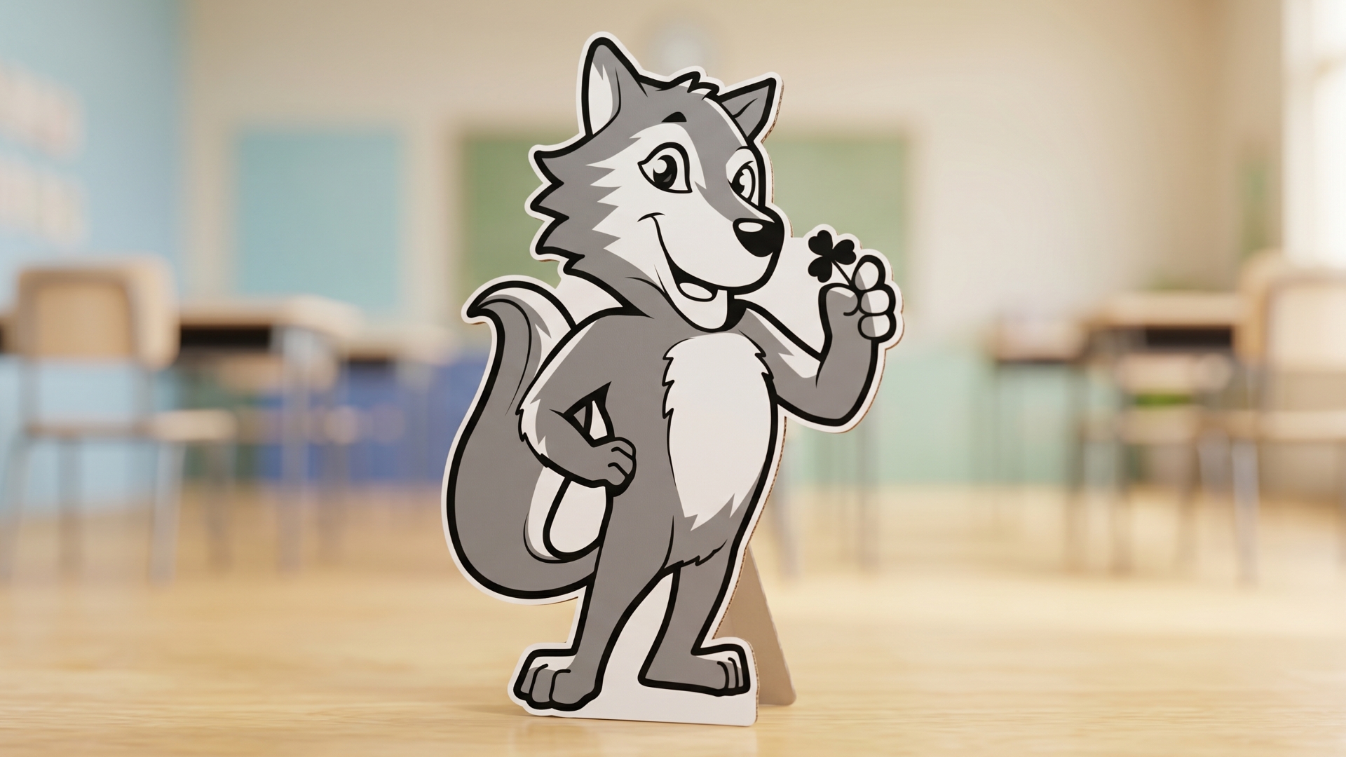
The shamrock ties every school back to the district.
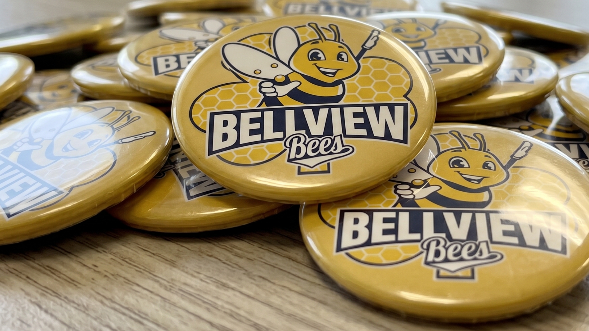
Built to look sharp everywhere it lands.
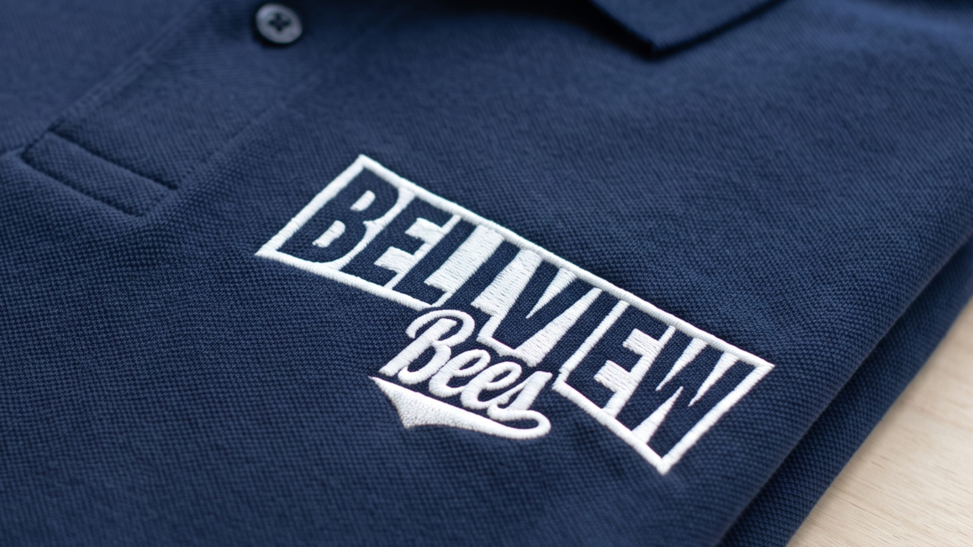
When color isn't an option, the mark still holds.
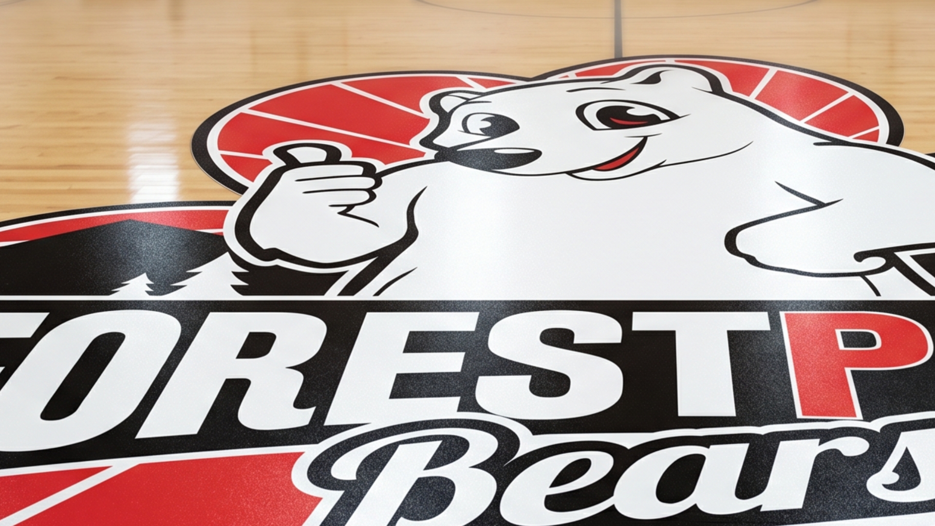
School pride is never an afterthought.
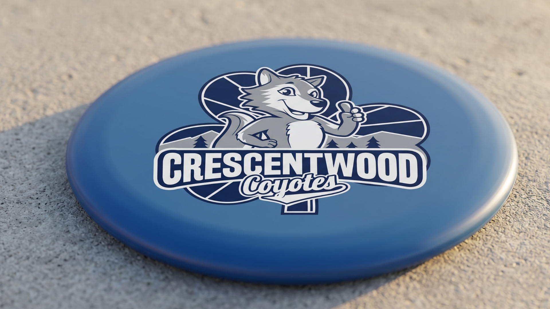
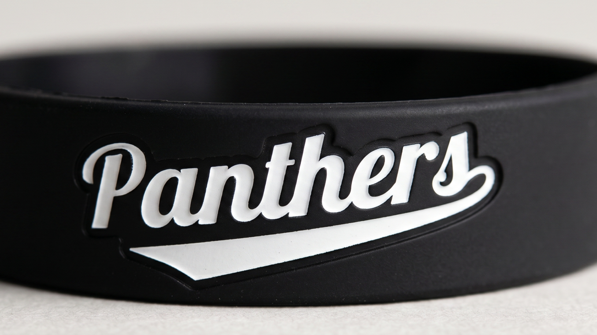
The kind of gear kids actually take home.
A foundation to build a culture around.
The Outcome
For the first time, all four elementary schools sit under one coherent system. Four identities that actually look like they belong to the same district. Each building has a strong core mark to build its culture around, and the two schools that had been sharing a mascot each have their own now.
The district also has a single source of truth. Every file lives inside an online brand asset manager, so anyone can pull the correct, current logo for the right school. A teacher, the front office, an embroidery shop, a t-shirt printer. No guesswork, no digging through old email attachments. For a communications team, that’s the difference between fielding constant file requests and pointing everyone to one link.
There’s a credibility gain too. Consistent, polished identities tell families and the wider community that these schools are cared for and worth investing in. And because the systems are built to flex, each school has room to grow into its identity as its own personality keeps developing.
These logos are better than I even could have imagined! Each school will now have its own unique identity, but as a set, they all belong to the same district. The shamrock-shaped shield is perfection. I am so excited to share these with our schools!
– Caitlyn Kienitz
What's Next
The mascot systems are built to serve the district for years. There’s natural room to grow from here: spirit wear, building signage, student-facing campaigns. As each school’s culture develops, its brand is ready to grow with it.