Portfolio → Case Studies → Patient Empowered Dentistry: 13 Years of Brand Building, Project by Project
Case Study
Patient Empowered Dentistry: 13 Years of Brand Building, Project by Project
")
Background
Patient Empowered Dentistry sits on Gratiot Avenue in Eastpointe, where Dr. Chris Dyki has built a practice around the idea that patients should be active, informed participants in their own care. The name isn’t a tagline somebody wrote in a branding meeting. It’s the philosophy that runs the practice.
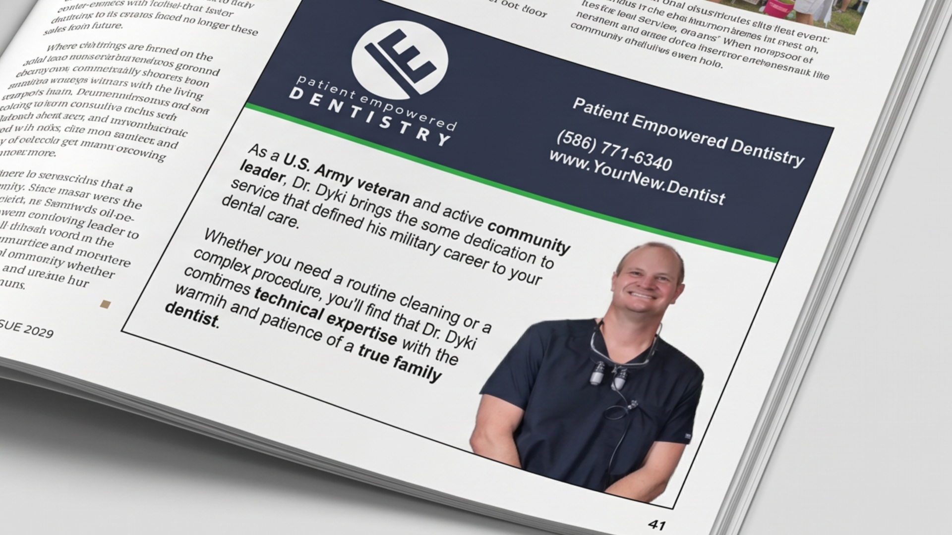
The relationship started at a Chamber of Commerce networking event in late 2012. John met Chris, they talked, a handshake turned into a project, and that project turned into another. Open our client list today and Patient Empowered Dentistry shows up as #0004 – one of the very first companies Fusion ever worked with, and still active 13 years later.
Out of every client we’ve worked with, Chris is the one who most fully understood what a real partnership is supposed to look like. He knows what he’s good at, he knows what he’s not, and when we recommend something, he trusts the call. We’ve spent 13 years not letting him down on that trust.
The Challenge
Independent dental practices don’t have a marketing director. They don’t have a brand manager. They have a dentist, some clinical staff, a front desk, and a hundred small marketing decisions a month that nobody specifically owns. The pens at the counter. The sign on the new operatory door. The intake forms patients fill out before their first appointment. The water bottles for the community sponsorship coming up next month.
What usually happens is each of those decisions becomes its own vendor relationship. The print shop down the street handles postcards. A different sign company does the door. Someone’s nephew built the website years ago, and nobody’s sure how to update it anymore. Nothing matches. Nothing builds on what came before. Every new project starts from scratch because no single vendor has the full picture.
Chris could’ve gone that route in 2012. Most practices do. It works well enough on any given Tuesday. The trade-off is that you spend 13 years rebuilding the same wheel over and over – new vendor, new learning curve, new chance for the brand to drift another inch off-course.
The Approach
The work moved through phases across 13 years, but the through-line stayed the same: we never had to start over.
2012-2015: Setting the Foundation
The first few years were the workhorses. Print collateral, ads, day-to-day design support – the kind of work that’s not glamorous but sets up everything that comes later. By the end of this stretch, we knew the practice well enough that new projects didn’t need a kickoff meeting. They needed a phone call.
2016: The Building Goes On-Brand (and the First Website)
Two big projects landed in 2016. We rebuilt the entire interior office signage system – branded wayfinding patients could actually follow. And we launched the practice’s first real website, which took Chris from “we have a site” to “we have a marketing tool.”
2017: The Whitening Card That Came Back
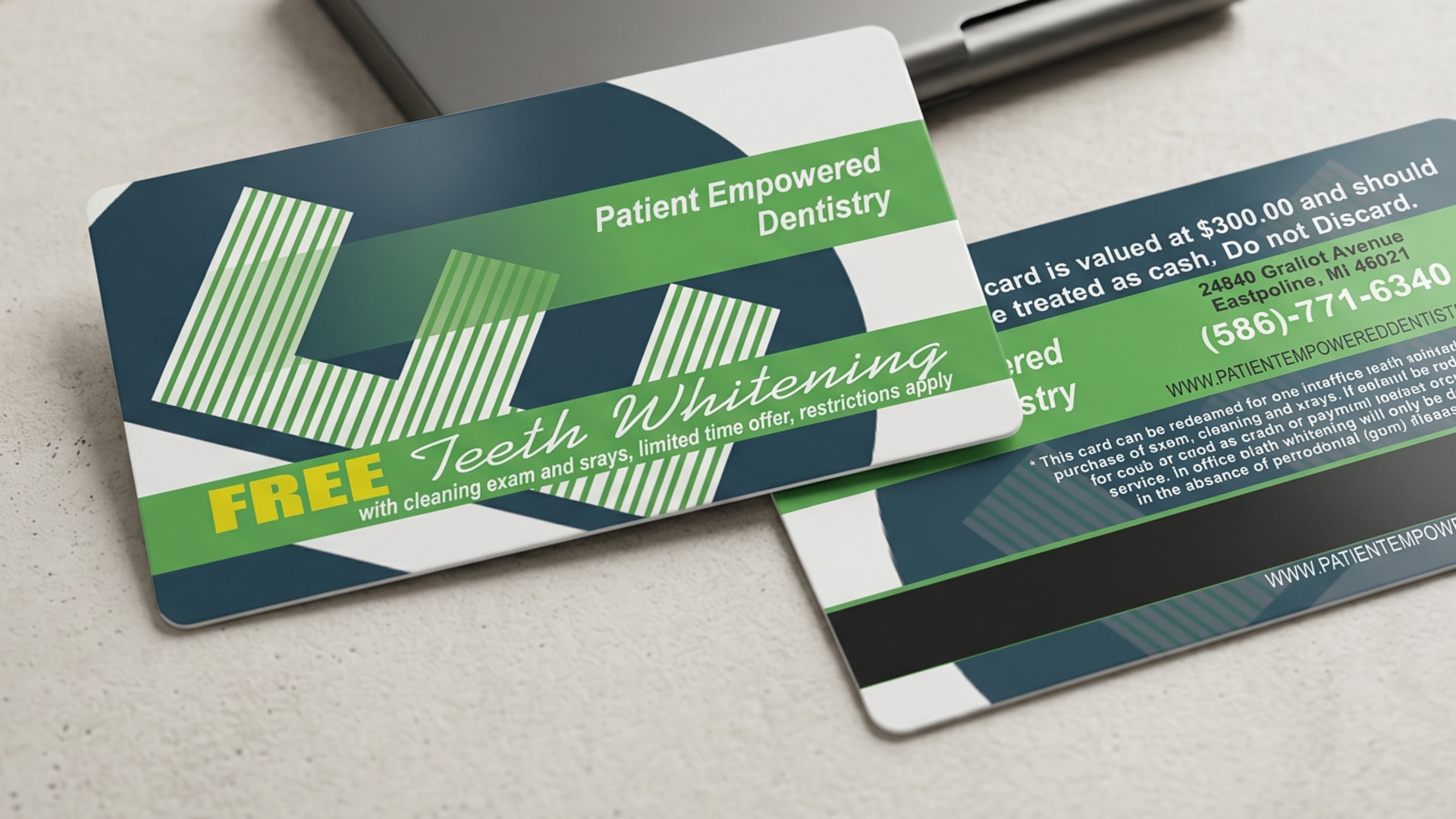
Chris wanted to run an in-office teeth-whitening promotion for new patients. The cheap way to do it would’ve been a stack of paper cards he’d reprint every year. We pitched something different – print them on translucent plastic, the size and thickness of a real credit card (roughly 3 mil), spot-color on both sides, with a faux magnetic stripe on the back for the look of the thing. The card carried a printed value of $300 and was made to be treated like cash.
The strategic move was the redemption mechanic. Patients brought the card with them and handed it to the receptionist at their new-patient visit, which meant the card came back. We only had to print the run once. The campaign stayed in circulation for years on that single print job.
2018: Forms, Bottles, and a Lesson in Restraint
Two very different 2018 projects.
We redesigned the patient intake forms from the ground up so they looked like they came from the same practice as everything else (most intake forms don’t – they look like they came from a 1996 fax machine).
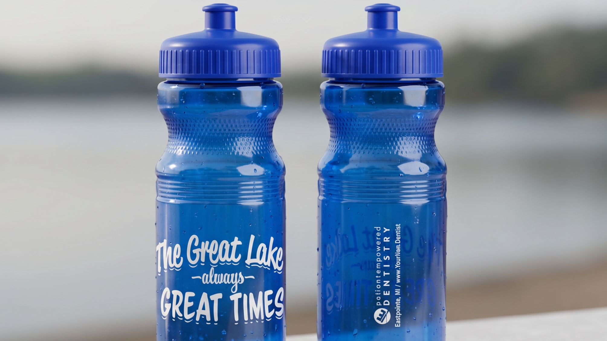
And we designed the run for Splash and Sprint, a community paddleboarding event Chris sponsored. Here’s where the partnership earned its keep. The instinct – the one almost every business owner has – is to slap your logo big and proud across the swag. We made a different call. We designed a text-forward bottle that read “The Great Lakes: always Great Times,” with the practice’s name, web address, and Eastpointe location set smaller on the back. 500 bottles went into circulation at the event. Chris reported afterward that they were the most-requested item there. Nobody wants a logo bottle. Everyone wants a great bottle.
2019-2021: Building Signs, Headshots, and a Pandemic Pivot
In 2019, we shot a fresh round of team headshots and would shoot another set in 2021 (photo libraries age fast in healthcare). 2019 was also when we redid the exterior building signage: 4-foot by 8-foot roadside signs on the front and back of the building, plus one-way window perf on the exterior doors so the team can see out but anyone walking up to the entrance can’t see in. That’s the kind of detail you don’t notice until you’re inside the practice and realize how much better it feels not to be on display.
Then 2020 happened. We helped Chris secure a $10,000 Online Business Connect Grant through Michigan’s COVID relief funding, awarded October 1st, 2020, with everything required to be wrapped by December 31st. Three months to deliver a full website rebuild, content writing, press release distribution, photography, and on-page and off-page SEO. Aggressive timeline. We hit it. The grant covered the cost. The practice came out of the pandemic with a stronger digital presence than it went in with.
2022-2023: Inclusivity, Education, and Ongoing SEO
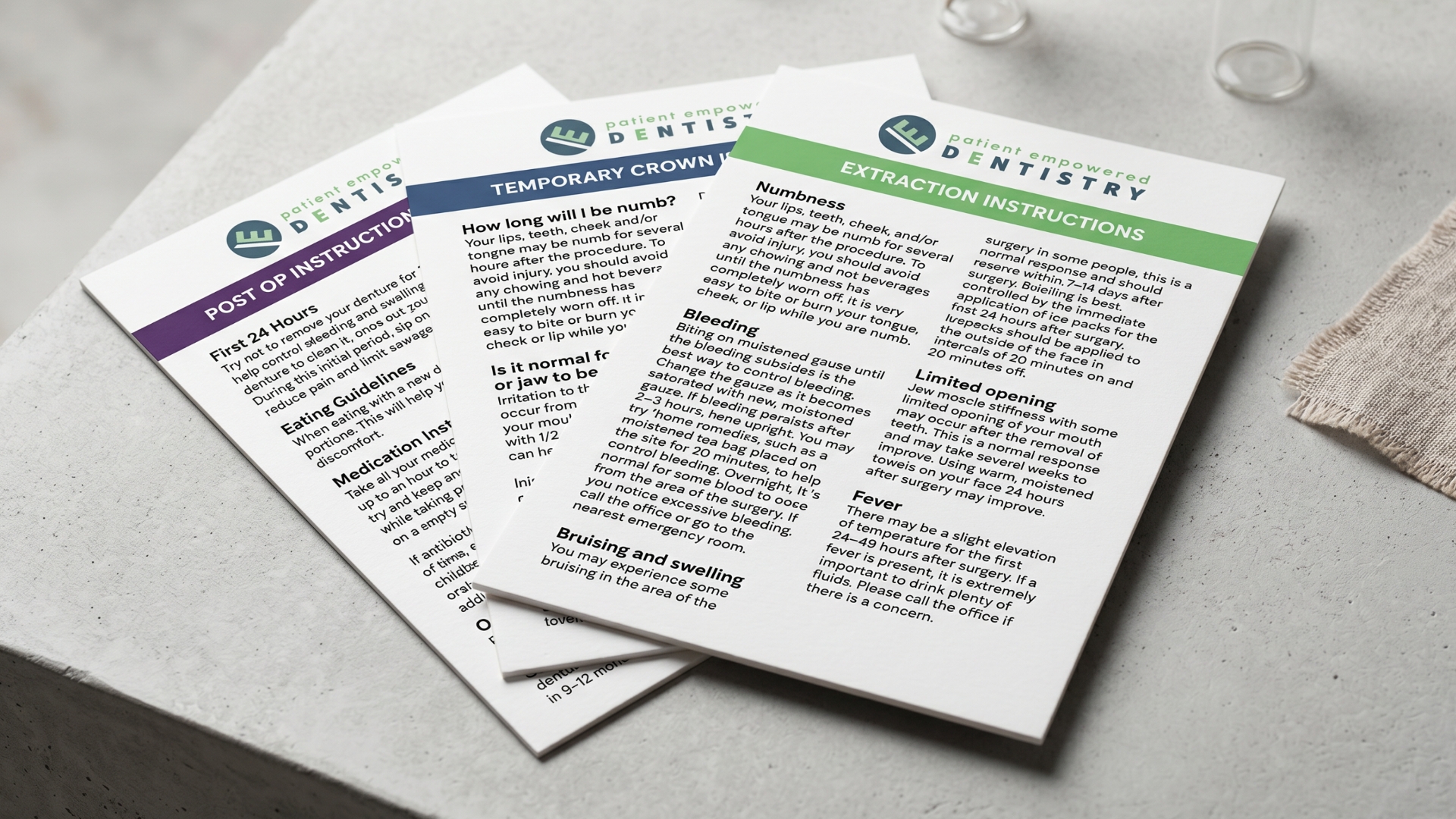
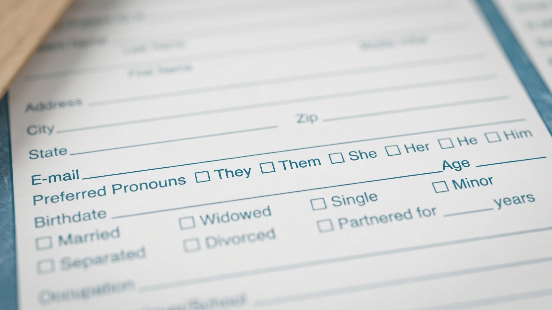
In 2022, we revisited the intake forms and added pronoun fields – a small change with a meaningful signal for who walks in feeling welcome from the front desk. In 2023, we redesigned the post-procedure educational handouts (root canal aftercare, tooth extraction instructions, others) as 4×6 cards with UV gloss, durable enough to hold up when a patient pulls one out of a glovebox two weeks after the procedure. SEO became a standing, ongoing service that same year.
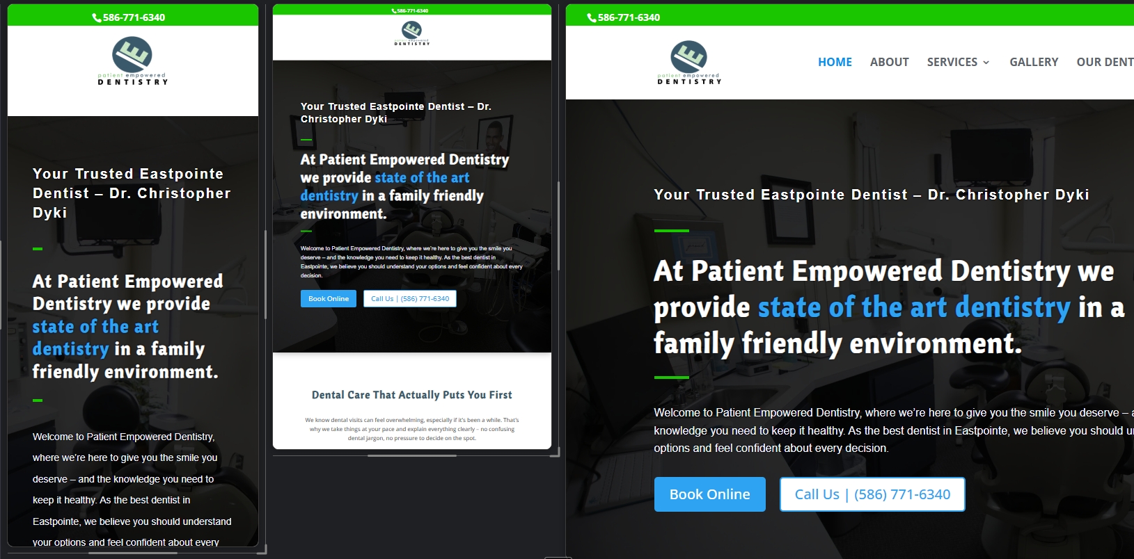
2025: Website Number Three
By 2025, the industry had shifted again, and so had Chris. The 2016 site was for a dentist still establishing himself. The 2020 site was the COVID-era rebuild on a brutal grant deadline. The 2025 site is for an established dentist with a defined niche and a community reputation. Same practice, three different brand moments, each captured in its own build.
The Work
Color-coded patient materials
Swag people actually want to keep
Custom designed intake forms
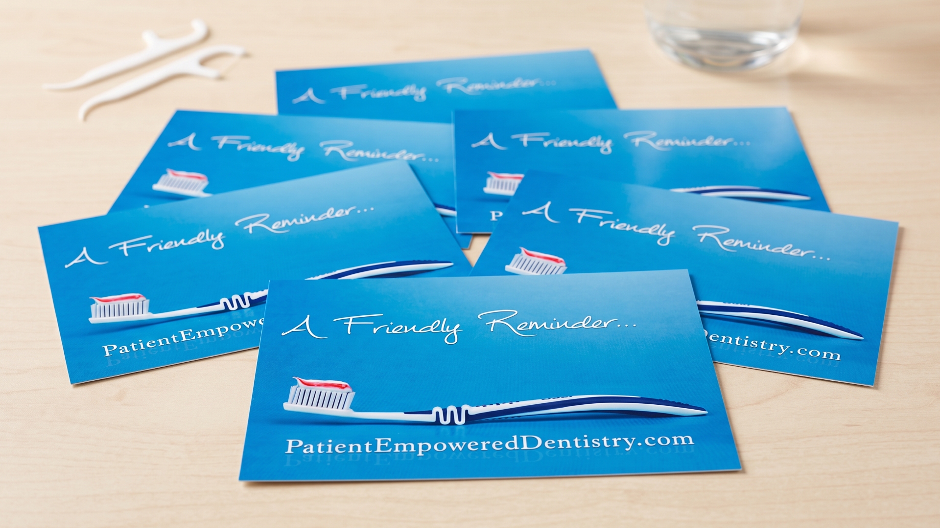
On brand touch points like reminder postcards
Professional copywriting tailored to the reader
Website design that meets clients where they are
Marketing campaigns that pay dividends
The Outcome
After 13 years, what Chris has isn’t a single hero brand asset. It’s the cumulative effect of every touchpoint being handled by the same team that knows the practice inside and out.
One call, every project. Chris doesn’t have to figure out who handles the next print order, sign install, ad refresh, intake form revision, or grant application. There’s one number to call, and the answer is almost always yes. That alone gives back hours every month that most independent practitioners burn coordinating vendors.
A cohesive brand without a brand manager. The waiting room signage matches the website. The educational handouts a patient gets after a root canal share visual DNA with the intake forms they filled out at their first appointment. The practice runs like a brand with a marketing department – without actually having one.
Trust that compounds. There’s a way Chris operates with us at this point: he doesn’t second-guess the recommendation, because we haven’t given him a reason to. That kind of trust didn’t show up in 2012. It got built one delivered project at a time. Somewhere in that 13-year arc, the relationship crossed the line from client-and-vendor into friendship. Our kids have gone trick-or-treating together. That’s what 13 years of doing the work right actually looks like.
Relationship continuity that doesn’t reset. Fusion was founded in 2012. Patient Empowered Dentistry has been here for nearly the entire run. Client #0004, still active in 2026. That’s not a marketing line. It’s a record.
What's Next
We continue to handle Patient Empowered Dentistry’s design, print, signage, SEO, social media, and strategy on an ongoing basis. Some projects show up on a calendar. Some show up because Chris called on a Tuesday with an idea worth running with. Both keep the work moving.