Apple Music just rebranded for the first time since it launched in 2015, and the most useful lesson in it isn’t about sound, oil, or typography. It’s about restraint. Apple kept the parts people already recognize, refined the parts that were holding it back, and gambled on one change that a lot of loyal users didn’t ask for. If you run an established business and you’ve wondered whether your brand looks dated, that’s the exact decision you’re facing too.
I’ll be honest about my bias up front. I think this rebrand is genius. But I also think it carries a risk worth talking about, and the way Apple handled both sides is a better rebranding guide than most of what gets written on the subject.
What did Apple Music change in its rebrand?
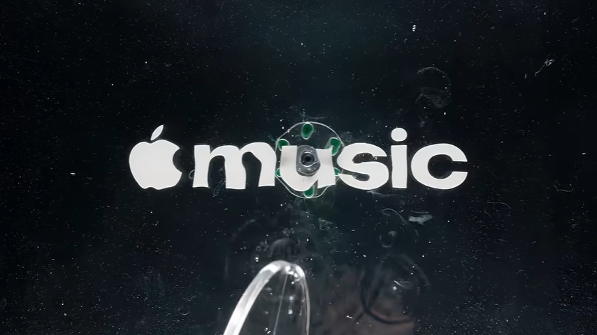
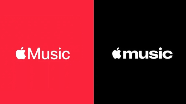
Apple Music changed its logo, wordmark, color, and sound, and it built the new logo physically instead of on a screen. Apple announced the new identity on October 21, 2026, and it rolls out with iOS 27.2.
Here’s what actually changed:
- The logo was shaped by sound. British producer Fred again.. and NEST Acoustics composed the notes. Those notes ran through a transducer, a device that turns an audio signal into physical vibration, sitting in a shallow pool of mineral oil. The ripples formed around an icon-shaped piece of plastic and were captured on camera, according to Dezeen.
- The wordmark went lowercase. “Music” is now set in a bold, lowercase, custom version of SF Pro, Apple’s own typeface.
- The red is gone. The app icon moved to black and white, with a white-on-black version for dark mode and a clear version that can be tinted, as Cybernews reported from the iOS 27.2 beta.
- It has a sound of its own. The same composition doubles as Apple Music’s new sonic signature.
Apple also published a behind-the-scenes video showing the whole process. Watch it. Seeing a frequency move a pool of oil into a logo is one of the coolest ways I’ve ever seen anyone visually represent sound.
Why does a logo made by sound matter when AI can make one in seconds?
It matters because almost everything right now looks the same, and Apple just proved that how you make something can be as memorable as what you make. When anyone can type a prompt and get a logo, the human part of the process becomes the differentiator.
We’re in a strange phase. AI-generated graphics, templated websites, and drag-and-drop logos have flooded every industry. The result is a sea of sameness, where brands blur together because they were built from the same ingredients. I believe we’re losing one of the most important pieces of art and design: the human part. I wrote more about where that line sits in AI in Graphic Design: Where It Belongs and Where It Doesn’t.
Apple clearly sees it too, and it’s doing it on purpose. When Apple TV dropped the “+” in 2025, its new intro was built from real glass and captured in camera with practical effects. That rebrand went on to win the Design Grand Prix at Cannes Lions 2026.
The contrast with where Apple was two years ago is hard to miss. In May 2024, its iPad Pro “Crush” ad showed a hydraulic press flattening a piano, a trumpet, cameras, and paint cans. Creatives hated it, and Tor Myhren, Apple’s VP of marketing communications, publicly said the company “missed the mark” and apologized. Two years later, Apple is making its logos with musicians, glass, and oil. That’s a company that listened.
You don’t need a mineral oil rig to apply this. Every logo and branding project we take on at Fusion starts the same way: on paper. We sketch out every idea without judging any of them. Silly ones, overused ones, off-brand ones. All of it goes down. Then we flesh them out and start crossing off what doesn’t work. It’s slower than generating fifty options with a prompt. It’s also the reason the final mark belongs to the business instead of to whatever the software averaged together.
What did Apple keep, and why is that the smartest part?
Apple kept the apple and kept the musical note, and that’s the smartest move in the whole rebrand. It evolved the brand instead of reinventing it, so people who’ve used the app for a decade will still find it instantly.
Look at what changed around those anchors. Nobody at Apple is asking for my opinion, but I think the wordmark is fantastic. In the old logo, the capital M in “Music” stretched to the full height of the apple icon. Now “music” is lowercase and lines up with the core of the apple. It feels more balanced to me. The weight feels right, too.
The bolder, modified SF Pro is the part I’d point you to if you’re thinking about your own brand. Heavier letterforms hold up better at a distance. They survive being shrunk to an app icon, and they stay legible when they’re blown up on a wall. This is a production reality more than a taste call, and 15+ years in print and production taught it to me the hard way.
That production background shapes every brand we design. I can’t tell you how many times a business owner has come to us wanting to put their logo on something that was never considered when the logo was created. Thin lines disappear. Tiny details fill in. A tagline baked into the mark becomes unreadable. A good rebrand plans for everywhere the logo will actually live, not just how it looks on a laptop screen.
Here’s a recent one. Earlier this year we rebranded the Eastpointe Gratiot Cruise. They were dead set on a busy logo: the organization’s name, an illustration of a classic car, and a silhouette of City Hall, all in one mark. So we built it in a way that lets the pieces come apart. When they run into a spot where the full logo won’t fit (and they will), the text mark can stand on its own. Every time people see the complete logo, that text picks up a little more brand equity, so eventually the words alone will read as the Gratiot Cruise.
There’s research behind the evolve-don’t-reinvent approach. Julian Major of the Ehrenberg-Bass Institute, which studies how brands get recognized, wrote in The Drum that brands should use their distinctive assets consistently and avoid refreshing them without a strong reason, because frequent refreshes can throw away years of built-up customer memory. Apple protected the apple and the note, then refreshed the rest.
Why is rebranding risky, and did Apple underestimate the red?
Rebranding is risky because you can throw away brand equity without realizing you had it. Brand equity is the recognition and trust people attach to the things they already know about you, like your colors, your logo, and your name. Change the wrong one, and customers can lose track of you or feel like you left them behind.
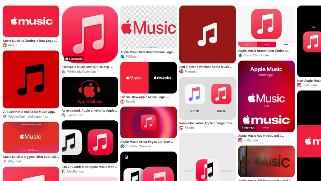
That’s where I think Apple may have overlooked something important to its users. Red has been a defining part of Apple’s music branding for more than a decade, whether as the background or the note itself. When the black-and-white icon showed up in the iOS 27.2 beta, the reaction on social media was mostly negative, with some users saying they’d consider switching to Spotify over it.
Personally, I like the monochrome. It lines up with the parent company, and Apple has the brand strength to make it stick. But I also understand that customers are entitled to their own feelings, and they vote with their dollars.
The cautionary tale every designer knows is Tropicana. In January 2009, it replaced the familiar orange with a straw on its Pure Premium cartons with a plain glass of juice. Unit sales fell 20% between January 1 and February 22, and the company announced it was bringing back the old packaging on February 23, according to Everything-PR’s review of the sales data. Tropicana’s North America president admitted they’d underestimated the emotional bond shoppers had with the old carton. Tropicana was a PepsiCo brand at the time, which is part of why I find PepsiCo’s more recent rebrand so interesting.
To be fair to Apple, there’s a counterargument. Ehrenberg-Bass research measures brand assets on two things: how many people link them to your brand, and whether they link them to only your brand. The Drum summarizes these as fame and uniqueness. Color struggles on uniqueness because there are only so many colors to go around, and in Major’s summary of that research, logos were the assets most likely to be tied to a single brand, with colors behind them. Jenni Romaniuk, who developed the approach, has warned in Marketing Week that picking a color your competitors also pick weakens it. So Apple Music’s red may have done less to set it apart than it felt like to loyal users.
That’s the real tension in this rebrand. Apple kept the shape, the kind of asset most likely to belong only to you, and changed the color, the kind most likely to be shared. Whether loyal users agree is the one part Apple can’t control.
How do you rebrand without losing customers?
You rebrand without losing customers by figuring out what’s already working before you touch anything, keeping those pieces, and changing the rest with a purpose. Here’s how I’d approach it if you’re running an established business.
1. Take stock of what’s working
List everything people recognize you by. Your colors, your logo shape, your name, the phrases customers repeat back to you, even your truck or storefront if you have one. Color is almost always on that list. If you don’t know what’s working, ask a few long-time customers how they’d describe your brand to a friend. Their answers will tell you what’s carrying the weight.
2. Decide what stays before you decide what changes
Pick the handful of things you’re going to protect. Apple protected the apple and the note. Your version might be a color and a logo shape. Once those are locked, the rest of the project gets easier, because you’re refining instead of starting over.
3. Sketch widely before you narrow
Get every idea on paper with no judgment. This is how we start every branding project, and it works because the bad ideas often point you toward the good ones. Cross things off after you’ve seen them all side by side, not before.
4. Test it everywhere it will live
Shrink it to the size of a social media profile picture. Blow it up to the size of a building sign. Put it in one color. Check it on a phone in direct sunlight. If it falls apart anywhere you’ll actually use it, it’s not done. That’s exactly why we built the Gratiot Cruise mark to come apart: the full logo for the places it fits, the text mark for everywhere else.
5. Bring your customers along
Tell people what’s changing and why before they stumble on it. Apple released a video showing exactly how its logo was made. That’s a story worth sharing. Your rebrand has a story too, and telling it turns “what happened to their logo?” into “oh, that’s cool.”
If you’re working with a family business or a brand that’s been around a while, I go deeper on balancing old and new customers in Legacy Brand Evolution: How to Update Your Family Business Without Losing Your Identity.
Thinking about a rebrand?
Apple Music’s rebrand is a reminder that the best updates feel new and familiar at the same time. You don’t need a famous producer or a pool of oil. You need an honest look at what’s working, a process that puts people ahead of shortcuts, and the discipline to keep what your customers already love.
If you’re wondering whether your brand needs a full overhaul or just a refresh, that’s a conversation we have with business owners all the time, whether they’re down the road in Macomb County or across the country. Sometimes the honest answer is that you don’t need a new logo at all. You can learn more about our full branding process or reach out and tell us what you’re working with.