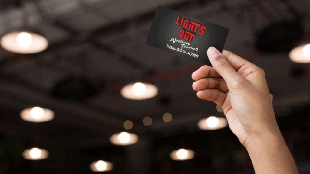
Business cards are an essential item to take with you whenever you’re representing your company. Be it at a public networking event or trade show, it’s vital that you have a stack of business cards with you so that you can conduct business and create connections with other companies.
Business cards are also a great item to have in your store so that visitors can remember your business. In some cases, they can even be used as loyalty cards to encourage customers to return in the future.
However, far too many people underestimate the impact of a good business card. So to help you out, we’ve put together a couple of quick tips to help you ensure that your business card is memorable and stands out from others.

1. Build your business card around your business logo and/or colors
Make sure you use your brand’s colors and logo on your business card. This creates a consistent branding theme and helps people identify that the business card belongs to your brand. This is one of the most basic design tips to help you create a fantastic business card that is recognizable and relevant to your brand.
2. Finding the right typeface that represents your brand
Make sure you do some research on different typefaces. Don’t just use the same font that you use on your website and try to have a different font for various parts of your business card to create visual contrast. The font can also be related to your industry or the type of business that you operate. For instance, you can use a more elegant script-like if you’re looking to create an elegant feel around your brand, or you can use a font with sharp edges and a modern design if you want to appeal more focused on technology.
3. Picking a shape and size that fits your brand
Business cards tend to be the same size because there’s a standard for them. This makes them easier to fit into wallets and cardholders. However, you can also pick different shapes and sizes if you want to create something a little more unique. If you’re a non-conventional company that likes to do things differently, then having a uniquely shaped business card is perfectly acceptable.
4. Cut down on unnecessary information
Decide what information you want to have on your card. The most important elements include your contact details, but this can appear in a number of different ways. Some companies may prefer to use a QR code, while others may include a website, an email, or a phone number. Keep the information organized and try to cut down on anything redundant.
5. Remove elements to cut down on the clutter and leave some blank space
Your design might have lots of unique elements to it such as border, outlined text, and unique patterns or shapes on both sides. However, this makes your card very loud and distracting. This could hide the important information and may make it difficult to read. Clean up the card and leave some blank space. This is easier on the eyes and can even be used to take notes if you want to write down something for your recipient.
6. Reduce the number of colors you use to keep it simple
Ideally, the card should only have around three colors with a maximum of four. This will prevent your card from appearing too gaudy or cluttered and will be more appealing to the eyes.
7. Prototype multiple designs before settling
A business card is a representation of your brand, so it’s perfectly fine to prototype several designs before you settle on one. Whether you’re working with a designer or making it yourself, don’t hesitate to try out different things to see how you can mix and match ideas for the perfect business card.
8. If you have space, include a call to action
A call to action isn’t essential, but it’s a great use of blank space if you’ve included everything essential and still have a lot of room. This can be anything like “call us today” or even a QR code for people to scan.
9. Proofread again and again
The last thing you want is to print out a thousand copies of a business card with a typo. Make absolutely sure that you’ve proofread it and that all the contact details are accurate before you send it off to print.
10. Consider adding a little something special to make your card stand out
There are lots of unique ways to make your card stand out from the rest, but it’s important not to include too many special elements. For example, the reverse of the card could be used for loyalty stamps if you’re handing them out at your store, or the card itself can be made from a different material instead of the typical thin card that most business cards use.
It’s definitely possible for you to design your own business cards. Even if you’re not a design specialist, you can always seek inspiration from business cards that you’ve collected, and you can even look at business cards online to get some unique ideas.
But regardless if you want to design your own cards or not, you’re going to need to find a reliable company to help you print out your cards with the materials that you’ve chosen. At Fusion Marketing, we’ve got the resources and tools to help you design and print high-quality business cards with unique materials such as metal, plastic, and thick cardstock. We can also apply different finishes such as matte UV, rounded corners, spot UV, and even foil.
Take a look at our portfolio today to see what we’re capable of. If you’d like to learn more, don’t hesitate to get in touch with us today for more information.


