We are living in an ever-evolving environment. In all spheres, what was current a few years ago is very different from what is in vogue at the moment. This change has not left the logo design industry behind.
The marketing and advertising space has become more affordable and effective. This has been necessitated by better and improved ways of attracting a loyal customer base. In order to maintain this tempo, logo designers have been forced to adapt to this new way of attracting customers. However, seeing as there is always a new idea with each coming day, it has necessitated the forecasting of trends such that it is possible to predict what will be in vogue in the near future.
Through this, we have been able to come up with trends that will dominate the design logo industry this year. These include:
Simplistic logo designs
This trend has been popular for a number of years now, and its popularity does not seem to be waning. This approach encourages the complete stripping of a logo to the bare minimum. Through implementing this trend, designers use clean-cut fonts with minimal colors while removing any and all irrelevant elements from the logo. A simplified logo is preferred because it looks good on a wide variety of surfaces from banners to fabric and even ceramic. We anticipate this trend dominating the logo design space this year.
Responsive logo design
A responsive logo is one that can adapt to different shapes and sizes. 2018 promises to be a year where more logo designers create logos that adhere to context awareness, i.e., logos that can be used on banners, posters, magazines, etc. without losing their initial meaning and communication.
Architecture inspired logo design
This trend is not a new one. It has been around a long time. However modern logo designers are finding new ways of incorporating architecture into logos in a tasteful and up-to-date way. This newfound popularity has seen architecture used in new innovative ways, i.e., in 2018, more designers will be using architectural landmarks and other architectural elements and conceptualizing them into the visual representation of what the brand should stand for.
Negative space logo design
2018 will be the year of the negative space logo design comeback. These were very popular in the near past and were featured extensively on many logos, they have however fallen off the logo design map for a while. This year we will see the focus on negative space shift from shapes and more towards texts.
Geometric shapes
Geometric shapes are a fan favorite in the logo design industry. With the immediate impact, ease of reading, and branding versatility, it is easy to see why.
In 2018 we will see more geometric shapes in logo designs but with a much more straightforward and minimalistic approach.
Experimental typography
For a long time, typography has been a subject of experimentation. Currently, we have numerous font types, and with each coming day, the number continues to increase. We should be seeing this trend continuing in 2018, with more innovative concepts aided by advanced modern technology.

Letter stacking
This trend comes in handy, especially for long phrases and names. With letter stacking, these are made to occupy less space and can be arranged in any manner to make them visually attractive and appealing. In 2018, we should be seeing this trend paired with fun fonts and radiant colors making them stand out more.
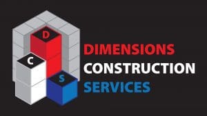
Overlapping
With this technique, different shapes or letters are overlapped to create an entirely new emblem that is both unique and attractive.
This also works with colors to create a whole new hue.
With the instant peak in popularity after the new look MasterCard logo, this technique will be in use more in 2018.
Typography and monogram combinations
2017 saw an increase in logos that imitate the ancient coat of arms. These logos, however, are a pairing of typefaces and monograms to recreate a logo reminiscent of the classics. This trend gives logo designers an opportunity to perfect their skills in classic typefaces with keen attention to logo typography, letter spacing, and choosing the right typeface to use depending on the needs of the client.
In conclusion, from the above, it is clear to see that 2018 promises to be a year of continual growth in the logo design sphere. We see a return of the classics, more typography experimentations, and many more designs. We will see more logo designers continue to push the design boundaries further, an exciting prospect.


