2020 was a challenging year for almost every business. With many companies rebooting their image and starting up once again, it’s a good time to consider rebranding your company for what is hopefully a post-pandemic world in 2021. So in this post, we’ve gathered some of the hottest logo design styles to consider if you’re starting a business in 2021, but these will also work perfectly for companies that are thinking of restarting or attracting new audiences.
Simplification is going to continue into 2021 and beyond
One of the trends we’ve been seeing for the past few years is simplification and minimalism. This trend is all about making logos a lot more compact, simple, and much easier to replicate on different kinds of media.
A common theme in the simplification trend is to switch from gradients to simple block colors. Gradients tend to be difficult to print out and they take a considerable amount of ink to replicate. In short, the cleaner it is, the easier it is to print on various types of media. This makes it far more flexible to use in different kinds of applications and is a trend that we expect to continue for a long time.
We’re also starting to see the simplification of characters and typefaces. For sample, serif typefaces on certain logos are starting to be replaced with smoother sans-serif versions. Some iconic characters and images have also been getting redesigned lately to be more simple and easy to replicate.
However, as a result of this simplification, it’s important to think of how you can retain your brand’s image without making it look like an entirely different logo. You’ll also need to think about how you can make your logo stand out if you’re removing complex elements from it. This may include bolding fonts to make them a little thicker or going for brighter or contrasting hues.
![]()
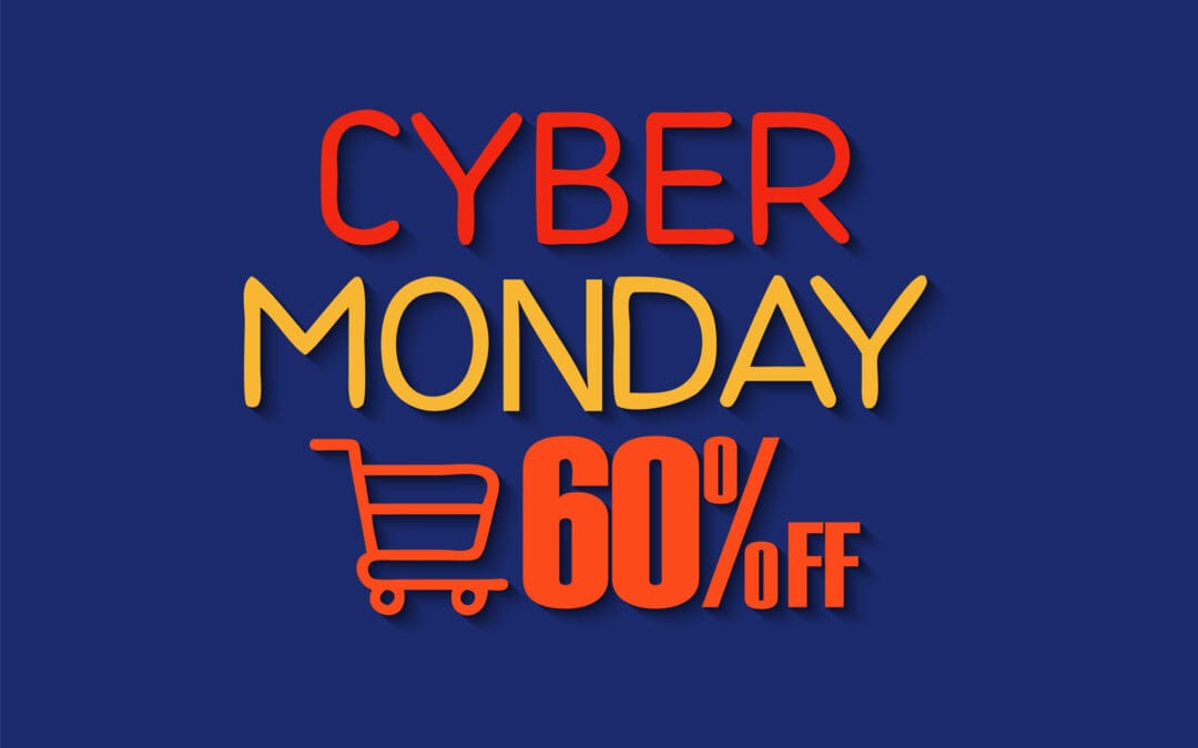
Gradient logos with bold colors and rainbow motifs
A trend that is starting to get a surprising amount of traction in the logo design world is using rainbow motifs and colorful gradients. This contrasts with the simplification trend that seeks to remove extra colors and patterns from a logo.
While vivid colors and gradients are certainly getting more popular, it’s actually not a trend that we can see lasting very long and isn’t something we personally recommend. This is because gradients can be expensive and difficult to reproduce on printed media. Whether it’s a simple document, a shirt, or a large poster, adding more and more colors will ultimately make the print more expensive.
This ultimately results in more marketing spend for surprisingly little gain. While they can be attractive to the eye, they don’t give off a professional or corporate feel which can actually deter some customers. If you don’t find a suitable printing company to work with, it can also be hard to replicate the logo exactly and some of the colors may not show up correctly when printed.
So while many companies have found success switching their logo to incorporate gradients and vivid colors, it’s something that you should be cautious about if you plan to print your logo onto different kinds of products and media.
![]()
Simplified black and white logo designs
Black and white logos are the pinnacle of utilitarian design. When combined with the simplification trend that’s popular today, you have a logo that is practical in every sense of the word and here’s why:
- Black and white naturally contrast, making it stand out regardless of where you print it
- The colors can be reversed to be used on both dark and light backgrounds, or dark and light modes in smartphone and computer applications
- Only black or white ink is used when printing it on various types of media, making it extremely cost-effective
- Black and white logos serve as a base that can be colored to suit various applications, such as website design layouts, clothing, or showing solidarity on social media
Simplifying a colorful logo into a simple black and white design can be tricky. It’s often easier for companies that are already well-established because their logo designs can still be recognized. However, for a new company, a black and white logo can be a hit or miss, so you may want to go through several iterations to find a design that resonates with your brand.
A simplified black and white logo is going to be a popular design trend that lasts a very long time. They’re incredibly practical and highly recommended, though you will need to invest some time into the design to avoid looking lazy.
![]()
Creative typography
Typography is an integral component of any logo design. Simply taking an available font from your design program is generally going to look boring, bland, and lazy. Searching for fonts can help your design stand out, and there are times where you may need to commission a font to really help your logo stand out.
However, there’s also the option of creative typography, a trend that has been growing in popularity over the past year.
This is a trend that focuses on moving away from using a single typeface for the entire logo. Instead, the logo can be hand-drawn or modified from an existing font to create something unique, different, and occasionally chaotic. This allows you to be a lot more expressive with your logo designs and it can be a lot of fun to try out various styles and typefaces. You’ll typically end up with various iterations of your logo to choose from, so it can be hard to decide on a final version.
Logo design trends are constantly changing, but you can rest assured knowing that these trends are going to stick around for a long time. We hope you find these tips useful and wish you the best of luck in starting your own business or rebranding your existing company. If you need assistance creating your logo, contact us today.