The arrival of 2021 has seen Burger King go out with the old and in with the new. Right now, the most obvious change is its new logo. Over the course of the year, it’s also due to refresh uniforms and packaging along with its signage, advertising, and marketing. Based on its logo reveal, the brand could be headed for a winning year.
A brief history of Burger King logos
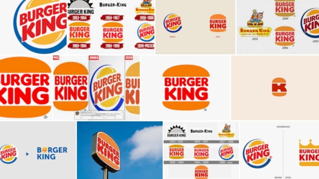
Burger King originally started as Insta Burger King. Their original logo was their name in black, topped by what looked like a sun in gray and black. This lasted one year (1953-1954). They then switched to using just their name in black. This lasted from 1954 to 1957.
In 1957, Burger King introduced color and complexity. Their logo became a king sitting on top of a burger, sitting on top of a banner with their name and the slogan ”HOME OF THE WHOPPER”. This lasted from 1957 to 1969.
In 1969, they introduced a new logo with their name “sandwiched” inside a bun. This essentially lasted from 1969 to 1999 although the coloring was touched up in 1994. The dawn of the new millennium prompted Burger King to update its logo. The “whopper” design stayed, but it was tilted slightly and surrounded by a blue crescent.
Its “2021” logo design is essentially a return to the 1969-1999 logo. It’s been streamlined and updated slightly, but that is really all.

Its “2021” logo design is essentially a return to the 1969-1999 logo. It’s been streamlined and updated slightly, but that is really all.
A masterclass in flat logo design
There are three main reasons why the new logo is a masterclass in flat logo design. Firstly, it’s simple. One of the first lessons a logo designer learns is that less is more in logo design. The less you try to pack into a logo, the easier it is for viewers to absorb it quickly. This is particularly important in today’s fast-paced world.
Secondly, it gets back on brand. Just removing the blue crescent would have improved the logo. Blue is found in the natural world, but it is unlikely to be associated with wholesome food. Switching out the generic yellow circle for a whopper bun makes it clear that the logo relates to a food business.
Reorientating the text makes it easier to scan quickly. What’s more, the font gives an image of thick, rich juiciness. It conveys the message that this is exactly what you can expect from a Burger King burger.
Thirdly, it works across a variety of media. Burger King needs a logo that looks as good on crumpled packaging as it does on Instagram. This means that bold is beautiful. You want chunky shapes, thick text, and bright colors.
The power of familiarity
All the previous comments could apply to any logo. There is, however, one extra reason why the new Burger King logo is a winner. It connects back to Burger King’s most established logo. Familiarity can be a powerful tool. It’s one McDonald’s uses regularly (and effectively). The new logo may allow Burger King to take a leaf out of its arch-rival’s playbook.


