A little more than one year ago, Google released a web-based shot that would be heard around the world when the Mountain View, California-based company — specializing in Internet-related services and products – unveiled a new mobile-responsive algorithm that would determine web page positioning following an Internet user’s mobile search.
Dubbed “Mobilegeddon,” the release involved the use of a computer algorithm that considered a site’s “mobile-friendliness” in recognition of the growing use of mobile devices as opposed to desktop searches.
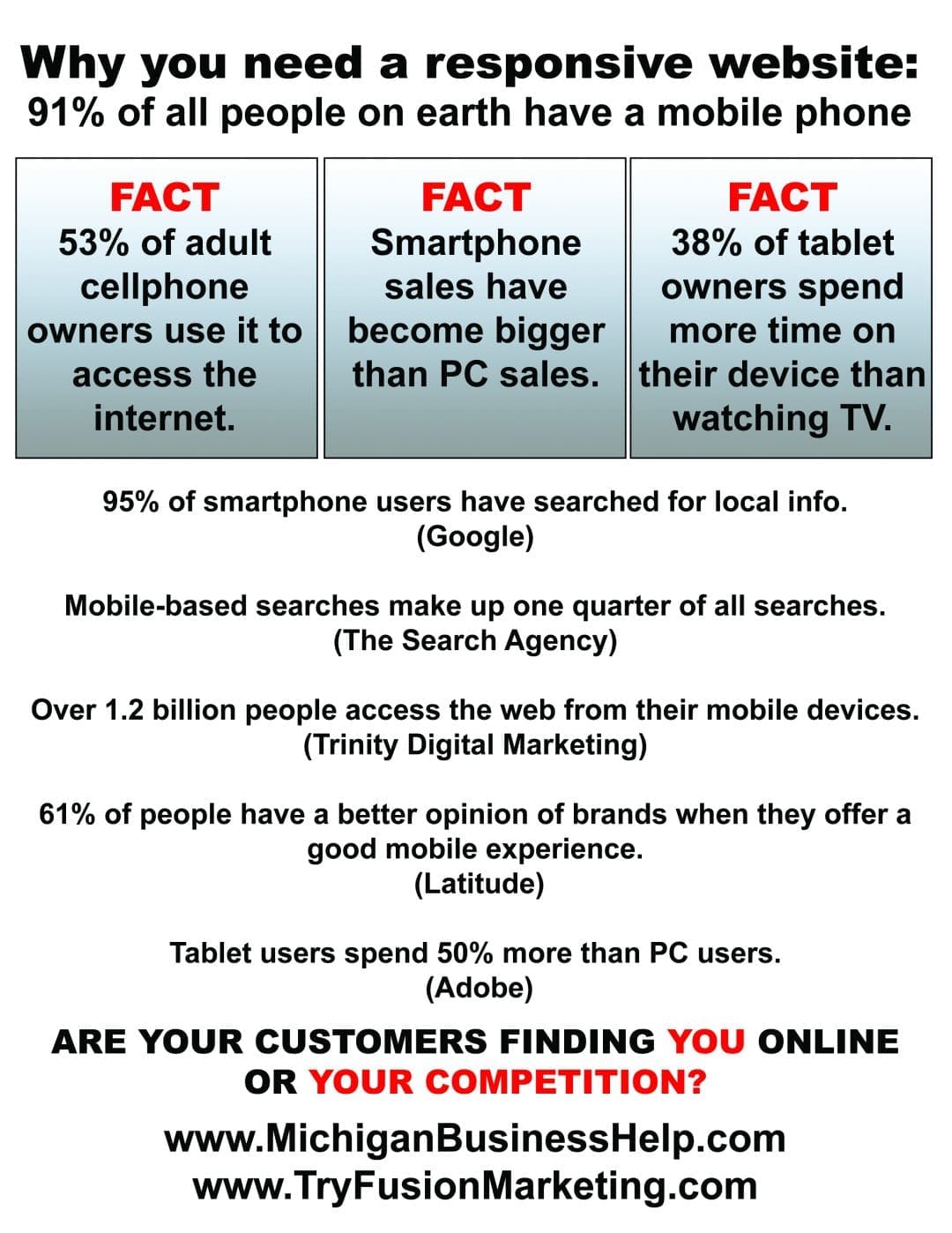
This innovative approach to the search engine process was a direct response to a growing industry trend. Following a steady increase, smartphone users finally surpassed desktop computer users with search requests in 2014.
Finally after the April 21, 2015 unveiling of Mobilegeddon, Google began trying to more fully compensate sites who were understanding and utilizing mobile-friendly access by positioning their pages higher on the web index results search page, also known as SERP.
That process was – and still is – a crucial factor to consider for any Michigan business with a presence on the World Wide Web.
Why is a mobile-responsive website so critically important for virtually any Michigan business?
Quite simply, it’s the best way to guarantee a company’s message – and products – can reach the eyes of the customers most likely accessing the web through a mobile device like a phone or tablet. Meanwhile, sites failing to adopt mobile-friendly features are essentially penalized where searches involving mobile devices are concerned.
A quick search of “Michigan Responsive web design” reveals the answers about the importance of a mobile-friendly approach through Wikipedia, the free online encyclopedia embraced by countless users. According to the site: “Responsive web design is an approach to web design aimed at crafting sites to provide an optimal viewing and interaction experience – easy reading and navigation with a minimum of resizing, panning and scrolling – across a wide range of devices (from desktop computer monitors to mobile phones).”

The immediate impact
Immediately following the heralded arrival of Mobilegeddon, there was a general shrug of disinterest across the industry. An initial review of the date following the April 21, 2015 revolution showed a paltry 17.3 percent if 20,000 non-accommodating pages followed by analysts were expelled from the initial pages of lists following the change of the algorithm. It was readily apparent that many different sites were removed from the first page because of a lack of mobile similarity; this pattern did not continue, however, where marked organizations were concerned. Those rankings changed only marginally. Early results revealed inconsistency, at best.
Times, they are a-changin’ … maybe
The early results of the Mobilegeddon revolution may have been less than impactful for many enterprises enjoying an Internet presence, but that’s not necessarily the case today. Google’s second volley into cyberspace in mid-March 2016 arrived in a blog post declaring refining of the rules relating to SERP. The statement in part declared: “… beginning in May, we’ll start rolling out an update to mobile search results that increase the effect of the ranking signal to help our users find even more pages that are relevant and mobile-friendly.”
The end result of this latest affirmation for Google to improve website rankings has caught the undivided attention of search engine optimization (SEO) specialists (like the Roseville, Michigan-based Fusion Marketing operated by project manager John Hoffman) poised to assist their clients looking to hold or establish prominent positions in cyberspace. While it’s not entirely clear if this recommitment from Google to the ideas behind Mobilegeddon will gain traction, it’s crucial for industry insiders and those looking from the outside to remain vigilant.
So you’re not mobile-responsive; now what?
The first (and most important step) for any Detroit area website owner wondering about mobile compatibility is to take a deep breath, then let it out and breathe easy. Mobile-friendly access is far from the only factor to consider when it comes to the web index results search page. Mobile compatibility represents merely one of more than 200 positioning variables that determine a website’s ranking. Remember this factor: Per Google’s “Inside Search” blog, non-mobile-only neighborly destinations may keep up their high positioning if those sites offer significant, valuable substance the end-users require. Summing it up as eloquently as possible, build visitors a site with quality content, and they will come.
Act now, before you’ve fallen behind competitors
Use of the Internet from mobile devices has steadily risen as the latest advances in technology land in the hands of customers, and experts note there’s no reason for that trend to end, barring the essentially unthinkable collapse of the World Wide Web. Between the endless arrays of texts, e-mails, entertainment, shopping, and other social media activities, mobile phones have become ubiquitous in modern-day life. That’s why maintaining a responsive website is so important to the bottom line for any metro Detroit business – profitability.
Failing to take the necessary steps to keep a website in touch with the times is the best way to fall behind the competition and to fade into eventual forced obsolescence. If any business hasn’t started focusing more on the responsive design of a website, the time is definitely right in light of Google’s 2016 reaffirmation of the principles behind Mobilegeddon.
The importance of inner website awareness
Web index results in search page awareness is a vital component related to operating a website, but businesses can easily get focused on the “where” of a site’s ranking while blissfully ignoring the “what’s going on behind the scenes.” There’s ample knowledge to be gained from tracking the activities of visitors, including their areas of interest, the amount of time spent in specific areas, and queries. From this data, it’s possible for savvy website specialists to redesign those electronic portals to deliver the specific sort of information customers are looking for on the web. The results are a more customer-friendly, mobile, or immobile responsive site. There’s really no better way to gain a stronger position on the Internet.
Why not act today?
Michigan businesses that don’t currently have a mobile-ready responsive website can acquire one from us!


