Ever notice how your mouth waters whenever you think of Grandma’s secret recipe? That’s because it’s timeless, classic—just like her love for you. It’s a culinary masterpiece that never goes out of style. Now, imagine if your logo could do the same for your business.
Intrigued?
You should be!
Just as Grandma’s secret recipe has stood the test of time, so should your logo. It needs to be more than just a pretty picture—it should encapsulate everything your brand stands for. In this article, we’re going to serve up some piping hot tips (see what I did there?) on how to create a logo that’s as timeless and unforgettable as your grandma’s secret recipe.
So, grab a cup of hot cocoa, sit back, and let’s get cooking. By the end of this article, you’ll be ready to whip up a logo that’s as deliciously effective as Grandma’s signature dish. And remember, in the world of branding, the secret ingredient is always love (and a dash of creativity).
Ready to get started? Great, let’s get your apron on!
The Magic of Timelessness in Logo Design
In the swirling vortex of logo design, timelessness is like that classic black dress that never goes out of style. It’s all about striking a balance between feeling contemporary and staying relevant as styles and tastes change over the years, much like how your love for grandma’s cookies never fades, no matter how many new desserts you try.
Now, let’s dive deeper into the world of timeless logo design.
The Simplicity Factor
Much like the simple joy of biting into one of Grandma’s cookies, a timeless logo is often simple and uncluttered. Think of iconic logos like Apple, Nike, or McDonald’s. They’re not overly complicated, yet they’re instantly recognizable. When designing your logo, keep it straightforward and uncomplicated. Remember, less is more!
Consistency is Key
Just as you can count on Grandma’s cookies tasting amazing batch after batch, consistency in your logo design ensures that it remains memorable and effective over time. This means sticking with your design elements – colors, fonts, and imagery – across all platforms and mediums.
Evolution, Not Revolution
Sometimes, even Grandma tweaks her recipe a little.
Similarly, timeless logos aren’t immune to change, but these changes are usually subtle and gradual, maintaining the logo’s core essence while keeping it fresh and relevant. Coca-Cola’s logo is a prime example of this — it has evolved over the years, but its central elements have remained constant.
Emotional Connection
Grandma’s cookies aren’t just tasty treats; they evoke feelings of warmth and nostalgia. Your logo should do the same. It should resonate with your audience and evoke the desired emotional response. This emotional connection can help ensure that your logo stands the test of time.
Versatility Matters
A timeless logo works well in all sizes and on all platforms. It’s like how grandma’s cookies taste great, whether bite-sized or as big as your palm. Make sure your logo looks good in all formats, from business cards to billboards and digital platforms.
Uniqueness
Just as Grandma’s secret recipe sets her cookies apart, your logo should be unique and distinguishable. It should stand out in the crowd and be easily identifiable.
Ultimately, creating a timeless logo is like baking cookies with Grandma’s secret recipe. It takes a dash of simplicity, a sprinkle of consistency, a pinch of evolution, a lot of emotional resonance, a dollop of versatility, and a heap of uniqueness. And just like those cookies, a well-designed logo will leave a lasting impression.
The Peril of Design Trends
Picture this: You’ve got a shiny new pair of bell-bottom jeans. You’re the bee’s knees, the cat’s pajamas, the coolest kid on the block… until one day, bell-bottoms are out, and skinny jeans are in. Suddenly, you’re left with an outdated pair of pants and a bruised ego.
This, my friend, is what happens when you jump on design trends. They might look snazzy today, but tomorrow they could be as outdated as a flip phone in an iPhone world.
Let’s dive deeper into this fashion faux pas of the design world.
The Flashy but Fleeting Nature of Trends
Much like bell bottoms in the 70s or neon windbreakers in the 80s, design trends can be all the rage one moment and then vanish as quickly as they came. Remember the glossy, 3D buttons that were everywhere on the web in the early 2000s? Or the skeuomorphic design that made every app look like a real-world object? They’re now as extinct as dinosaurs.
The Perpetual Redesign Cycle
Following trends can trap you in a constant cycle of redesigning. It’s like always chasing the latest fashion trend – you’ll never have a consistent wardrobe (or, in this case, brand image). You’ll be forever playing catch-up, and your audience might struggle to recognize you.
The Loss of Individuality
Just like that time everyone at school showed up wearing the same “unique” band t-shirt (have you seen these kids and their Nirvana shirts?!?), following design trends can dilute your brand’s uniqueness. Trends are, by nature, widespread. If you adopt them without thought, you risk blending in with the crowd instead of standing out.
The Misalignment Risk
Imagine trying to wear a punk rock outfit to a formal dinner. It just doesn’t fit, right? The same goes for design trends. They might not align with your brand’s identity, values, or target audience, causing a jarring disconnect.
The Danger of Function Over Form
Ever tried running in high heels or typing in leather gloves? Some trends prioritize aesthetics over usability. In design, this could mean a beautiful website that’s confusing to navigate or a stylish logo that’s illegible.
So, what’s the solution? Aim for timeless design. Think classic jeans, white shirts, little black dresses. They never go out of style.
Similarly, a design that’s simple, functional, and true to your brand will always be relevant.
Don’t get me wrong, keeping an eye on trends isn’t a bad thing. It’s about taking what works for your brand and leaving what doesn’t. So, the next time a design trend catches your eye, remember those bell-bottom jeans and technicolor platform shoes gathering dust in your closet and tread carefully.
Your brand (and your ego) will thank you.
The Art of Creating a Timeless Logo
So, how do you create a logo as timeless as the Mona Lisa’s smile? Focus on the essence of your brand, not the fleeting whims of fashion. It’s like choosing a classic leather jacket over a neon windbreaker – one will always be in style, while the other is a ticking time bomb of trendiness.
Let’s get into the nitty-gritty of crafting that timeless logo.
Show The Essence of Your Brand
This is like your secret sauce, the DNA of your brand. It’s the core values, mission, and personality that make you, well, you. Your logo should reflect this essence. It’s like how a leather jacket might symbolize rebellion and freedom – if that’s your brand, embrace it!
Remember The Simplicity Rule
Remember when you tried to juggle while riding a unicycle? Yeah, it didn’t work out so well, right?
The same goes for logo design. Trying to cram too many elements into your logo will only lead to a confusing mess. Keep it simple, clean, and focused. Think of the Nike swoosh or the Apple apple. Simple, yet incredibly powerful.
Harness The Power of Colors and Fonts
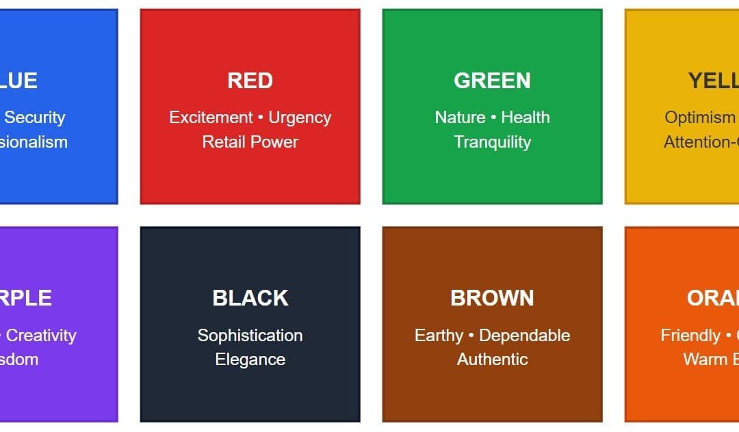
Colors and fonts are like the spices in your grandma’s secret recipe. They add flavor and depth. Choose ones that represent your brand’s personality. But remember, like too much chili in your grandma’s stew, too many colors or overly complex fonts can overwhelm the senses.
The Test of Time
Picture your logo in a ’70s disco, an 80s rock concert, a 90s grunge festival, and a modern-day pop show. Does it fit in each era without looking out of place? If yes, you’ve got yourself a timeless logo!
The Versatility Check
Imagine your logo on a tiny business card and a massive billboard. Does it still look good? Can people still tell what it is? If so, you’re on the right track. A timeless logo works well in all sizes and on all platforms.
The Uniqueness Factor
Have you ever had that awkward moment where you show up at a party wearing the same outfit as someone else? Yeah, you want to avoid that with your logo. Make sure it stands out in the crowd and is easily identifiable.
Creating a timeless logo is an art. It requires a clear understanding of your brand, simplicity, thoughtful choice of colors and fonts, adaptability to different times and sizes, and uniqueness. So, roll up your sleeves, channel your inner Da Vinci, and start creating your masterpiece!
And remember, like any good art, it might require a few drafts before you get it just right.
Wrapping it Up
So, my dear design aficionado, we’ve journeyed through the land of timeless logo design, and what a ride it’s been! We’ve seen how trends can be as unpredictable as a cat on a hot tin roof and why chasing them can lead you down a rabbit hole faster than you can say “bell-bottom jeans.”
We’ve discovered that creating a timeless logo is like baking the perfect loaf of sourdough bread. It’s all about finding the right ingredients (your brand’s essence), keeping things simple (no one likes bread with too many nuts and seeds, right?), choosing the right flavors (colors and fonts), and making sure your loaf… err, logo looks good no matter the size.
And just like that perfect loaf of bread, a timeless logo isn’t just about the taste (or look). It’s about how it makes you feel.
That warm, fuzzy feeling when you bite into a slice of freshly baked bread? That’s the kind of connection your logo should evoke in your audience!
Remember, creating a timeless logo isn’t a one-and-done deal. It’s an ongoing process of tweaking and refining, much like perfecting your grandma’s secret cookie recipe. And sometimes, it might mean breaking a few eggs to make that perfect omelet.
So, what are you waiting for? Get out there and start crafting your timeless logo! And remember, don’t chase trends. Be like the tortoise, not the hare. Slow and steady wins the race. And in the world of logo design, it creates a timeless masterpiece that’ll shine brighter than any fleeting trend.
So, here’s to being timeless, my friend! May your logo be as classic as a leather jacket, as iconic as the Mona Lisa, and as enduring as a diamond. Cheers!
And remember, if you need a hand, we’re always here to help.


