A deep dive into why successful rebranding often means simplification, and what that means for your business.
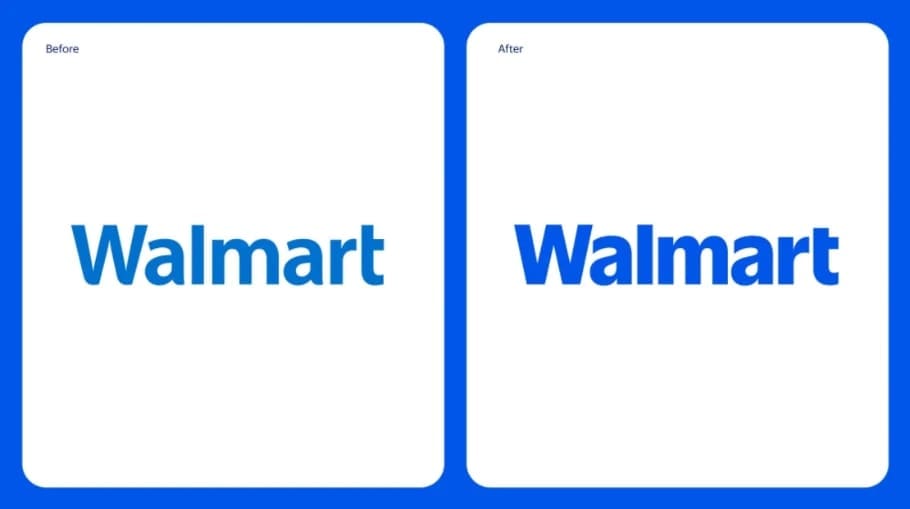
When Walmart unveiled its streamlined rebrand in January 2025, they didn’t add new elements – they refined what was already there. The retail giant’s initiative to simplify their iconic spark symbol and update their typography will cost millions to implement across their vast network of stores, digital platforms, and marketing materials. This investment proves a principle that many small business owners find counterintuitive: sometimes, less really is worth more.
The Complexity Trap
“Picture trying to embroider a detailed painting scene – complete with painter, brush, paint bucket, and house – onto a baseball cap,” explains John Hofmann, founder of Fusion Marketing. “What looks impressive in a large format often becomes an unrecognizable blur when scaled down to a business card or promotional item.”
This scenario plays out regularly in the world of brand design. New businesses often approach designers with complex visions, wanting to showcase everything they do in their logo. While the intention is good – to communicate value and services – the result often undermines their goals.
The Memory Test: A Lesson from Global Brands
“Try this simple exercise,” suggests Hofmann. “Picture the McDonald’s logo in your mind. As the world’s leading fast food brand, you can probably not only visualize it clearly but even draw it on a piece of paper. Now, try to recall Burger King’s logo – the number two fast food brand – with the same clarity. Not so easy, is it? Or consider Starbucks versus Nike. While Starbucks’ logo is complex, Nike’s swoosh is so simple a child could draw it.”
This striking contrast reveals a fundamental truth about effective branding: the simpler the logo, the easier it is for your target audience to remember and recognize it. “Our goal as a branding agency,” Hofmann explains, “is to help our clients get their target demographic to recall them with the least amount of friction possible. We want to take them from ‘some company’ to ‘I know that company.'”
The Million-Dollar Simplicity
The world’s most successful brands have long understood the value of strategic simplification, investing substantial resources in what might appear to be minor adjustments. Consider these notable examples:
Pepsi’s $1.2 Billion “Smile” (2008)
While the logo redesign itself cost $1 million, Pepsi invested $1.2 billion in the total rebranding campaign and implementation. The goal? A simplified, asymmetrical version of the Pepsi Globe incorporating a “smile” element to convey optimism and youth – proving that even subtle changes require significant investment to implement properly across a global brand.
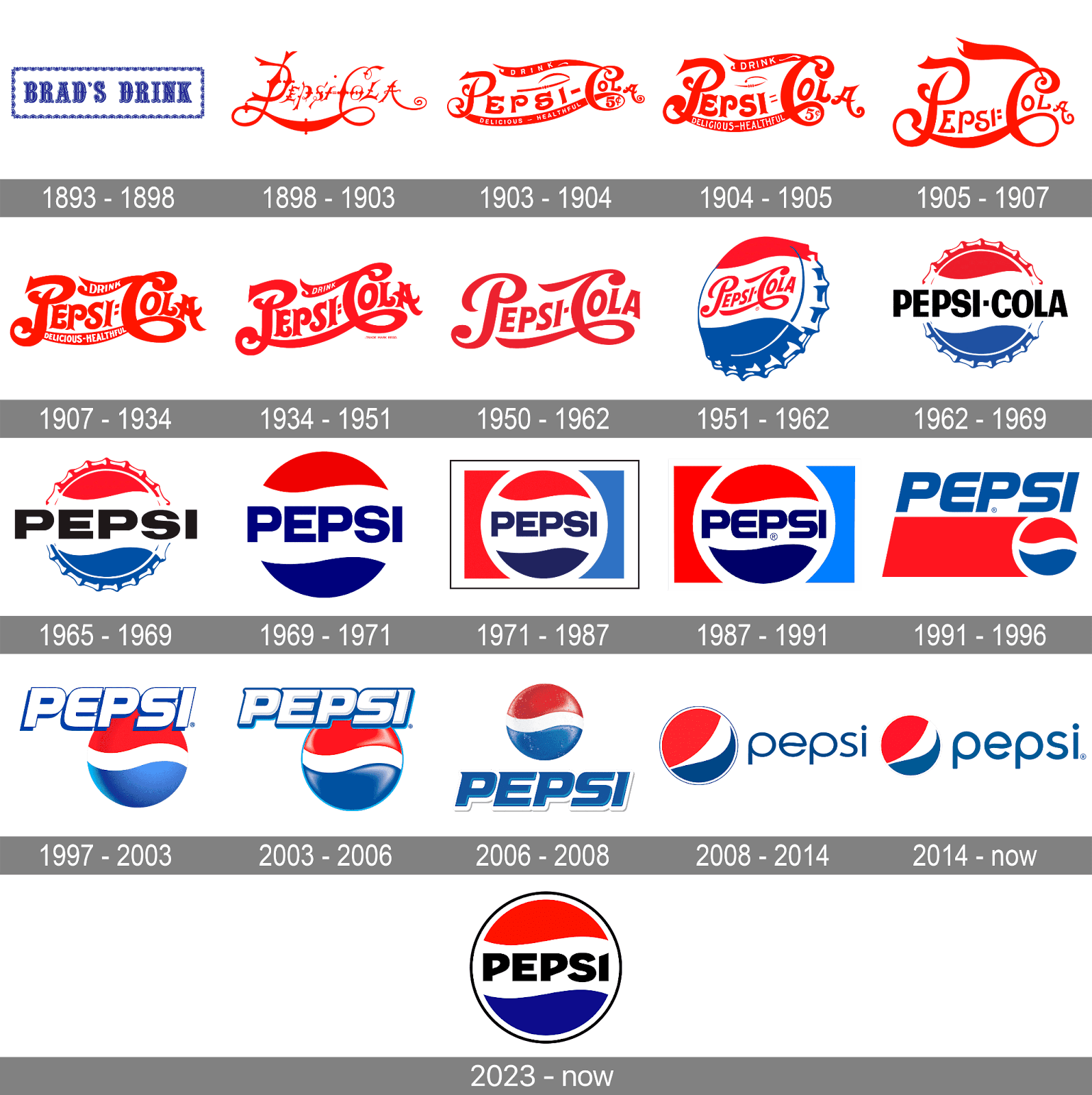
Image credit: 1000logos.net/pepsi-logo
Mastercard’s Wordless Revolution (2019)
In a bold move toward simplicity, Mastercard removed their name entirely from their logo, leaving only the iconic red and yellow interlocking circles. This decision wasn’t made lightly – it followed extensive research showing that over 80% of people could identify the brand from the circles alone. The comprehensive rebranding initiative, which included sonic branding elements, took two years to develop and implement.
Volkswagen’s Digital Evolution (2019)
VW’s shift from a 3D chrome effect to a simpler, flatter 2D design wasn’t just about aesthetics – it was about digital adaptation. The new logo features thinner lines and is designed to be clearer across digital applications while better representing their move toward electric vehicles. The implementation included illuminated badges across vehicles, showrooms, and branded locations worldwide.
The Hidden Costs of Complexity
What many business owners don’t initially realize is that complex logos create practical challenges across every marketing channel:
- Promotional items become problematic (try reading intricate details on a pen)
- Embroidery costs increase significantly with each element
- Social media profiles require squinting to see details
- Digital displays struggle with intricate elements
- Print reproduction becomes inconsistent
- Brand recognition suffers
Making It Work for Your Business
Your logo needs to:
- Be instantly recognizable
- Work across all media
- Scale from tiny to enormous
- Reproduce consistently
- Stand the test of time
The Real Value of Professional Design
In this day and age, anybody can make a pretty picture – that’s the easy part. It’s all of the behind-the-scenes forethought that truly makes a good logo great. If you’re thinking about starting a new business or rebranding, make sure you find the right partner before signing any contracts. Your brand deserves more than just a beautiful design – it needs a strategic foundation that will serve your business for years to come.
Remember: You’re not paying for complexity; you’re investing in strategic simplicity that will serve your business across every touchpoint, from business cards to billboards.
