Look, we get it. Your branding process started with the best intentions – creating something that would make your company stand out in the online marketplace.
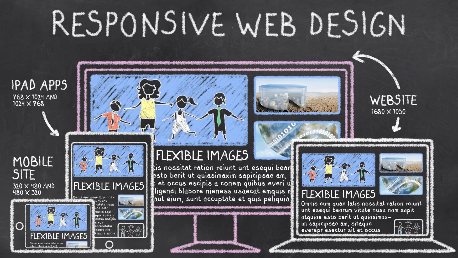
But here’s the thing about mobile-first design that most people miss: your brand strategy needs to work seamlessly across all screen sizes, from massive desktop displays down to the smallest screen on mobile devices.
Contrary to popular belief, this isn’t just about shrinking things down and calling it a day.
Mobile-first design focuses on creating websites and apps with mobile users in mind, starting with the smallest screen size.

The Hard Truth About Modern Brand Visibility
Ah, brand visibility! Let’s start with a reality check about how users actually interact with your brand in today’s mobile-first world.
While desktop users might still be part of your audience, the majority of your customer base is accessing your website, services, and product design through smartphones and other devices. This means your entire branding process needs to focus on ensuring a consistent user experience, regardless of how someone chooses to connect with your business.
The Mobile-First Reality Check
- Mobile users make up over 70% of web traffic
- Most potential customers will identify your brand first on mobile phones
- Social media display spaces are shrinking, not expanding
- Your brand needs to achieve instant recognition across different screen sizes
In a mobile-first era, your logo must adapt seamlessly and still make an impact on your target audience. If they can’t access your content on their smartphones, they’re not accessing your content at all.
Breaking Down Mobile-First Logo Design
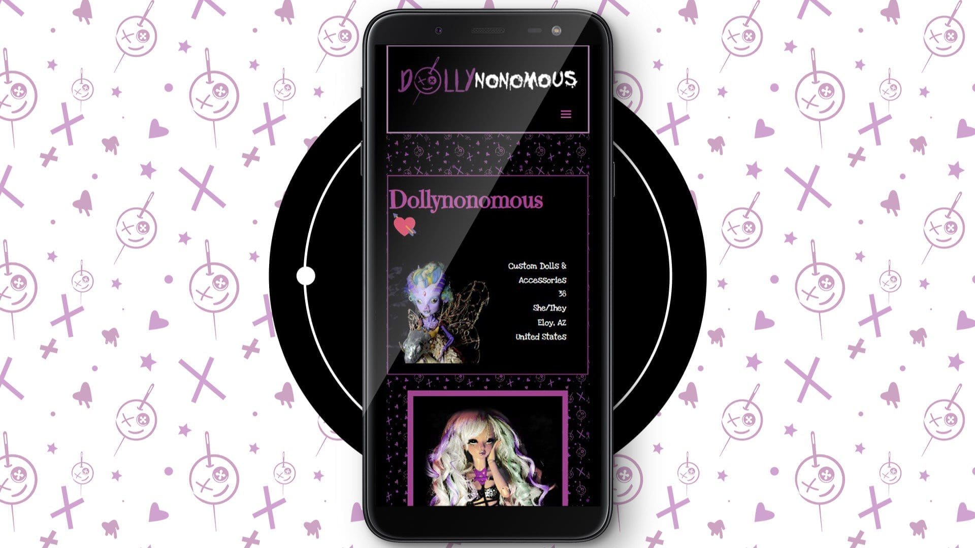
When we talk about creating a strong brand in today’s digital landscape, the mobile-first approach isn’t just a buzzword – it’s the difference between your brand thriving or diving. Mobile users interact with your brand differently than desktop users, and your logo needs to support both experiences while maintaining quality across all devices.
Let’s break down how to create a mobile-first design that actually makes sense for your business.
Start Small (No, Smaller Than That)
Forget everything you learned about graceful degradation – that whole “design it big and scale it down” process is as outdated as your grandad’s flip phone.
A true mobile-first approach means starting with the smallest screen where users will interact with your brand. This forces you to identify what really matters in your product design. If your logo can’t create instant recognition at the size of an app icon, you need to rethink your brand strategy.
Color Isn’t Your Safety Net
Here’s where a lot of companies lose control of their brand value – they focus too much on how their logo will display in ideal conditions. But in the context of mobile devices and smaller screens, your logo needs to ensure consistency across:
- Background images and colors: If you’re not accounting for how your logo will display over different backgrounds, you’re setting yourself up for failure. Your brand won’t always have a white background to live on – ensure it looks great in all situations!
- Monochrome applications: These are applicable for grayscale displays, such as e-readers.
- Reverse treatments: A reverse treatment is when white text appears on a dark or patterned background- think dark mode
- Micro sizes: Favicons are already tiny, but mobile apps require even smaller icons – your logo needs to adapt (if you don’t know what a favicon is, it’s the tiny icon that appears in your web browser tab next to the website name).
And let me tell you, if you’re banking on subtle color variations to make your logo work, you’re setting yourself up for a world of hurt when it comes to actual mobile-first design implementation.
The Technical Stuff You Didn’t Know You Needed to Know
Let’s get into what separates a strong brand from a struggling one.
Creating a mobile-first design isn’t just about what your logo looks like – it’s about the technical foundation that gives your brand the ability to display perfectly across every possible context. And trust me, at Fusion, we’ve seen countless businesses try to leverage their existing logos for mobile devices without the right file setup… well, let’s just say it’s not pretty.
File Formats Are Your Future Self’s Best Friend
This is where it gets real technical, but I promise this matters more than most marketing practices you’ll ever learn!
When it comes to mobile users and their various devices, you absolutely need:
- Vector files: Vectors scale infinitely, which is mighty handy when screen sizes keep evolving
- Raster files: Rasters are optimized for quick loading on smartphones
- Platform-specific formats: Because each social media site wants something different
- Multiple layout options: Multiple layouts are necessary for different display contexts
And here’s the kicker – each of these needs to support your overall mobile-first approach while maintaining quality across every single touchpoint where your customers might access your brand. We’ve seen way too many companies rush this process only to end up with logos that look like they were created in MS Paint when viewed on certain devices.
Whitespace Is Your Secret Weapon
Here’s something that rarely gets enough focus when developing a brand for mobile users: the space around your logo has just as much value as the logo itself. For a truly professional mobile-first design, you need to manage:
- Breathing room requirements: Crowding kills brands
- Size limitations: Make sure you test across all screen sizes
- Vertical and horizontal layouts: Some spaces just demand horizontal logo orientation, while others only work with vertical
- Single-color uses: This is why simplicity is your friend – it makes single-color versions of your logo easier to read and recognize at a glance.
- Simplified versions: For smaller devices
Think of it this way – your logo needs to be a chameleon that not only changes colors but also knows exactly how much space it needs to look its best in any environment.
And believe me, that’s not something you want to figure out after you’ve already launched your website.

Future-Proofing Your Brand
Here’s the thing about mobile-first design that keeps us marketing people up at night: the technology we’re designing for today might be completely different in six months.
We see too many businesses stuck with outdated brand assets because they didn’t think about how quickly mobile devices evolve. Your brand value isn’t just about looking good now – it’s about creating something that can leverage whatever new technology comes around the corner.
The Digital Evolution Never Stopshow
The mobile-first approach isn’t just a current trend – it’s the foundation for how your brand will survive in whatever comes next. Your logo needs to be ready for anything:
- Whatever wild new devices the tech giants dream up
- Marketing platforms that haven’t been invented yet
- Light and dark mode (your customers will definitely use both)
- Virtual and augmented reality (trust me, this stuff’s coming faster than you think!)
The businesses that manage to stay relevant are the ones that develop their brand assets with future technology (including state-of-the-art mobile devices) in mind.
Testing Is Not Optional
Before you even think about calling your mobile-first design process complete, your logo needs to ace these tests (and yes, I mean every single one):
- Crystal clear visibility on mobile devices of large and tiny sizes
- Instant brand recognition across all devices
- Loading speed that won’t make users on mobile devices bounce quicker than you can say “optimization.”
- Accessibility standards (this influences everything from website performance to brand valuation)
- Easy access and functionality across every platform where your customers might find your business
There are too many examples floating around out there of brands that looked fantastic in the initial mockups but fell apart the moment they had to work in actual practice. And let me tell you – redoing your entire brand identity because you skipped these tests is about as fun as a root canal.
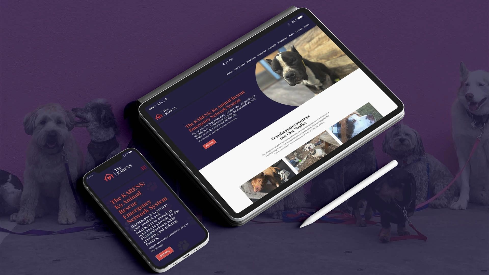
A Thriving Brand in a Mobile-Driven World Starts with a Great Logo
I’ve walked you through the wild world of mobile-first design, and by now, you’re probably realizing just how much goes into creating a logo that actually works for your business.
The mobile-first approach isn’t just some fancy marketing buzzword – it’s the difference between your brand thriving or diving in a world where smartphones rule everything around us.
Here’s what it all boils down to: your logo isn’t just a pretty picture – it’s the face your company shows to every single customer across every single device in every single context. And in a world where users access your website primarily through their mobile devices, you can’t afford to treat mobile-first design as an afterthought.
The companies that nail their mobile-first approach from day one are the ones that end up with brand identities that actually make sense five years down the road. Your logo needs to work everywhere your business needs to be – today, tomorrow, and whatever comes next.
Ready to Stop Stressing About Your Logo?
Look, creating a truly mobile-first brand identity is a massive undertaking.
If you’re sitting there thinking, “Well, damn, this is way more complicated than I thought,” you’re not alone. Give Fusion Marketing a shout – we’ll help you develop a logo that works its ass off for your business, no matter where it shows up.
Your brand deserves better than a logo that only works in your PowerPoint presentations.


