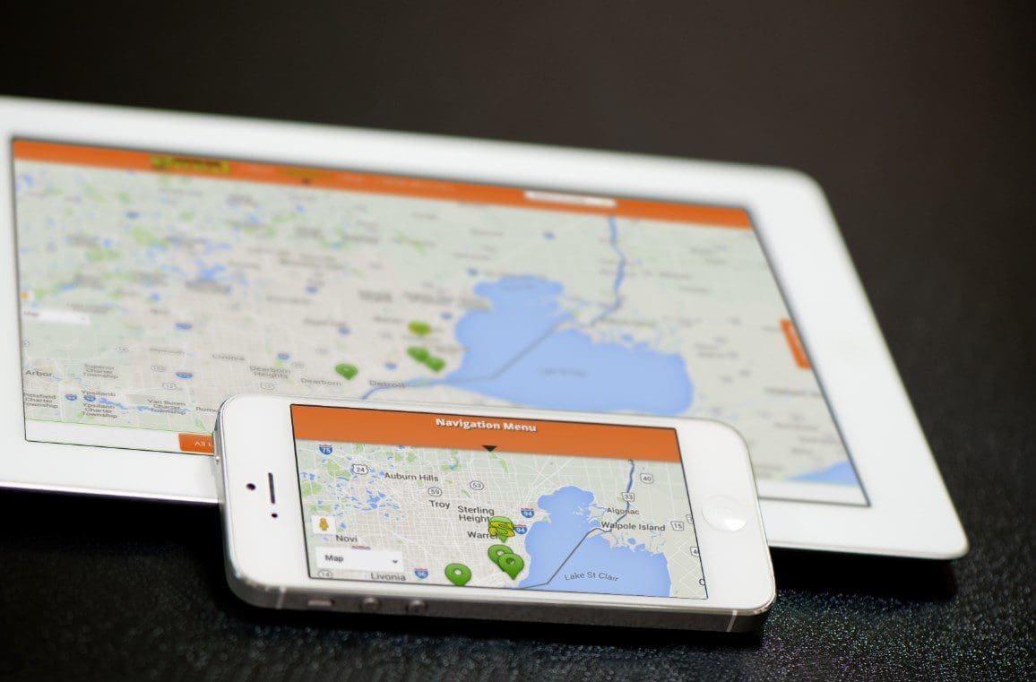
Access to the internet has significantly increased with the smartphone wave. Many people, unlike before can now access the internet from anywhere provided they have their smartphone with them. Consequently, mobile phones are fast replacing traditional desktops for web access.
More imminent, the majority of internet users today apparently use Google as their primary link to other sites. In this regard, Google has rolled out an arrangement that will see them transition into the mobile-first web design that will also enhance the online content consumers get.
In the heat of the smartphone wave, mobile usage has no doubt exceeded that of the desktop. The scene of web access is fast shifting.

So what does mobile-first design entail?
To concretely understand how this design works, recall the days you tried loading sites on your phone that could not display all the contents? Well, that’s because the sites operate on a desktop-first web design that comes with its fair share of restrictions for mobile users. Conversely, a mobile-first design sets the product design from the mobile end then expands progressively to incorporate tablet and desktop versions.
The model incorporates two critical elements of web design: responsive web design and progressive advancement.
Responsive web design
A Responsive web design is compatible with any screen resolution. The web page automatically fits on different screens without having to zoom for clarity. The design is highly flexible, and as a user shifts from their phones to laptops or any other device with different screen resolutions, the web page readily adjusts to the convenience of the user.
Some of the common advantages of using responsive web design include reduced browsing time because of the automatic adjustments and the fact that web page developers only need to develop a single version that fits all.
Progressive advancement
Progressive advancement on the other hand simply means that developing a web page would begin by building versions that work for light browsers, mostly installed on phones. The version would later be upgraded progressively to accommodate other heavy browsers that work for desktops. It is widely preferred over graceful degradation which is typically the opposite.
Developers would initiate their designs from ends that support heavy browsers then cut off some features out to accommodate light browsers. Mobile-first is, therefore, a rule of progressive advancement.
Advancements by Google
The number of searches through the Google search engine is continuously swelling by the day as more and more people gain access to the internet. Through its traffic, hundreds of millions of these accesses were made through phones. The number has reliably surpassed access through desktops. The shift to mobile-first design is hence long past due.
Google has started the rollout plan and has already enrolled a number of sites into the mobile-first design and continues to make arrangements that will see more sites shifted.
Since a majority of web users today access other sites primarily from Google, it is important to note that having different web designs for different screen resolutions may be misleading in a way. Think of it in this line-you need to get to a web page and extract as much information as possible. Searching from your phone would mean pages with the desktop first design orientation would not be fully loaded. Even more regrettable, you may be directed to a mobile page for desktop users. Most of the content that you probably needed will not be displayed or instead displayed incompletely.
Users consequently heap the blame on Google other than the sites themselves which have these designs to start with. The rollout plan will, therefore, ensure that these sites adopt a mobile-first design that accommodates not only different screen resolutions but is also conveniently fast. Access from any device will display all the content you could possibly get on the website.

Encouraging mobile-first web design
Without a doubt, the benefits of mobile design are far substantially and extensive than the customary desktop-first design. Businesses are prominently making the shift with the acknowledgment that in due time, web access will be overwhelmingly through mobile smartphones. Google has additionally announced that in its full implementation of the program, it will most likely move with the sites that are ready for it.
Even more encouraging, there is a team from Google that is already monitoring the sites that were shifted for trial. The progress is good, and soon enough, it will be fully scaled.


