Project Background
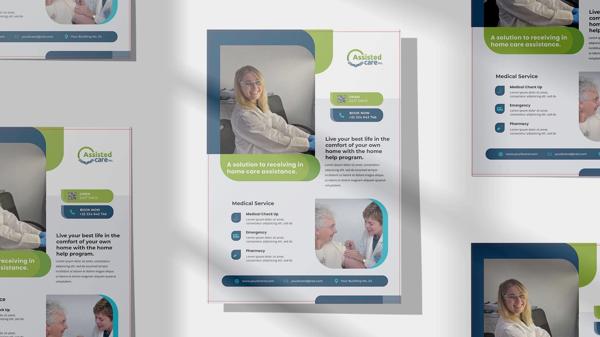
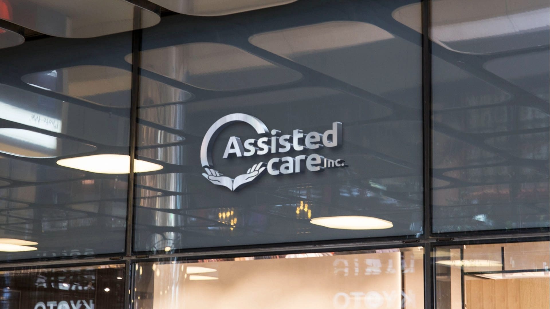
Assisted Care, an established organization within the healthcare industry, had been operating without a visual identity until our collaboration. We were tasked with creating a logo that accurately reflects their mission and values.
Project Description and Materials Used
We took on the challenge of creating a bold, memorable logo for Assisted Care. The process began with understanding the company and its clientele. Sketching potential designs led us to a selection we were enthusiastic about, which we then presented to Assisted Care. After a few minor revisions, we arrived at the final design.
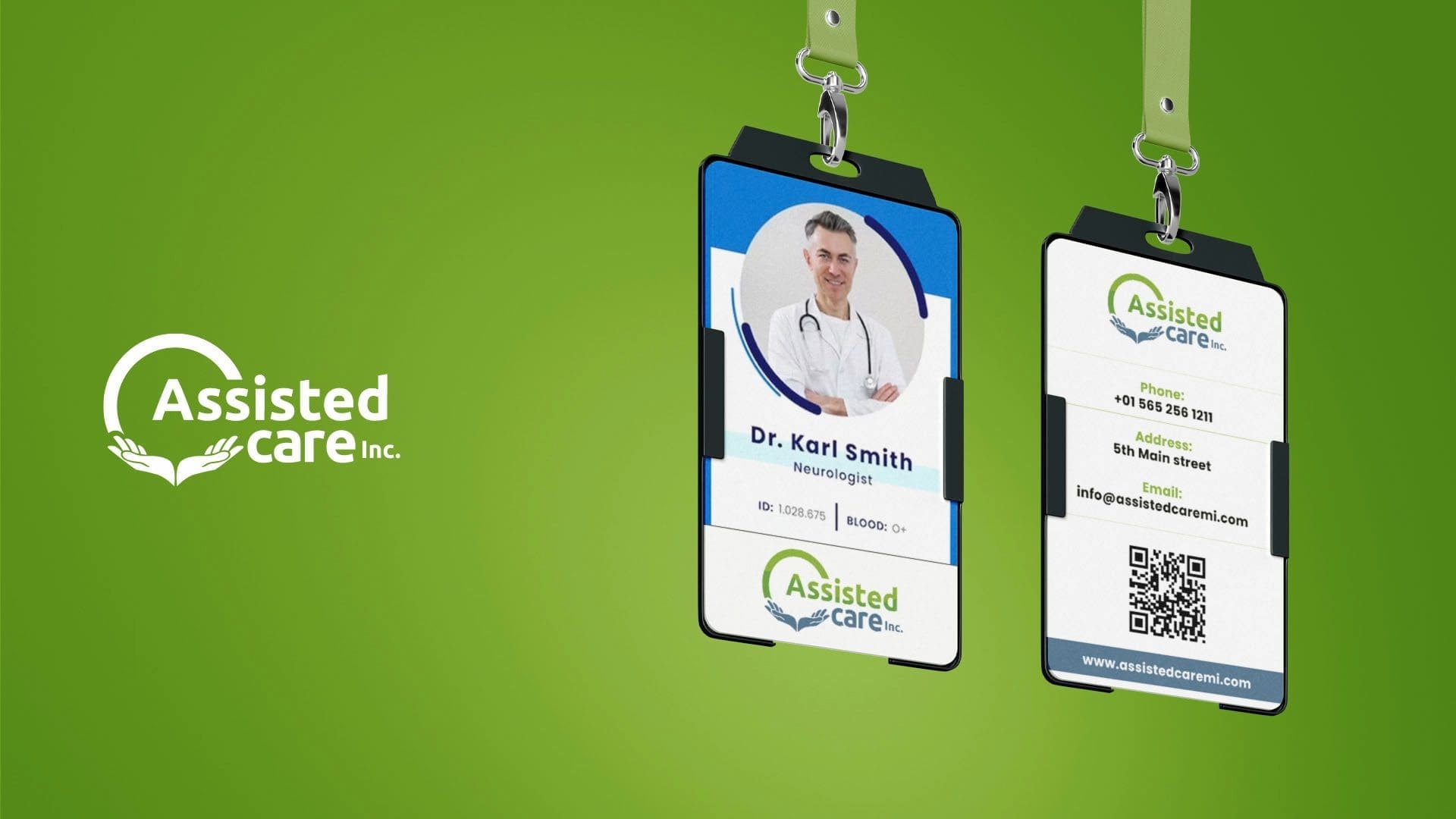
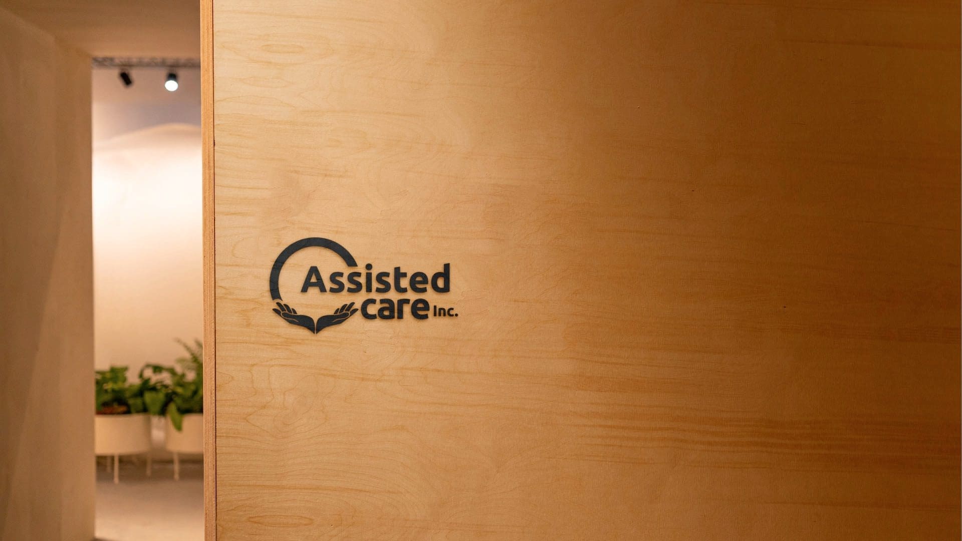
The logo features two stylized hands to the left, symbolizing unity and support. Above the hands is an arch or circle, adding a touch of elegance and balance to the overall composition. The logo is predominantly blue and green, which signifies trust, harmony, and growth. To the right of the hands, “Assisted Care Inc.” is written in a legible font, reinforcing the sense of care, compassion, and reliability.
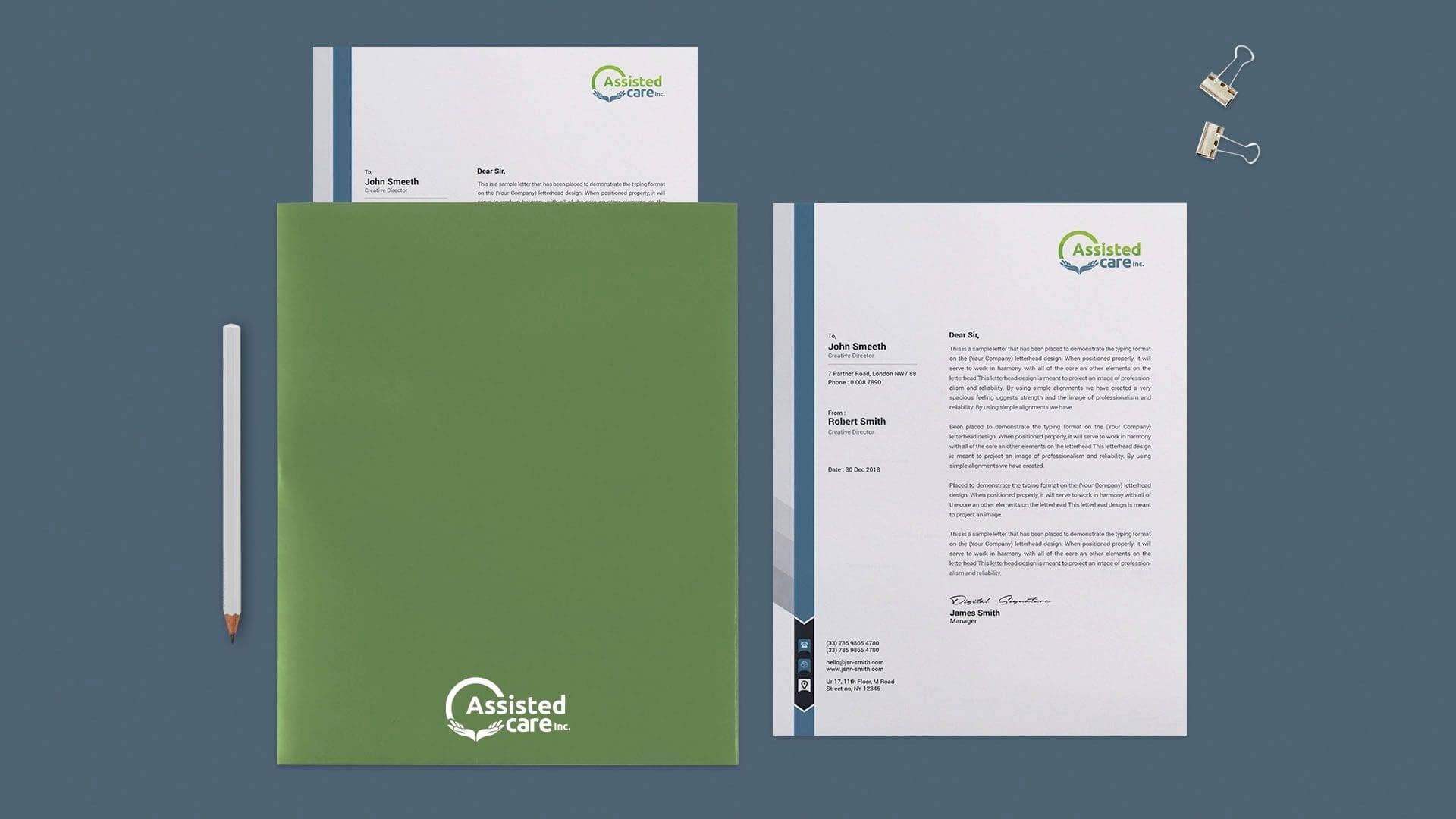
We used Adobe Illustrator to create this logo. We provided Assisted Care with a comprehensive package that includes all necessary files, varying colors, social media profile pictures, and print files.
Problem Addressed and Approach
Assisted Care required a design that would resonate with their target market and endure over the years. We aimed to create a logo that was easy to recognize and encapsulated the essence of Assisted Care’s mission and services. Our approach was to incorporate bold elements representing strength and support while maintaining a sense of professionalism and trust.
Project Benefits and Outcomes
The new logo will significantly enhance Assisted Care’s brand image and visibility. It builds trust, improves recognition, and fosters client loyalty. This logo will shape their brand identity and market perception, helping them stand out in the healthcare industry.
We’re confident that this logo will be a powerful tool in Assisted Care’s marketing arsenal, playing a pivotal role in its branding strategy and establishing a solid connection with its audience. We look forward to seeing their brand grow and evolve with this new logo as its foundation.
