Project Background
A few years back, a new lawn care company approached us with a clear vision: they wanted a professional logo that would embody their brand without using a fox graphic or a cartoonish aesthetic. Their goal was to create a strong identity that resonates with customers while maintaining an air of sophistication.
Project Description and Materials Used
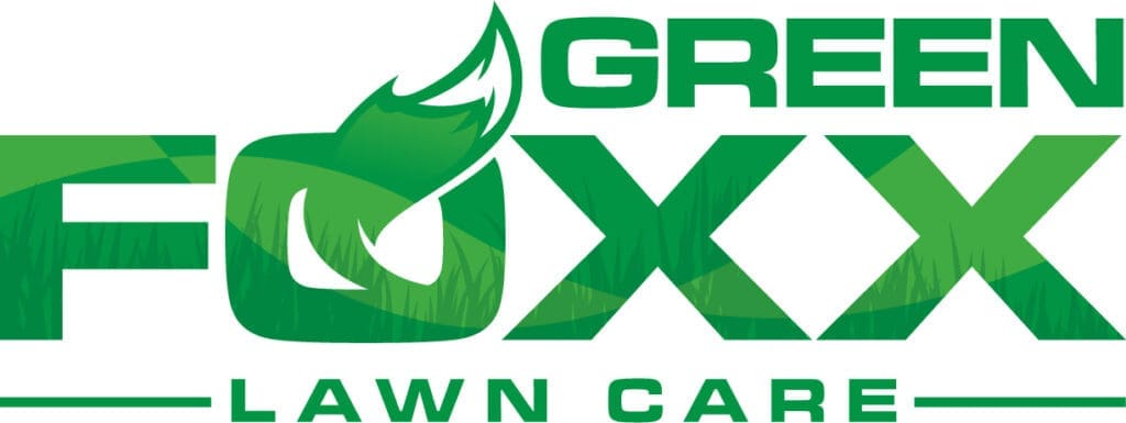
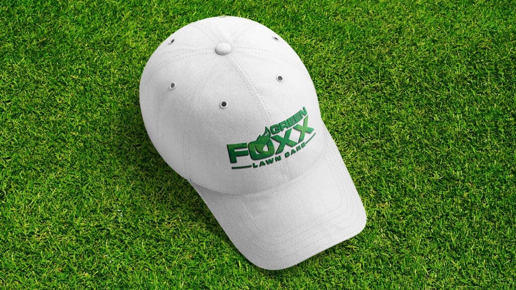
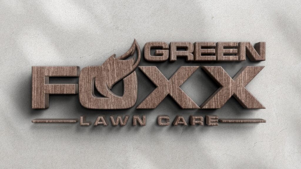
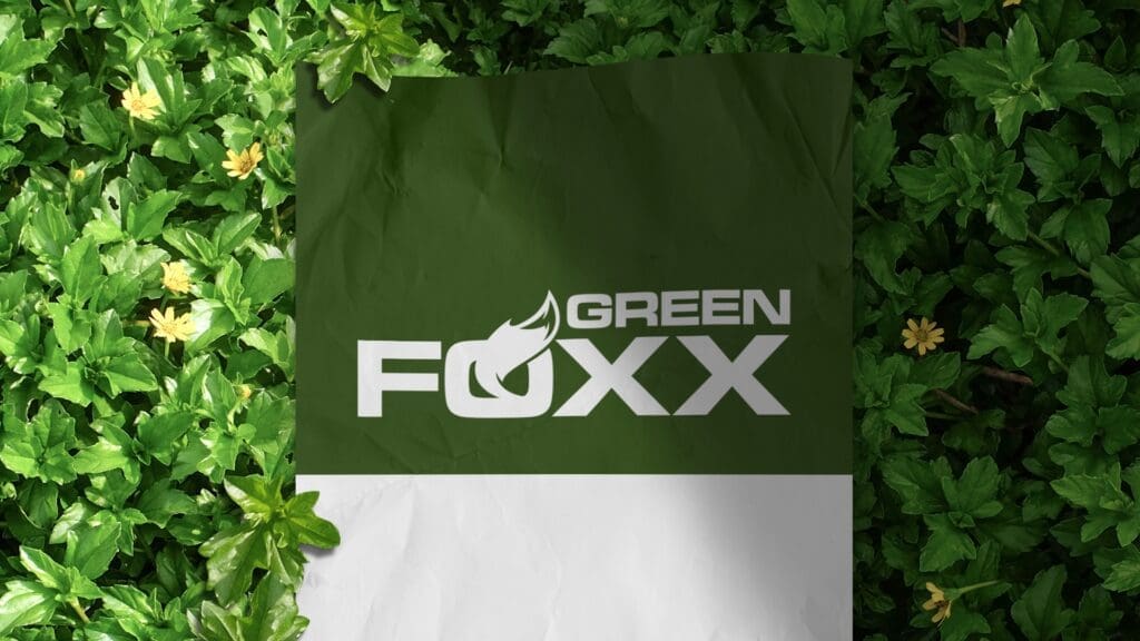
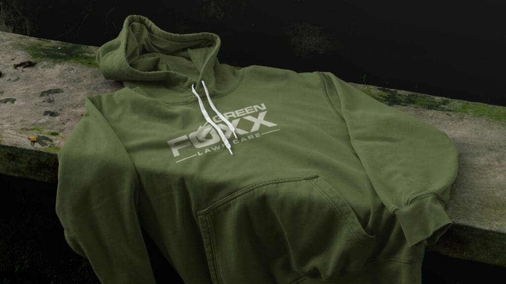
To bring their vision to life, we began with sketches on paper before transitioning the design into a digital format using Adobe Illustrator. The logo features the word “green” nested in the top-right above “Foxx.” A fox’s tail elegantly emerges from the ‘o’ in “Foxx.” Beneath “Foxx,” the words “lawn care” are centered, complemented by decorative lines on either side. The fill color for the lettering is a vibrant green with a subtle grass texture for full-color printing, while a solid green variant is available for one-color applications.
Problem Addressed and Approach
Finding the right balance between an overly simplified design and one that is too busy is a common challenge. Our solution was to incorporate the fox’s tail popping out of the ‘o’ in “Foxx,” effectively injecting personality into the brand without crossing into childish territory—a frequent pitfall for smaller or DIY landscape companies. This detail provides a memorable element while still maintaining a professional look.
Project Benefits and Outcomes
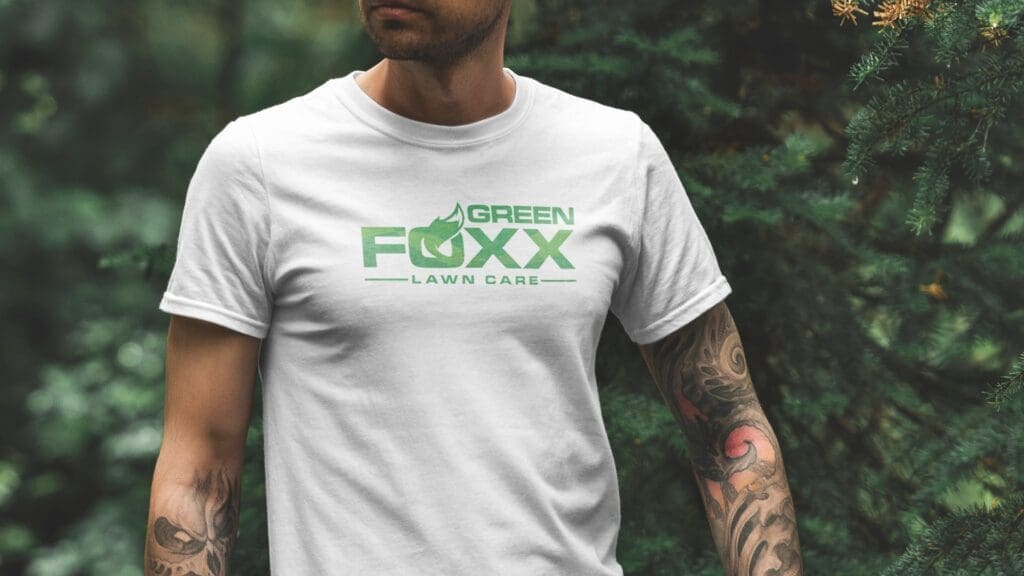
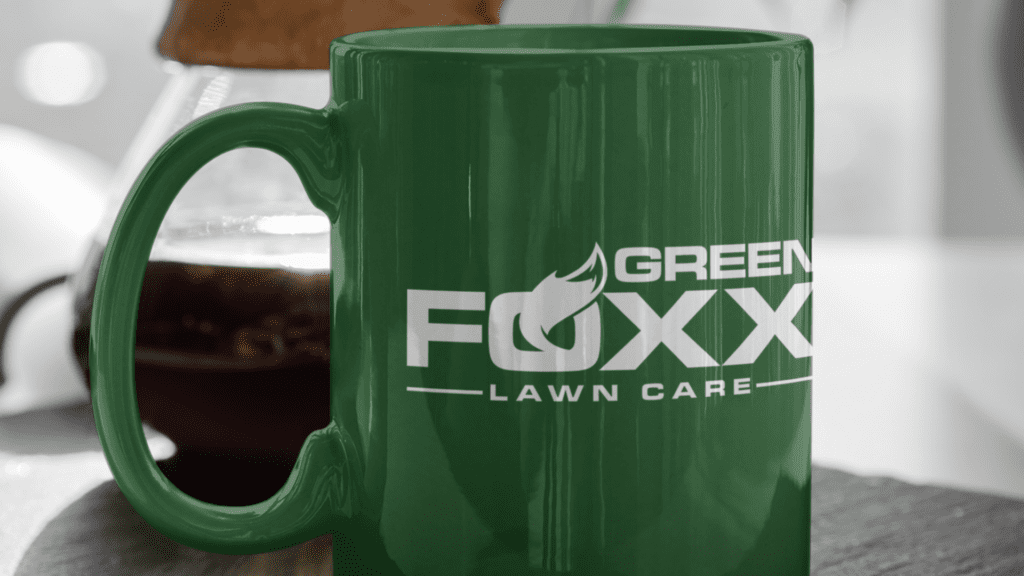
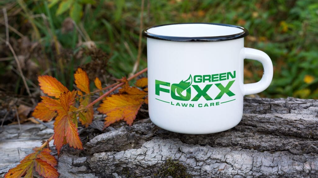
The result is a stunning logo for Green Foxx that meets all of their criteria and translates beautifully across various print applications. It performs well as a one-color design and adapts seamlessly to dimensional lettering, perfect for an interior wall display. Green Foxx now possesses a distinctive brand identity that both reflects its professionalism and appeals to its target market.
We are proud to have helped Green Foxx Lawn Care establish a strong visual presence and look forward to future collaborations that enhance its business.
