The power of a logo to evoke an emotional response can have a thunderous effect on the way potential customers view a particular product, service, or company. A powerful logo may look simple, but there’s nothing simple about creating an effective logo. Be aware that the logo shapes used to portray the most visible brands in our culture have not been chosen by chance. Instead, there are some powerful psychological forces at work, and exploring various logo shape ideas can spark inspiration in the logo design process.
Take a moment to explore different logo shapes for inspiration and creative ideas. Let’s take a deeper look at the psychology of logo design and how fonts, shapes, shapes, and colors can play a role in your finished logo design choice.
What is a logo shape, and why does it matter?
Logo shapes define the shape of a graphic either through its configuration or on behalf of it, as an abstract image. The shapes used on the most prominent brands in our culture have not been chosen by chance but rather because of the power they evoke and communicate. These logo shapes are often made up of a few primary geometric shapes and forms combined differently to create something new and unique for each brand’s personality. The choice of shape in a logo is intentional, as it reflects the brand’s personality and values.
Often, we focus on the most desired qualities: colors and fonts. However, overlooked components like shape still determine how well a logo will resonate with an audience. Shapes form the foundational elements of icons; they can be combined or featured behind a logo to establish its strength. Abstract logos, in particular, use geometric shapes and symbolism to convey a brand’s personality, often incorporating hidden meanings and negative space to enhance brand messaging.
Creating your logo with the right shape for you.
Depending on your company’s personality, you’ll want to make sure your logo has the right shape, as the right shape can evoke a specific feeling and create a connection with your audience.
- a tight curve or half circle may be better for an intimate company with a small staff, and close relationships between employees
- straight lines can represent stability and strength in difficult times; they also imply that anything is possible if people are willing to work hard
- You can use squares and rectangles to convey tradition, stability, and reliability.
- Circles or rounded shapes are often associated with warmth, safety, and a sense of belonging. These shapes are easily recognizable and help foster a strong connection with your audience.

Examples of successful companies that have used different shapes for their logos.
Here are a few examples of successful brands and their respective shape logos, demonstrating how strategic use of design elements can enhance brand identity. The following should help to get your wheels turning about what shapes might work best for your logo.
𖧋 Logo designs with circles:
Circular shapes are often chosen in logo design for their symbolism of unity and completeness. A circular brand logo can convey a sense of wholeness, reliability, and timelessness, making it a popular choice for brands seeking to express these qualities.
- NASA
- Coca-Cola
- Olympics
☐ Brands with squares in their logo:
Square logos are known for their symmetry, stability, and boldness. Choosing a square shape for your logo can help convey reliability, trustworthiness, and a sense of balance.
- Youtube
- Lego
- Microsoft
△ Triangles are another popular logo element:
Triangle logos are popular in logo design for their symbolism of strength, progress, and sharp edges. The triangle shape is often used to convey stability, movement, and aspiration, making it a versatile choice for brands seeking to communicate these values. Well-known brands like adidas and nike utilize triangle logos or incorporate the triangle shape in their designs to represent performance, focus, and forward momentum.
- FedEx
- Google Play
- HGTV
A list of shapes to choose from, what they mean.
There are many different and unique shapes, some of which can evoke mystical and intellectual responses, especially shapes like spirals that inspire a sense of wonder. Here are a few most commonly used in business logo design and corporate branding projects.
☐ Squares – stability and grounding
𖧋 Circles – wholeness, unity, perfection
△ Triangles – balance and harmony
▯ Rectangles – order and practicality
⬡ Hexagons – cooperation and community spirit
⯃ Octagons – creativity and innovation
𖦹 Spiral logos – mystical and intellectual qualities, often found in nature, these logos evoke a sense of wonder, growth, and energy, and are associated with creativity, spirituality, and deeper symbolic meanings.
Logo shapes, like triangles and hexagons, should be used with great care when trying to communicate a message that aligns with your company’s target audience.
How to create a unique logo design that stands out from the rest.
The first step to creating a unique logo and stands out from the rest is understanding what makes your business stand out. What are your core values? Whom do you serve? How are you different than other businesses in the same industry or niche? Once you have an answer to these questions, it becomes easier to start designing your logo. At Fusion Marketing, we cover a lot of these questions with our clients during a free discovery meeting. These answers allow us to get an idea of who your business is, and more importantly, who your customer is.
Once you have chosen your logo shapes and other design elements, such as color, typography, and negative space, you are ready to create your logo.
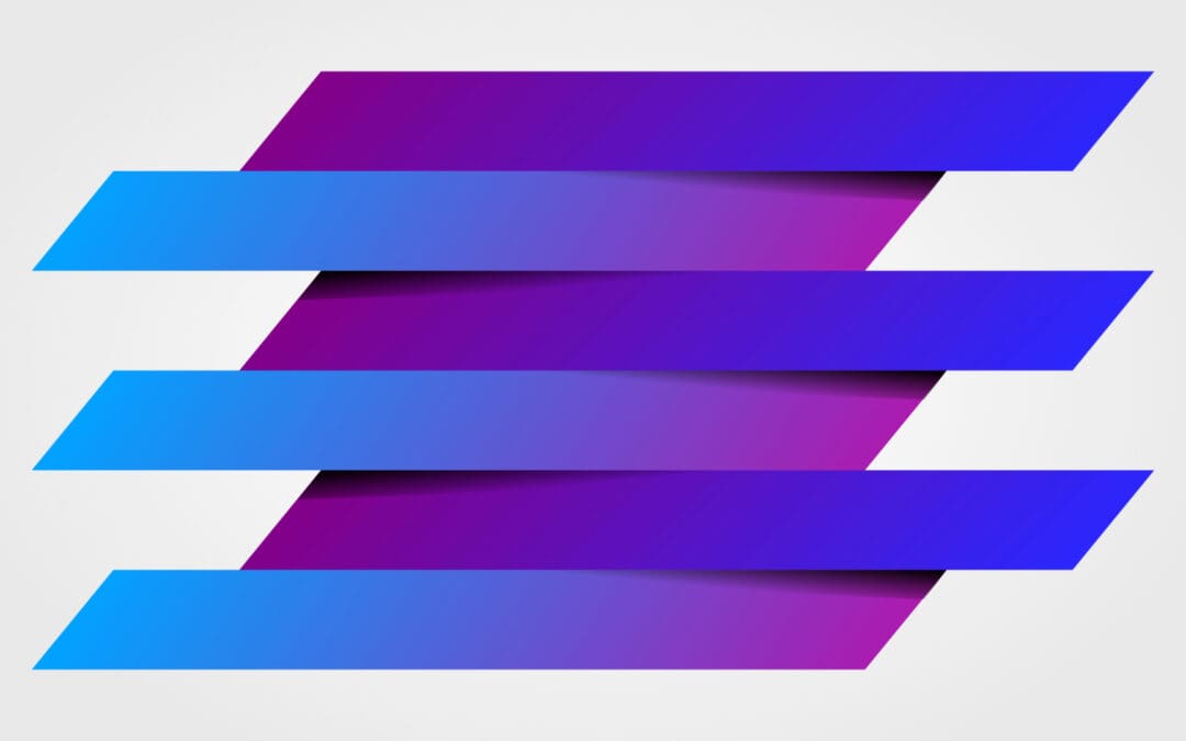
The Psychology of Logo Design: Lines
The first and most versatile of the visual elements of art, lines are the foundation of art. You can use lines in artwork to suggest shape, pattern, form, structure, growth, depth, distance, movement, and emotion. Geometric line art logos are currently popular and among the logo design trends this year. Take time to learn from successful brands about how geometric shapes and lines are used in logo design to create effective and memorable logos.
— The psychology of lines in logo design.
Logo design with line elements can fit a logo representing the company’s values, such as simplicity, minimalism, and cleanliness.
Vertical lines are powerful and engaging. But, on the other hand, horizontal lines promote relaxation or calmness in logo design, which can suit businesses that want their logo to generate trust, like banks or hospitals.
Many design organizations aim to appeal to a feminine side: You can accomplish this by incorporating horizontal lines in otherwise angular designs. Horizontal lines help to ground a brand.
Logo designs with a combination of vertical and horizontal lines create a sense of balance, harmony, and stability, appealing to companies that want their logos to appear professional yet friendly. Lines and shapes in a logo can help make a clear point, ensuring the design communicates a decisive message about the brand’s core values or stance.
The psychology behind corporate logo designs is significant because it shows how the human brain reacts unconsciously when viewing different line color combinations or compositions.
TIP: Remember that your font choices also come into play. The fonts you choose will add to the overall feel of the design. In addition, many programs will allow you to filter fonts based on styles and categories.
Lines create a sense of movement and action.
![]()
Motion lines:
Using a simple motion line technique, an object that feels dead can be transformed into something lively and full of life.
Medium disturbance:
A simple demonstration of movement is the way a person’s wake disturbs the water. Moving through any matter creates waves or trails that can be easily seen and felt, but it may not always seem obvious with objects in the air like smoke because they are lighter than other types of matter.
Anticipated movement:
The anticipated movement relies on the suggestion of motion to trick an observer into seeing it as real, which you can do by presenting them with something they’ve seen before, like leaping kangaroos and other animals moving across flat surfaces such as trees or walls.
Transparency:
The technique is called transparency because when two different transparent images layer themselves over each other, they can create the illusion of something happening between them or through them that isn’t there—transparency! (example: Mastercard) This effect makes the artwork come alive and make you feel as if it’s moving before your very own eyes!
The Psychology of Logo Design: Colors
Red is considered exciting, attention-grabbing, warm, and connected to love, anger, life, and comfort. Yellow is adventurous, evoking happiness, enthusiasm, youth, and travel. Brown is the color of the outdoors and can be seen as friendly, organic, natural, friendly, and rugged. Black is all about sophistication, intelligence, seriousness, and expense. It’s also essential to bear in mind that how you mix your colors in a single design also has psychological implications for your viewers. Do your due diligence and research your audience so you can make the best color choices based on their specific backgrounds. Your color choices should always embody the personality of the brand. Additionally, certain color combinations and logo shapes can symbolize a brand’s connection to the world or highlight its global reach.
The psychology of colors:
⚫ Black logos – Sophistication, elegance, luxury or edginess
🔴 Red logos – the power of emotions
🔵 Blue logos – a color that is cool, calm, and collected
🟢 Green logos – nature’s favorite color
🟡 Yellow logos – happy and cheerful
🟣 Purple logos – creativity at its finest
What colors should you avoid when looking at the psychology of logo design?
Clients often underestimate the importance of color psychology and the logo design process, though this is not without reason. When you look at a logo, your eyes are drawn to the colors in it first. For this reason, we can say that color is an essential element of any design.
The psychology and science behind colors have been studied for decades now. However, there’s still room for interpretation regarding what feelings they evoke within us or how best to utilize them.
Here are a few things to avoid during the logo design process;
🌈 Multicolor and Rainbow Colors
Multicolor or rainbow colors are often difficult for viewers to differentiate between. Too many colors can result in a logo design where the viewer cannot tell which color represents what part of your business. The rule is often to stick to 2-3 colors at most.
There are times when multicolor or rainbows do work, but only when they align with your brand, and can be turned into a 1 or 2 color logo without losing the design.
😶🌫️ Light Colors on Light Backgrounds
Light colors on light backgrounds are challenging to read. For example, when you have a white logo and put it against more of the a similar color, the text becomes hard to decipher because it blends too well with its background. If you must use a color scheme without much contrast, make sure you use a tool like https://logolab.app/lab to check what those with color blindness will see.
🦺 Neon Colors
Neon colors are often used for marketing purposes, but they can make the product look cheap and unprofessional if not used correctly.
-
- Neon colors can be difficult to work with because they do not print correctly.
- Popular neon colors include electric pink, orange-reds like tangerine or mandarin, chartreuse yellow-greens such as lime green.
Elemental Colors; Gold, Silver, Copper
When translated to solid colors, these elements lose their ‘wow!’ factor. For instance, here are the most popular requests we receive and the colors they translate to.
● Gold: This is a very yellow color or a brown that can be described as “baby poop.”
● Silver: Tell me more about your love for the color gray
● Copper: Copper translates to a strange orange-brown and or weird greenish color
● Platinum: Maybe we should use silver as an alternative? When translated, platinum is a lighter shade of gray when compared to silver.
")
Why some people are more affected by specific colors than others.
According to Wikipedia:
“How people respond to different color stimuli varies from person to person. In a U.S. study, blue is the top choice at 35%, followed by green (16%), purple (10%), and red (9%). Blue and green may be due to a preference for particular habitats beneficial in the ancestral environment, as explained in evolutionary aesthetics. Orange, yellow, and brown are the least popular colors, respectively.
Color preference may also depend on ambient temperature. For example, cold people often select warm colors such as red or yellow, while hot colors favor cool colors like blue and green. Introverted individuals are also found to be more attracted to cool colors, while extroverts prefer warmer colors.”
In conclusion, there is often more than meets the eye when looking at the shape and color combinations of logo design.
When determining which logo design to go with, start by assessing what makes your business stand out. Then, identify your ideal client. Once you have an idea of the core values that define your business (AKA your mission statement) and how it differs from other providers in the industry, it becomes easier to choose a color combination and shape. And, if this has your head spinning, you can always reach out to one of our project managers who have years of experience helping businesses just like you stand out in a crowded marketplace and request a logo quote.
A great logo is a true reflection of your brand’s identity, combining inspired design elements that communicate your values and make a lasting impression. The Nike Swoosh is a perfect example of a great logo – its inspired, minimalist shape is instantly recognizable and truly symbolizes the brand’s message.