In the printing world, avoiding common mistakes is like having a secret weapon up your sleeve.
Why?
Because understanding these pitfalls is the key to consistently achieving top-notch print quality.
We all want those vibrant colors and crisp lines, right? Paying a little extra attention during the pre-printing stage can save you a lot of hassle later on. Plus, you’ll keep those printing disasters at bay, which means saving both time and money—and let’s face it, nobody wants to deal with a printing mishap! Understanding the nuances of proper print preparation ensures smoother workflows and more satisfying results, keeping frustration at a safe distance.
What You See Is Not Always What You Get
You know that moment when you absolutely love the colors on your screen, only to find them look totally different on paper?
Frustrating, right?
Why Does it Happen?
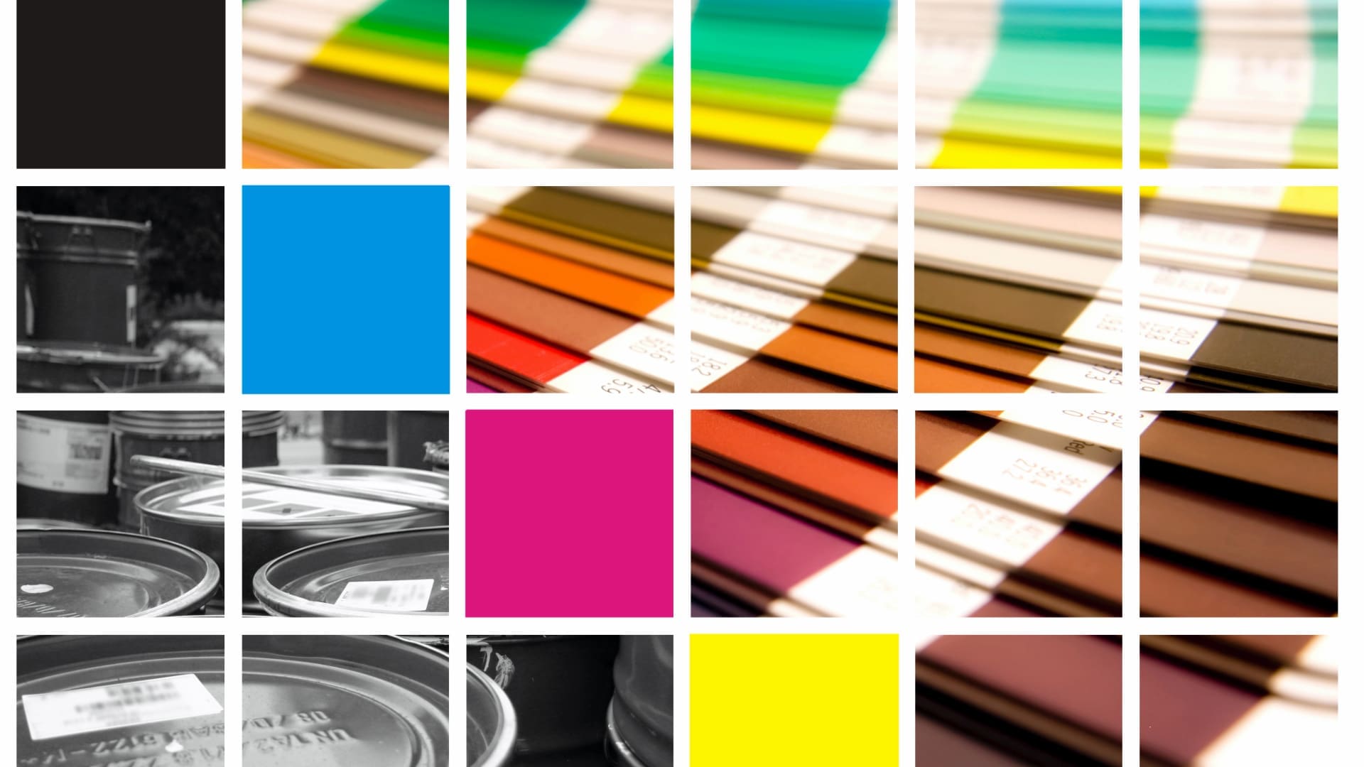
This mismatch often happens because screens and printers speak slightly different languages in terms of color. Your monitor might display vibrant shades thanks to its RGB color model, while the printer relies on CMYK to get the job done.
This slight difference can lead to your favorite teal looking more like seaweed green after printing.
How Can I Fix It?
To avoid a color breakdown, start by calibrating your monitor. It’s like adjusting your TV settings for the clearest picture. There are plenty of tools out there that can help with this, or you can use built-in features on your computer.
Once your display is set, dive into color-proofing. Think of it as a sneak peek of what your print will look like, helping to catch inconsistencies before it’s too late.
These steps are a bit like prepping ingredients for a recipe—ensuring everything’s just right before the big reveal! With a little extra care in the pre-printing stage, you’ll be well on your way to achieving those print results you’ve been dreaming of.

Forgetting to Remove Border/Cut Lines
Let’s talk about one of those sneaky little mistakes that love to wreak havoc on your print projects: border and cut lines left hanging where they shouldn’t be.
Imagine planning a beautiful design and the printer goes ahead and adds these extra lines as if they were part of the masterpiece. Oops! It can really take your work from “wow” to “whoops.”
The good news?
This is a totally avoidable mistake.
Double Check. And Then Triple Check
First, always give your files a good once-over in your design software before calling it a day. It might seem obvious, but those extra lines have a habit of slipping in without notice. Toggle off any template guides you may have been using and crop your design to the final print size. Also, make sure your design software settings are all in ship shape and set to export only what you need.
Use a Dedicated Layer
Another pro tip is to use a dedicated layer for your border and cut lines while designing, then simply hide or delete that layer before sending your design off to print. It’s like a safety net for your files.
A little bit of precaution goes a long way. Just think of this as an extra chance to ensure your end result looks as polished and professional as you intended.
Skipping Proofreading
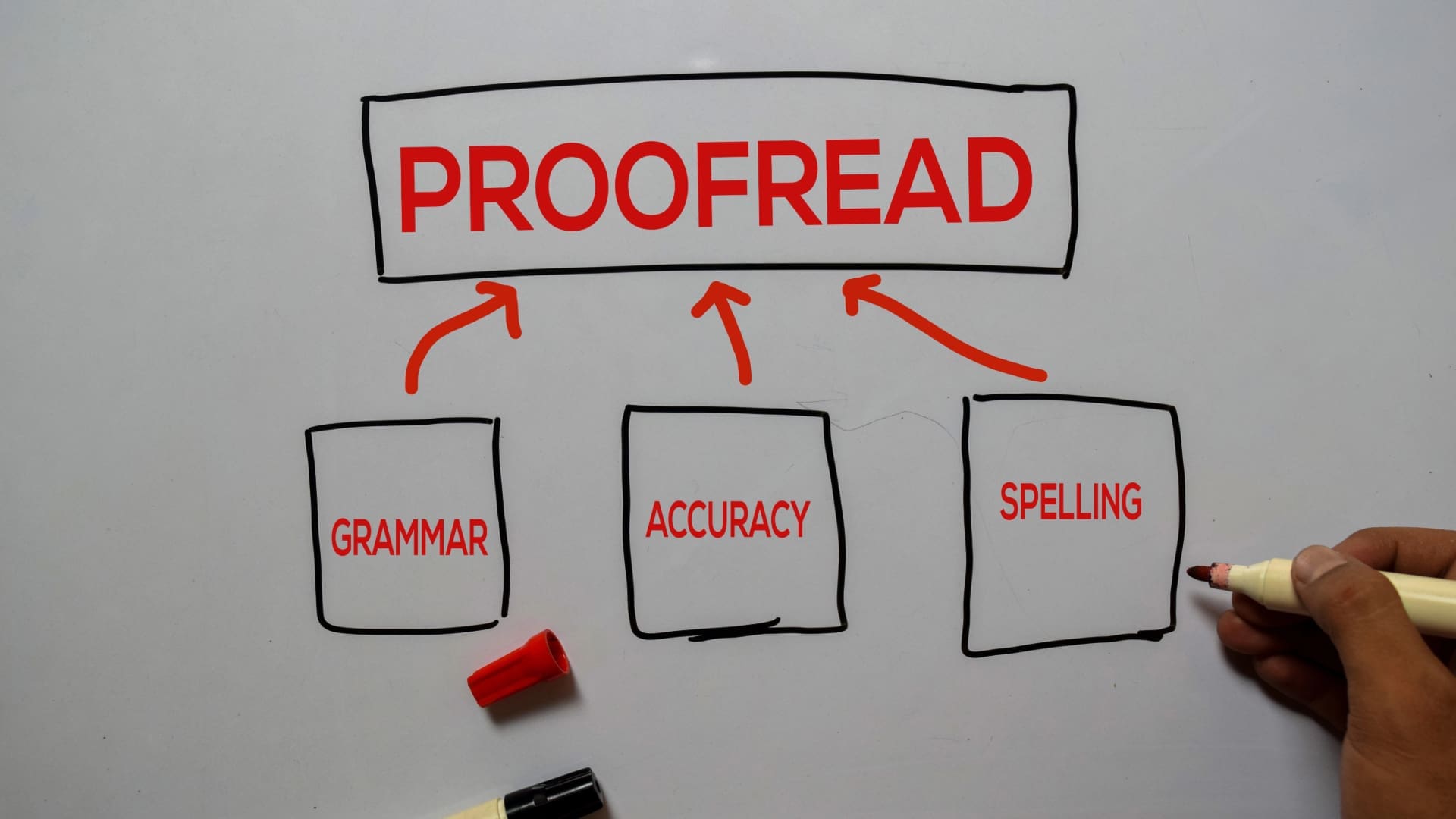
Ah, the dreaded proofreading stage—often overlooked but absolutely crucial. Think of it as the last pit stop before the finish line. Failing to proofread can lead to all sorts of unwanted surprises, like typos sneaking past your radar or pesky layout issues popping up in the final prints.
Nobody wants their project to fall flat just because of a missed spelling error or a misplaced image, right?
Option One
First things first: take the time to meticulously review your proofs.
Give your work a thorough once-over—you’re looking for any typos, awkward spacing, or design blunders that need correcting. And don’t just do a single pass; multiple reviews are your friend here. Each read-through could unveil something new.
Option Two
Why stop with just your eyes? Bring in a fresh set of peepers from your team. Having different perspectives helps catch those elusive mistakes that may have slipped by unnoticed. It’s a case of the more, the merrier when it comes to catching errors.
Option Three
Let’s face it, it’s 2024. Literally everyone in the professional world uses programs like Grammarly, right? Use these powerful tools to double-check for any oddities. They’re great for catching those tiny typos that tend to hide in plain sight.
Option Four
This is my personal favorite of the options, and it is one I use regularly while I write these articles.
Let your proof breathe for a bit. Take a step back and return with fresh eyes—sometimes, a short break can make all the difference, but I usually set an article aside for a full working day. I find that when I sleep on it, I stop seeing what I want it to say and start noticing my errors.
The same works for designs! Take a break and come back to it later for a final review.
With these few extra steps, you’ll sidestep those last-minute dramas and watch your prints come out flawless, just like you pictured them.

Misunderstanding Image Size and Print Size
Have you ever tried resizing an image only to find it looks blurred and not what you envisioned? You’re definitely not flying solo on that one.
It’s a common snag in printing—many people think they can stretch an image without sacrificing quality. Surprise twist: there’s a bit more to it. This is where understanding the relationship between resolution and print size comes in handy.
What is DPI?
Let’s break down the essentials. You first need to wrap your head around DPI or dots per inch. Think of it as the magic number that determines an image’s clarity when printed. A higher DPI equals sharper images, and trust me, your future self will thank you for going with at least 300 DPI for most print jobs.
Raster vs Vector
Staying sharp also means making the right choice between raster and vector images. Raster images are made up of pixels, so they risk looking grainy when blown up. In contrast, vector images use mathematical equations to maintain crispness no matter how you size them, making vectors your best pals for graphics that need resizing.
Long story short? Start with high-resolution images and know when to go vector. Just a smidge of knowledge here can keep your prints looking top-notch, avoiding that dreaded pixel party you never invited!
Additional Tips
When it comes to print projects, getting it right is like choosing the perfect outfit for a big event—you want it to fit perfectly and make a lasting impression!
The Right File Type
JPEGs might be great for quick online sharing, but PDFs or TIFFs are your go-to choices when it’s time to print. They handle all the detail and color your project deserves, making sure everything comes out looking sleek and professional.
Low-Resolution Images
Low-resolution images—it’s like trying to watch an HD movie on an old tube TV! Pixels are not your friend in the print world, so start with high-res images from the get-go to avoid that blurry clutter. Trust me, your work’s clarity is worth that extra step.
Mind the Bleed!
Oh, don’t forget to keep bleed areas in mind. If you didn’t factor in the bleed, an otherwise awesome design will sadly end up with surprise white borders around it.
Sigh.
You’ll want to extend your background or design elements slightly beyond the intended crop line. This way, even if things shift a bit during cutting, your prints will still look flawless, minus the unexpected borders.
These tips might seem small, but they pack a punch. Incorporate them into your process and watch your print projects go from “meh” to “marvelous”!
Ready to Print?
Now that we’ve covered the finicky yet crucial details of pre-printing, it’s clear that a little extra effort can make a world of difference. From watching out for those sneaky extra lines and never underestimating the value of a thorough proofread to mastering the art of image resolution and file formats, each step ensures your project dazzles rather than disappoints.
Remember, your print piece is an extension of your brand, so giving it the attention it deserves goes a long way toward leaving that lasting impression!
Call Fusion Marketing for All Your Printing Needs
With our team of experts at Fusion Marketing on your side, you can leave all your printing worries behind.
The devil is in the details, they say. And when it comes to print projects, this couldn’t be truer.
We understand the importance of every detail, and we take pride in delivering top-quality prints that meet and exceed your expectations. From business cards to large-scale banners, we’ve got you covered!
Ready to elevate your print game even further? Reach out to Fusion Marketing today. Let’s turn your vision into reality with expertise and flair.


