As a business owner, you want your interior signs to do more than just blend in with the décor—you want them to make a statement. After all, your signs are one of the first things customers notice when they walk in the door, so you want to ensure they convey the right message about your brand. Here are a few tips on how to create interior signs that pop.
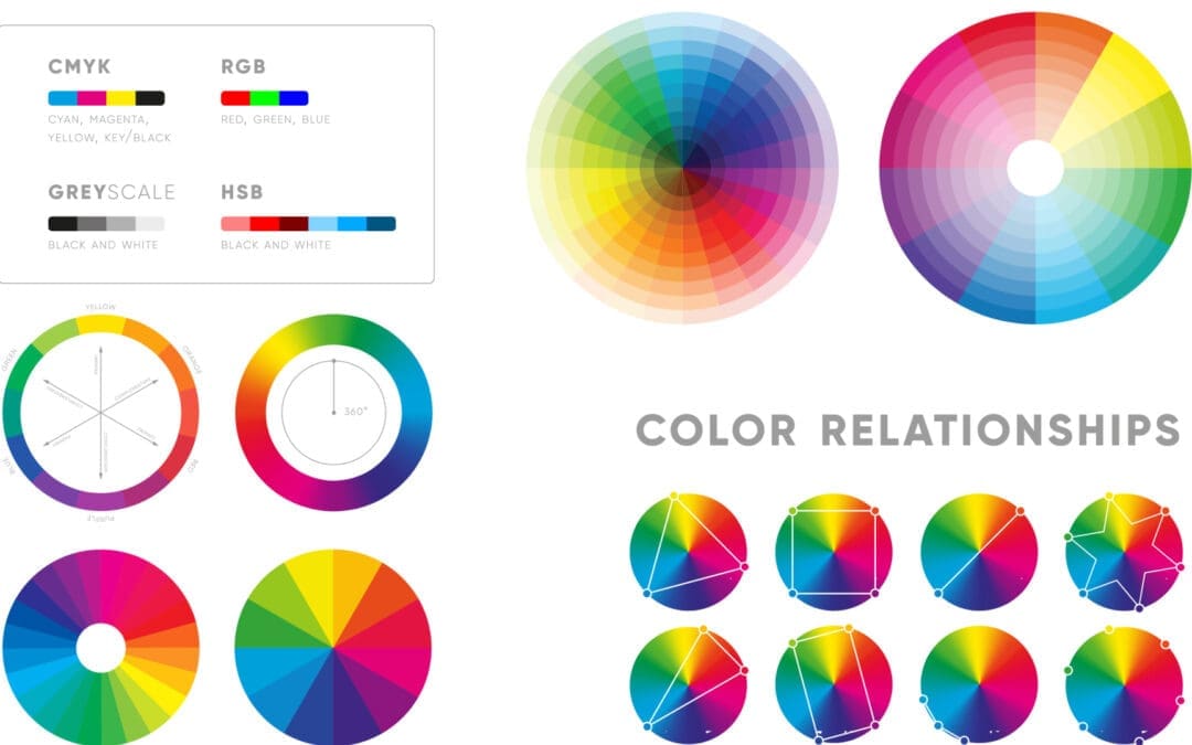
Use Colors That Complement Your Brand
Your brand colors should be front and center in your interior signage. Whether you use those colors for the background of your sign or as an accent, make sure they are prominent and easy to spot. Consider using a neutral background with colored accents if your brand colors are limited. This will make your sign stand out without being too loud.
Choose the Right Fonts
The font you use for interior signs says a lot about your brand. The fonts you use on your interior signs should be legible from a distance and easy to read. If you want to convey a feeling of sophistication, use a classic serif font. For a more modern look, go with a sans-serif font. And if you really want your sign to pop, use an eye-catching display font. Just make sure the font is readable from a distance—no one wants to have to get up close and squint to read what your sign says!
Use Positive Messaging
Your interior signs should be positive and welcoming—after all, you want customers to feel good when they’re in your store! Avoid using negative words or phrases; instead, focus on messaging that will make people smile. For example, instead of saying, “No food or drinks allowed,” try something like, “Please keep our store clean by enjoying your food and drinks at home.” Clients are more likely to remember positive messaging, so ensure your signs send the right message.
Go Big or Go Home
When it comes to interior signage, bigger is almost always better. People tend to scan their surroundings quickly and may miss more minor details. So if you really want your sign to stand out, go big! Make sure the sign is proportionate to the space it’s in—you don’t want a massive sign that will overwhelm your store.
Keep It Simple
When it comes to interior signage, less is definitely more. You don’t want customers to feel overwhelmed by too much information, so keep your signs short and sweet. Stick to one or two key messages per sign, and make sure those messages are easy to understand at a glance. Also, use fonts, colors, and other design elements that are easy to read and not too busy.
Your interior signs are crucial to your brand identity, so ensuring they’re sending the right message is essential. Use these tips to create signs that pop and reflect the positive, professional image you want your business to project.
Interior signage is an integral part of any business—but it’s not just about slapping up a few boring posters! With a bit of thought and creativity, you can create interior signs that really pop! By using colors that complement your brand, choosing the right fonts, and using positive messaging, you’ll be well on your way to designing signs that will leave a lasting impression on customers.
Fusion Marketing Creates High-Quality Interior Signs that Pop for Our Clients
If you’re looking for high-quality, professional interior signs for your business, look no further than Fusion Marketing. We specialize in creating custom signs that reflect your brand identity and help you achieve your marketing goals. Contact us today to learn more about our interior sign design services!


