Hey! It’s John and I’m going to toss out a few tips you need to take into consideration when flushing out the design process for your new logo. Designing a logo is more than just slapping together a few fonts and pictures. It’s an important part of establishing your business’ brand, and it should be approached with the same care and attention as any other marketing material. Unfortunately, many people don’t realize this and end up with a logo that doesn’t accurately reflect their company or its products. Anyway, let’s jump to it.
1. Keep it simple
A complex logo will be difficult to remember and might be overwhelming for customers. A logo is one of the first things potential customers will notice about your business, so it’s important to make a good impression. That doesn’t necessarily mean your logo needs to be complicated, however. In fact, sometimes the simplest designs are the most effective. A complex logo may be difficult to remember, and it could be overwhelming for customers. Instead, opt for a clean and straightforward design that clearly communicates what your business is all about. This will make it easier for customers to connect with your brand and build loyalty over time.
2. Use typography wisely
Select a typeface that is easy to read and complementary to your brand’s image. As any graphic designer knows, typography is an essential element of good design. The right typeface can add visual interest, convey a sense of personality, and set the tone for an entire piece. Conversely, the wrong typeface can make a design look cluttered, dated, or simply unappealing. When choosing a typeface for your next project, it’s important to select one that is easy to read and complementary to your brand’s image. A simple sans serif font may be perfect for a corporate newsletter, but it would be out of place on a vintage poster. Likewise, a playful script font could give a child’s birthday invitation fun and festive vibe, but it would be jarring if used on a hospital’s letterhead.
3. Be unique
Don’t mimic other logos; you want your brand to be memorable and stand out from the crowd. Logos are much more than just a name or a symbol; they are the face of a company or brand. As such, it is important that logos be unique and memorable. A logo that is too similar to another company’s logo will only serve to confusion and could result in lost business. On the other hand, a logo that is too abstract or complex will be difficult for customers to remember. The best logos strike a balance between being distinctive and easy to remember. They are often simple in design but make use of color or other visual elements to set them apart from the competition. Ultimately, your goal should be to create a logo that accurately represents your brand and that will be remembered by your target audience.
4. Use color strategically
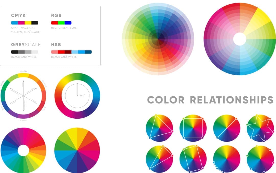
Colors can evoke certain emotions; choose those that reflect your brand’s personality. The colors you use in your branding can have a big impact on how consumers perceive your company. Certain colors are associated with different emotions, so it’s important to choose colors that reflect the personality of your brand. For example, if you want to convey a feeling of strength and stability, you might use darker colors like navy or burgundy. If you want to create a feeling of energy and excitement, you might use brighter colors like yellow or orange. And if you want to evoke a sense of calm and serenity, you might use softer colors like blue or green. By using color strategically, you can help create an emotional connection with consumers that will make them more likely to remember your brand and do business with you in the future.
- Knowing which colors to use in your branding and marketing can evoke the emotions you desire, making people more likely to buy from you.
- Colors can be used to create a certain feeling or mood in someone, and this can be very persuasive when trying to sell a product or service.
- Colors are everywhere, so using them effectively in your marketing can make a big impact with very little effort.
5. Avoid trends
A trendy logo may look dated quickly; opt for a more timeless design. When it comes to branding, following trends can be tempting. A trendy logo or color scheme may make your business seem cutting-edge and up-to-date. However, these trends often have a short lifespan, and your logo may quickly start to look dated. Instead of chasing the latest trends, try to create a logo that will stand the test of time. Look for timeless design elements that will still look good years from now. Avoid using trendy fonts or iconography; instead, opt for something more timeless and universal. By avoiding trends, you can create a logo that will remain relevant for years to come.
6. Consider negative space
The empty space around your logo can be just as important as the logo itself; use it wisely. The notion of negative space is often explored in the world of art; it’s the area around an object that helps to define its shape. In a similar way, the empty space around your logo can be just as important as the logo itself. By using negative space wisely, you can create a more balanced and visually appealing design. The key is to use negative space to add clarity and visual interest. For example, you might use white space to highlight a certain element of your logo or to create a sense of movement. As with any aspect of design, experimentation is key; don’t be afraid to try out different approaches to see what works best for your brand.
7. Simplify
When in doubt, less is more; a simple logo is often more effective than a busy one. In today’s world of ever-growing competition, businesses are always looking for ways to stand out from the crowd. When it comes to branding and marketing, many companies think that the more complicated and busy their logo is, the more attention it will grab. However, this is often not the case. A simple logo is often more effective than a busy one because it is easier for people to remember and recognize. In addition, a simple logo conveys a sense of professionalism and sophistication. It shows that the company is confident in its product or service and does not need to rely on gimmicks to sell it. So when you are designing your next logo, keep it simple – less really is more.
8. Get feedback
Ask others for their opinion on your logo design to get an outsider’s perspective. Creating a logo is an important task for any business. After all, your logo will be one of the first things that potential customers see. It’s important to make sure that your logo is professional and conveys the right message about your company. One way to get feedback on your logo design is to ask others for their opinion. Friends, family, and even strangers can provide valuable insights into how your logo appears to them. Make sure to ask people of different ages and backgrounds, as they may have different interpretations of your design. listen to their feedback and use it to refine your logo until you are happy with the results. With a little effort, you can create a logo that you can be proud of.
9. Hire a professional
A professional graphic designer can help you create a high-quality, impactful logo. Fusion Marketing is a full-service marketing agency that specializes in creating impactful, high-quality logos for businesses of all sizes. Our team of experienced professionals will work with you to understand your brand and create a logo that perfectly represents your company. With our help, you’ll be able to choose the right colors, fonts, and imagery to make sure your logo leaves a lasting impression. So if you’re looking to take your business to the next level, Fusion Marketing is the perfect partner to help you achieve your goals. Contact us today to learn more about our services.
10. Be prepared to revise
Don’t be afraid to make changes to your logo design; it may take several iterations to get it just right. It’s often said that the first impression is the last impression. This maxim is especially true when it comes to businesses and their logos. A well-designed logo is the face of a company, and it can have a lasting impact on its customers. However, designing a logo is not a one-time process. It takes time and effort to create a logo that truly represents a business. Be prepared to revise your design several times before you settle on the perfect logo. The key is to be open to change and willing to experiment. Try different fonts, colors, and shapes until you find a combination that feels right. And don’t be afraid to ask for feedback from others; they may see something that you missed. With perseverance, you’ll eventually create a logo that you and your customers will be proud of. Well, I hope you enjoyed reading this article on logo design. Remember that simplicity is key when it comes to logo design. A busy or convoluted logo will often be ineffective and can be difficult to remember and recognize. It’s important to get feedback from others to help refine your logo design, and it’s also a good idea to hire a professional graphic designer to help you create a high-quality logo. It’s okay to revise your logo design several times before you settle on the final design. With perseverance and a little help, you can create a logo that perfectly represents your business. Thanks for reading! -John


