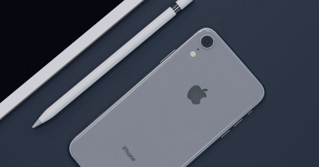
Personally, I love the Apple logo and everything they have done with the company branding. But before we jump in, let’s touch on some of the different things you should know about branding and the art of logo design. Only then will you understand why the Apple logo is a home run in my opinion.
Types of Logos
There are many different types of logos. Some common types are wordmarks, combination marks, pictorial marks, emblems, mascots, and abstract marks. Let’s take a look at a few of them a little closer.
Wordmark
A wordmark is just that, the company’s name in plain text. This is probably the most common logotype used today since it doesn’t require any special drawing skills to create and the visual association with the brand is very direct. Examples of this are Visa’s logo or Google.
Wordmarks can also be created by using a combination of upper and lower case letters to form the visual brand, just like how many high schools create their logos. If you are interested in learning more about creating your own word mark, there are books that have been written that cover just this topic.
Icons
Icon elements are very popular with larger brands and consumer goods. Let’s explore a few of the different styles.
![]()
Pictorial Mark
A pictorial mark is a logo composed of an image or illustration to represent the brand. Pictorial marks are on the more realistic end of the spectrum. Examples of pictorial marks are Domino’s mark and Twitter’s iconic bird.
Pictorial marks can also be composed with a combination of either word, symbol, or both to create a hybrid logo. Using the previous examples, you could combine Twitter’s bird with the name “Twitter” to create the Twitter wordmark, or you could combine the Domino’s mark to create their full logo.
Abstract Mark
An abstract mark is an image or illustration that does not represent anything in particular, but often represents the feelings associated with the brand. Examples of abstract marks are Google Drive and the Pepsi mark.
Abstract marks can also be combined with wordmarks to create hybrids just like we explored with pictorial marks.
Emblem
An emblem is similar to icons and pictorial marks, but an emblem often contains both words and pictures that together compose the visual brand of the entity. Examples of emblems include Starbucks and Harvard.

Mascot
A mascot usually has human characteristics combined with animals or other non-human entities to represent a brand, company, organization, etc. Examples of mascots include Pillsbury’s Doughboy and the M&M’s candy characters.
Mascots can also be combined with (you guessed it) wordmarks to create a hybrid logo. The famous Kool-Aid logo is an example of a hybrid logo composed of a mascot mark and wordmark.
Design Elements
When designing a logo, there are many important considerations. Some important elements to consider include color, typography, and shape. Apple’s logo is simple and uses a clean typeface and a minimalist shape. All of these things come together to create a logo that is efficiently designed.
Color
The Apple logo uses silver, black, and white which cover all possible placements. These three colors were chosen because they stand out against a majority of backgrounds and the white projected purity which is an important quality for his company.
Typography
The Apple logo uses a clean and modern typeface which gives it a sleek look, this is important because it’s the main element that identifies Apple.
Pomme (French for apple) is the original logo typeface designed by Gerard Unger back in 1976, it was used until 1998. At this time, Steve Jobs had returned to Apple and wanted to modernize Apple’s image with a brand new look. With the help of the company’s lead graphic designer, Rob Janoff, they created a new logo typeface from scratch. The first font of this family was a custom version of the Bitstream font called Apple Garamond. For a few years, it was used as an alternative to the official logo before being definitively replaced by the current logo in 1998.

Meaningful Attributes
When creating a logo, it’s important to consider what attributes will make it meaningful to customers. Apple’s logo is iconic and has many meaningful attributes, such as its association with innovation and simplicity.
Iconic Attributes
While all logos have some iconic attributes, Apple’s logo is so prominent that it has a reputation for being an icon. For example, when non-apple users see the apple logo they associate it with Apple as a company and this association can give them an idea of what to expect from Apple as a product. Additionally, the apple logo will always stand out making it easy for customers to identify Apple products, on the other hand, some companies end up with logos that are harder to identify (Kleenex is one example) which can be problematic for branding.
Simple Attributes
The important thing about brands like Apple is that they represent a simplicity mindset. The use of a simple typeface and shape in their logo, effectively communicates this mindset.
Innovation Attributes
Apple’s logo also has many innovative attributes that make it meaningful from an advertising perspective. For example, the bite in the apple design is often used to create associations with Apple products and new technology. Every time you see someone take a bite of an apple it triggers the associations that they may have with Apple. This is a great example of how companies can use logo design to connect with customers, engage them in their ads, and reinforce brand attributes.
Examples of Other Logos
There are many different logos out there. Some good examples include Nike and Google as they have simple, minimalistic designs as well.
Nike’s Brand
Another good example of effective and meaningful logo design is Nike’s swoosh icon. They’ve managed to integrate this swoosh icon as a meaningful brand element and it has become an iconic representation of Nike as a company.
The Google logo is another example of a great minimalistic design where they’ve managed to integrate their name into the symbol. The logo uses clean lines and simple colors which give it an aesthetic that is immediately pleasing to the eye.
The Apple logo is my favorite
Apple is a company that is well-known for its sleek and simple design. Their logo is no exception, as it uses a clean and modern typeface that gives it a sleek look. Additionally, the apple logo will always stand out making it easy for customers to identify Apple products. Some of the meaningful attributes associated with their logo include its association with innovation and simplicity. Iconic and simple attributes are also important, as they help reinforce the brand’s image. Lastly, it’s important to note that companies like Apple represent a simplicity mindset. The use of a simple typeface and shape in their logo effectively communicates this mindset.
If you are starting a company or are looking to refresh your logo, it’s important to consider what attributes will make it meaningful to customers. Check out our portfolio for some examples of our branding experience.


