Creating a professional logo for your urban farming operation should be simple, right? Unfortunately, effective agricultural branding requires more strategic thinking than most template solutions provide.
If you’re considering template solutions for your logo design, understand that your urban farming business faces unique branding challenges that generic options simply can’t address. The cost of poor agricultural branding extends far beyond the initial savings of choosing a template.
The Problem: Why Most Urban Farm Logos Miss the Mark
The Template Trap That Limits Agricultural Branding
Here’s what template services don’t tell you: countless agricultural brands end up looking identical because they’re all choosing from the same limited options.
When you choose from a library of pre-made designs, you may not be getting:
- Audience-specific design that speaks to both CSA members and restaurant owners
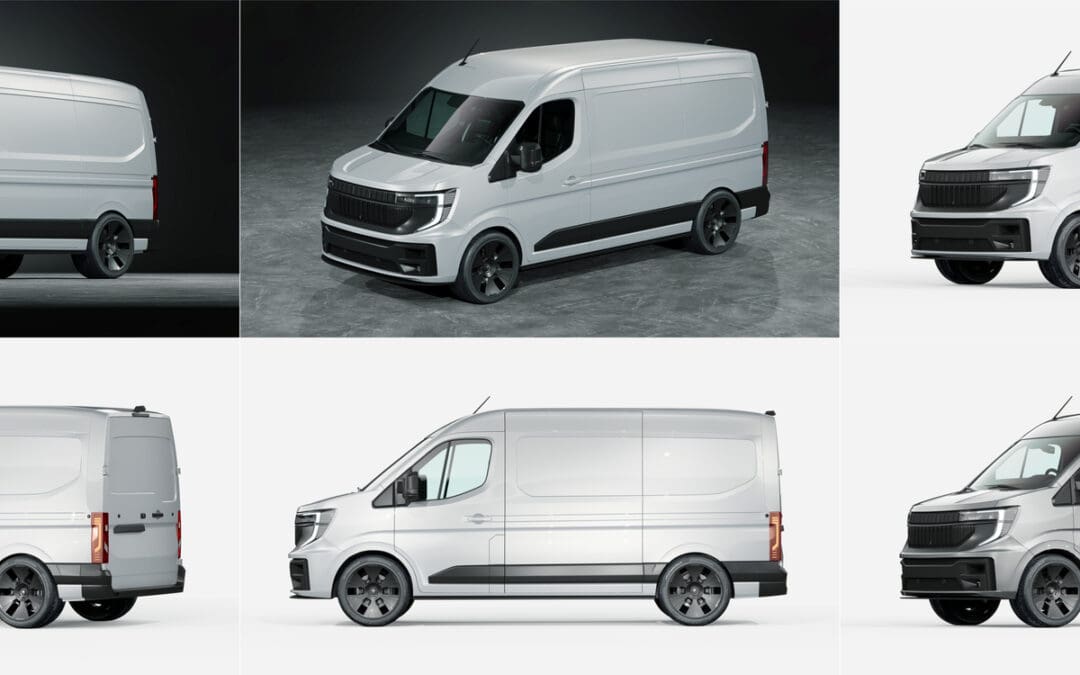
- Professional file formats that work on everything from business cards to delivery vans
- Strategic brand positioning that differentiates you from other local brands
- Scalable graphics that maintain quality at any size
Template sites promise “unlimited possibilities” and “customizable logo designs,” but what they deliver is the visual equivalent of choosing the same seeds as everyone else in your neighborhood, you’ll blend into the background instead of standing out.
The DIY Challenge: Technical Requirements vs. Time Investment
Running a successful urban farming operation requires focus on growing and distribution. Logo design involves technical complexities that take time away from your core business activities.
The reality is that creating professional agricultural branding requires more than good intentions and a free design app. You need to understand:
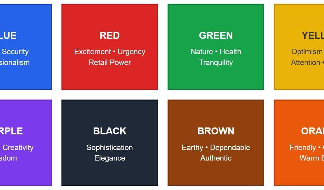
- Color psychology and how it affects customer perception
- Typography choices that work across all applications
- File format requirements for different uses
- Brand consistency across platforms
Don’t be that urban farm that uses the same template as multiple other businesses in your area. Visual consistency with competitors hurts your ability to stand out in local markets.
The Real Cost of Poor Logo Design
When your agricultural branding falls short, the impact ripples through every aspect of your business:
- Lost Premium Opportunities: High-end restaurants expect sophisticated branding that matches their standards. Poor logo design can eliminate you from consideration before they even taste your produce.
- Inconsistent Brand Presence: A design that works on social media might not translate well to vehicle graphics or signage, leading to unprofessional appearances across different platforms.
- Competitive Disadvantage: Professional-looking competitors capture premium clients while businesses with amateur branding struggle to break out of budget market segments.
Understanding Your Urban Farm’s Unique Brand Needs
Know Your Diverse Audience Segments
Your urban farming operation serves multiple distinct audiences, each with different expectations:
- CSA Program Members want approachable, community-focused branding that communicates trust and local connection. They’re looking for authenticity and transparency from their food sources.
- Restaurant Clients expect sophisticated design that matches their establishment’s quality standards. Your logo needs to convey premium quality and professional reliability.
- Farmers Market Customers want to see innovation balanced with agricultural authenticity. They’re drawn to the urban farming concept but still want to feel connected to traditional farming values.
- Educational Program Coordinators need professional branding they can confidently present to administrators and parents. Clean, credible design helps establish your program as a legitimate educational resource.
Technical Requirements That Actually Matter
Professional logo design isn’t just about making something that “looks nice.” Your agricultural branding needs to work everywhere:
- Scalability: From social media avatars to billboard advertisements
- File Formats: Vector files (AI, EPS, SVG) for scaling, PNG files with transparent backgrounds for digital use, high-resolution JPEG files for print
- Color Variations: Full color, one color, reversed, and black and white versions
- Cross-Platform Consistency: Looking professional whether it’s embroidered on aprons or printed on produce packaging
If someone sends you a logo in a Word document, run. Just run.
The Professional Logo Design Solution
Strategic Brand Development Process
Professional designers don’t just create pretty pictures, they’re brand strategists who understand your market. Here’s what you get with expert agricultural branding:
- Market Position Analysis: Understanding where you fit in your local landscape and how to differentiate from competitors
- Audience-Specific Design: Creating visual elements that resonate with your diverse customer segments without diluting your message
- Brand Story Integration: Translating what makes your urban farm unique into visual elements that communicate at first glance
- Future-Proofing: Designing for growth, whether you’re expanding into new markets or adding product lines
Technical Excellence That Protects Your Investment
Professional designers understand the technical requirements that DIY solutions miss:
- Proper File Formats: You’ll receive all the variations you need for every application, from social media to vehicle wraps
- Color Theory Application: Strategic color choices based on psychology, not just what “looks good”
- Typography Mastery: Font selections that work across all media and maintain readability at any size
- Brand System Development: Guidelines that ensure consistency as your business grows
Beyond Logo Design: Complete Brand Systems
A professional approach gives you more than just a logo, it provides a complete agricultural branding system:
- Color palette development with specific Pantone and RGB values
- Typography guidelines for headlines, body text, and special applications
- Usage examples showing your logo in real-world applications
- Brand guidelines documentation that anyone on your team can follow
Real-World Applications: Where Your Logo Design Investment Pays Off
Marketing Materials That Actually Work
Professional agricultural branding shines across all your marketing efforts:
- Digital Presence: Social media profiles, website headers, email signatures, and e-commerce platforms that build trust and recognition
- Print Materials: Business cards that don’t embarrass you at networking events, brochures that restaurants actually keep, and packaging that customers want to photograph
- Promotional Items: Branded merchandise that people actually want to use and display
Professional Presence That Opens Doors
Quality logo design impacts every professional interaction:
- Vehicle Graphics: Professional branding on delivery vehicles creates mobile advertising that attracts customers and builds recognition in your community
- Trade Shows and Markets: Displays that communicate professionalism and draw visitors to your booth from across the venue
- Partnership Materials: Presentations and proposals that position you as an equal partner, not the scrappy underdog
- Signage Solutions: From farmers market banners to facility signs that enhance your location’s professional appearance
Making the Right Investment Decision for Your Urban Farm
Understanding the ROI of Professional Agricultural Branding
Quality logo design pays for itself through:
- Premium Pricing Opportunities: Professional branding supports higher prices by communicating quality and expertise
- Client Trust Building: First impressions matter, especially when you’re asking people to trust you with their food
- Brand Recognition Benefits: Consistent, memorable branding makes it easier for customers to find and recommend you
- Long-Term Cost Efficiency: Done right the first time means no expensive rebrands when you’re ready to scale
Questions to Ask Potential Designers
When evaluating logo design services, ask:
- Do you have experience with agricultural branding or food businesses?
- Can you show examples of logos working across different applications?
- What file formats and variations will I receive?
- How do you ensure the design works for my specific audience segments?
- What’s included in terms of brand guidelines and usage documentation?
- Do you understand the technical requirements for both print and digital applications?
Red Flags to Avoid
Stay away from designers who:
- Only deliver JPG files or charge extra for proper formats
- Can’t explain their design choices beyond “it looks good”
- Use the same generic agricultural symbols for every farming client
- Don’t ask questions about your audience or business goals
- Promise unrealistic timelines for custom work
Investing in Professional Agricultural Branding for Long-Term Success
Your urban farming operation deserves branding that reflects the innovation and quality you bring to local food production. Professional logo design isn’t just about aesthetics, it’s about building a brand system that supports sustainable business growth.
Strategic agricultural branding helps urban farms:
- Position professionally with premium clients and restaurant partners
- Maintain consistency across all marketing materials and platforms
- Avoid costly rebrands as the business scales
- Compete effectively with larger agricultural operations
When local brands invest in quality logo design, they’re investing in their business’s future. Template solutions might save money initially, but professional branding pays dividends through improved client perception and business opportunities.
Ready to cultivate agricultural branding that grows with your business?
The urban farming industry continues expanding, and businesses with professional visual identity are better positioned to capture premium market opportunities.
At Fusion Marketing, we understand the unique challenges facing urban farming businesses. Our experience with local brands across industries helps us create agricultural branding that opens doors and drives growth.
Contact us today to discuss logo design solutions that work as hard as your urban farm.
