Do you often find yourself wondering if you have a bad logo? Maybe you’ve been told that you need logo inspiration from the logo design community.
You might be thinking, “I don’t even know what a good logo looks like vs. a bad logo. So how would I know if mine is a bad logo?”
Well, fret not because we have the answer for you!
Many people think that good logos are challenging to design and maintain a great modern logo. But, in reality, they can be easy as long as you follow the logo design tips to keep you from having a bad logo design.
What Makes a Good Logo
A good logo can be recognized by its “simplicity, memorability and timelessness.” To put it simply, a quality logo is easy to remember and is not dated or obsolete, and gives you brand recognition right off the bat. Here is an excellent example of good logos:
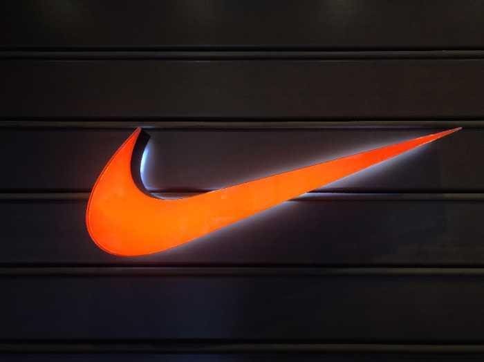
Take a look at the Nike and Adidas logo design. They both use similar elements (the name and a symbol). Still, their symbols give them an edge over the other, making them distinguishable from each other and easily recognizable.
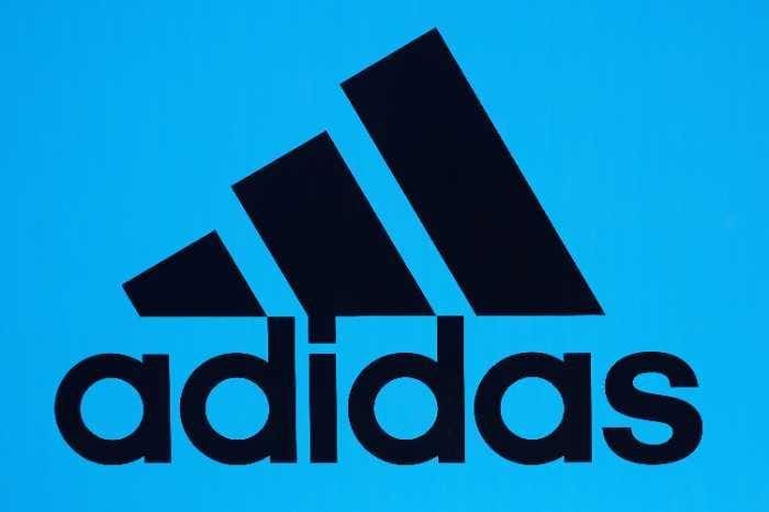
Why is that? To put it simply, Nike’s symbol looks like a checkmark while Adidas’ symbol looks like a mountain. So even though these are two of the same type of companies, you can easily differentiate one from the other; even if you see the logo without the company name, you’ll never look at either of these logos and think of different brands.
It’s the same with Pepsi and Coke. Again, two similar companies, but you’ll never confuse the Pepsi logo with the Coke logo.

Memorable logos should also have a straightforward and easy-to-read graphic design. Clarity means that there are no confusing elements or hidden messages in the graphic design of the logo; it is self-explanatory and doesn’t require any special knowledge or context to understand it and grasp your companies brand identity.
What Not to Do When Creating Your Company’s Logo
To help you identify what not to do when designing a logo and keep you from adopting a terrible logo design, we have compiled a list of the most common mistakes. Not only will these design practices help you to avoid making the same mistake yourself, but they will also show you why certain design elements are so essential.
Inevitable blunders are more common in new logo design than others. However, seeing them in action can help you avoid them in your work. We’ve put together a list of the most frequent mistakes of logo design blunders for your convenience. If you’ve already committed one of these corporate identity sins, don’t be alarmed; after reading this article, you’ll know how to fix the issue.
Don’t Use Too Many Colors
You should never use more than two colors for your logo design, three at the very most. The reason we say this is because if you’re designing a logo to show off your brand identity that can be printed in color or black and white, you want to make sure that your logo will still be easily recognizable in either scenario.
It’s best to stick with two or three basic colors that work well together. In addition, it would be best to consider making your logo monochrome to avoid clashing hues that will make your brand look unprofessional.
As far as colors for your logo design, you will want to avoid using gradients in your graphic design.
Don’t Use Gradient Colors
One of the biggest mistakes that a company can make when logo designers are creating a graphic design for a new logo is using gradients.
The problem with gradients is that they don’t always transfer well in printing. So depending on the medium, they may not always show up as you would like them to.
Whether it’s the way they fade into one another, or the gradient is too dark, and we can’t make out the design, gradients don’t work well in logos.
Avoid using gradients in your logo design, and you’ll be on the right track to having a great-looking logo that makes your brand identity stand out.
Using gradient colors is one of the most common mistakes that companies make when they are creating their new logo design. The best thing you can do if you’re dead set on a gradient is to design an original logo and a second, printer-friendly version of your logo.
Don’t Use Too Many Fonts
Using too many fonts can ruin the cohesion of your logo design. As far as how many fonts to use, we recommend using no more than two at max.
We recommend no more than two fonts for your logo design because too many fonts can result in your company’s logo looking unprofessional and indistinguishable. Would this look good on a shirt or poster to show off your corporate identity? Most likely not!
Don’t Use a Font that is Hard to Read
The font you select for your logo should be simple, sleek, and professional-looking. Stay away from fonts with strange curves or odd angles.
If you’re thinking of using more than one font simultaneously, make sure they are both easy to read or are put next to each other in a way that makes it easier for the eye.
Don’t Use Clip Art Logos
Suppose you’re thinking about making your logo design in PowerPoint or some other program with tons of clip art features. In that case, we strongly urge you to reconsider! Instead, opt for original logo art created by a graphic designer.
Suppose you are thinking of creating a logo design in PowerPoint or some other program with tons of clip art features. In that case, we strongly urge you to reconsider! Instead, opt for creative logos that have not been used before and won’t be used again.
Don’t Make Your Logo Designs Too Hard to Read
Your audience should be able to read your logo easily and quickly without any confusion. If it takes them a while to decipher the meaning of your logo, then you may have an issue with readability. On the other hand, if you can’t read a logo, it’s a bad logo.
For customers or clients to understand what you are trying to say with your logo design, they need to read it. And not just read it; they should be able to point it out wherever your logo appears and know what your company does just by seeing the logo design.
A prime example of a company with an easy-to-read logo is FedEx. The FedEx logo is easy to read and has clear design elements. The FedEx logo is composed of nothing more than a dynamic arrow and the letters that make up the company name. In today’s world, simple logos are much more elegant and practical.
Don’t Use Too Much Detail
Some logos are very complicated with lots of detail. This can make them appear cluttered and not aesthetically pleasing. A good rule to remember is this: if you can’t draw it, don’t include it in your logo design.
When designing a logo, keep simplicity in mind. The more complex the logo appears, the less of the logo your potential clients will remember. If your clients don’t remember you when they are looking for a business in your field, your logo sends the wrong message, and you don’t have a successful logo.
It’s never a good idea to design a logo that has too much going on. This will make it harder for customers and clients to remember your company down the line, which means they won’t come back as often, and you’ll miss out on potential business.
So what should you do? First, keep your logos simple and easy-to-read at all times! Your logo’s job is to embed itself into the minds of potential clients so that when they think of your field, they think of you above anyone else.
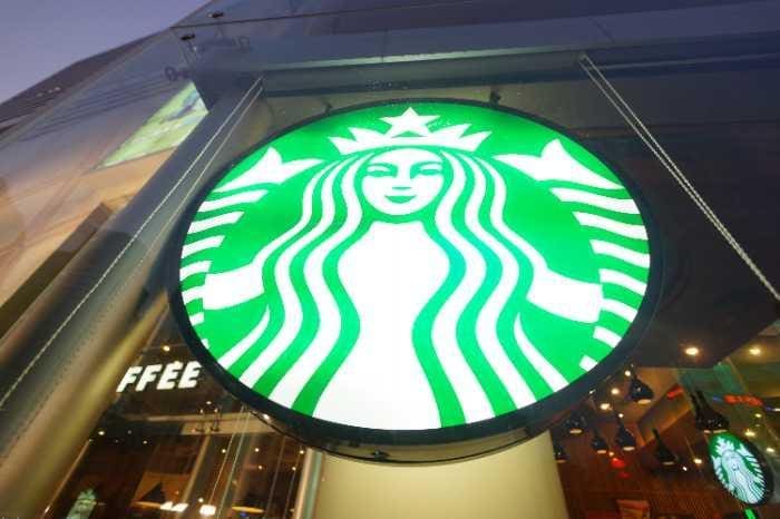
Think about the Starbucks logo. Starbucks Coffee has a distinctive brand identity. When a person thinks of coffee, they most likely think of Starbucks. This is because Starbucks has put in the time and effort to make its logo stand out, be easily remembered, and appear professional.
Don’t Give Your Logo a Complex Monogram
A monogram is a design made from two or more letter/symbol shapes, which are put together to make one larger shape.
Monograms are great for personalizing an object by incorporating initials or names of individuals into a single design. However, if you’re thinking about using a monogram for your logo, be aware that it can be hard to read unless you’re using the correct type of font.
Monograms are great for personalizing an object. For example, suppose your logo cleverly incorporates initials or names of individuals into a single design that is easy to see. In that case, it’s probably a great logo. However, if you’re thinking about using a monogram for your logo, remember that it will be hard to read unless you use the correct font.
Don’t Create a Logo that A Child Can’t Draw
A great advertising strategy is to create a logo that anyone can draw, even a child. If your logo is simple enough to be drawn by a child, you are sure to make an impression on any potential clients.
This goes back to the idea that you want your logo to stick in the clients’ minds, not confuse them. Therefore, a great logo will be easily remembered and transparent in its meaning. On the other hand, a bad logo would be something that has so much detail that a person’s attention would only be drawn to one aspect instead of the entire picture.
The best example of a logo that can be easily drawn is the Nike swoosh. The symbol is simple, it is easy to remember, and it is very successful.
If your potential clients can draw the logo, then they are more likely to remember it.
This is what you want! Your customers remembering your company because of a clever graphic design is exactly what you want from your logo design.
Poorly Designed Logos
Now that we have gone over what it takes to make cool logos, it’s also important to know what can happen if you don’t take the time to follow these design rules.
Any logo that makes it hard to figure out what the company does, its name, or where the company is located should be thrown out right away.
If you are having trouble designing your logo and ensuring it’s not a bad logo, ask a friend or family member what they think about it. Ask them if they can interpret the message from your logo and if they have any suggestions on how you could improve it. If the person doesn’t understand your logo or suggests changes, then chances are you should redesign your logo.
A bad logo is common in company logos that try to incorporate everything into one image. If you’re not careful, including too many elements can make it difficult for your logo to be distinctive and memorable.
You don’t want customers confusing your brand with that of another company or forgetting you entirely because there is too much getting in the way of their being able to remember what your logo looks like!
Kia

The Kia logo would be at the top of our list of bad logos. The reason for this is because it is complicated to figure out what the symbol says!
Remember, if you can’t make out what the logo says, you can’t make out what the company does. Also, if you can’t draw the logo from memory, chances are you won’t be able to remember the company either.
KIA has gone through several logo changes, but this is probably their worst logo. It’s hard to tell where the symbol ends and where the letters start, which makes it very difficult for people to understand what this brand is all about.
Jaguar
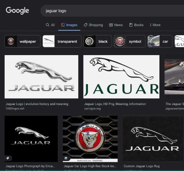
Another company on our list of bad logos is the Jaguar Logo. This logo is on our list because it’s too busy and confusing for the average consumer to figure out what the business does.
The first thing you think of when looking at this logo is speed, even if you know nothing about cars! Which might be exactly the intention of having such a bold image. But the point is that if people see this logo, they might not know what you do.
You want a logo that convinces new customers about what your business does without spending any extra money on advertising!
AT&T
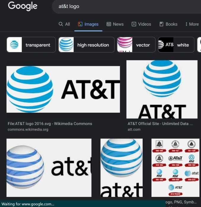
Next on our quick list of bad logos is AT&T. This logo is a great example of a company just throwing every element they could think of into it and hoping for the best!
This is on our list of worst logos because there are too many colors, lines, and shapes that make it hard to figure out what exactly you’re looking at.
Logos can make or break a business, and ensuring that your company’s logo stands out among the rest is extremely important.
NBA
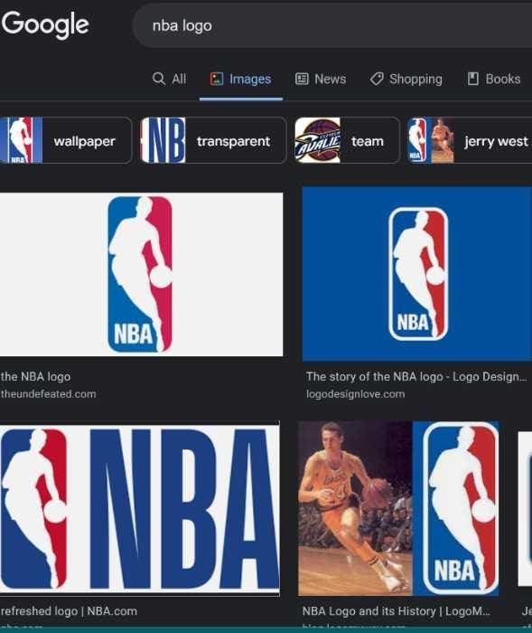
One more company that doesn’t impress us with its bad logo is the NBA logo. This is another great example of just putting everything in the logo and hoping for the best.
This one makes our list because it’s not very memorable or unique to their specific brand. But, of course, you could say that about any sports team logo. Still, when you’re paying for a unique idea for your business, you don’t want to go with something that you can find on 100 other websites.
Logos are so important because they help people identify your business and remember your brand! However, suppose your logo is just like every other company’s. In that case, that takes away from the uniqueness of your company and how memorable it will be for potential customers.
Peavey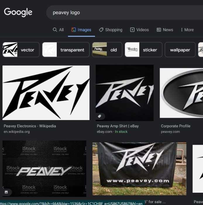
Finally, our last company on our list of bad logos is Peavey. We feel that this logo makes it onto our list because they wanted to include a great image of a guitar and a key component of their business in one design.
However, what they ended up with looks fake, and hard to tell what it represents.
When you’re creating a logo, the point is to make sure that it’s easy to figure out quickly and looks professional. If your company’s logo isn’t looking like it belongs in an ad or on a website for other businesses, then chances are it seems fake and unprofessional – which might prevent people from taking you seriously as a potential business partner.
Now that you’ve read more about bad logos and why they are harmful to the success of your business, hopefully, this has given you some insight on what to look for in creating your own company’s logo! If you want to learn more ways to
Why Choose Fusion Marketing
Fusion Marketing is a graphic design company that has been in the industry for over 13 years. Fusion Marketing strives to provide clients with incredible customer service and top-of-the-line designs. They work with each client thoroughly to find out what they are looking for in their logo or printed products, and then they come up with different ideas to give them a few options of what they can do. The best part about working with Fusion Marketing is that they offer competitive pricing that is affordable for the average person starting a business.
The company’s slogan is “Graphic Design Done Right.” The reason for this is because Fusion Marketing takes a lot of pride in being able to work with each client to give them exactly what they want, create a high-quality design that will look great once it has been printed on materials, and do all of this while still offering affordable pricing.
In addition to working with companies who are looking for a logo, Fusion also offers help creating social media graphics, brochures, business cards, posters, billboards, or banner ads for other businesses. This can be extremely helpful if you have someone else creating these designs rather than learning how yourself.
If you’re thinking about starting a new business, or even if you’re thinking about updating your current logo or a complete logo change but aren’t sure where to begin, Fusion Marketing can help you get started.
Call us today to get a free quote! You can reach us by phone at (586) 610-0055 or visit our website for more information.