See how simple menu cards can boost your restaurant’s appeal: Ferlitos partnered with Fusion Marketing to create durable, glossy menu cards that not only tempt taste buds but also complement their ambiance.
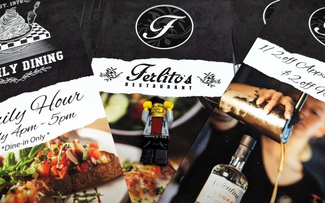
See how simple menu cards can boost your restaurant’s appeal: Ferlitos partnered with Fusion Marketing to create durable, glossy menu cards that not only tempt taste buds but also complement their ambiance.
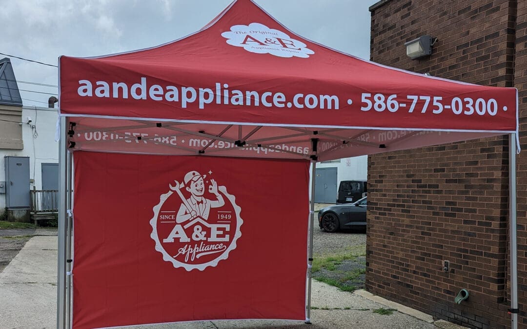
Elevating A&E Appliance: Captivating Event Presence with a Custom Branded Tent
A&E Appliance needed a standout solution for event presence. We designed a custom 10′ x 10′ dye sublimation tent, blending lightweight durability with striking visuals. The result is a visually engaging tent that boosts AE Appliance’s visibility and supports their business growth at events.
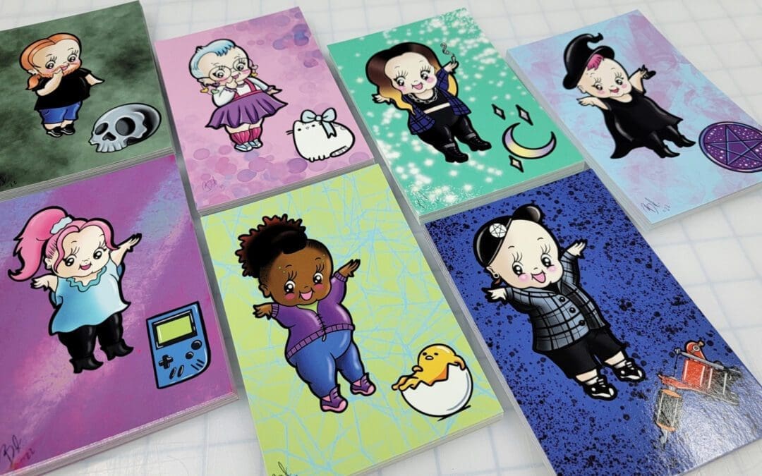
Unveiled: How a Tattoo Artist Transformed Unique Kewpie Art into Unforgettable Gifts in Record Time!

Unlock the Secret to Marketing Success: Discover How Our Innovative Cards Are Changing the Game for Our Clients!
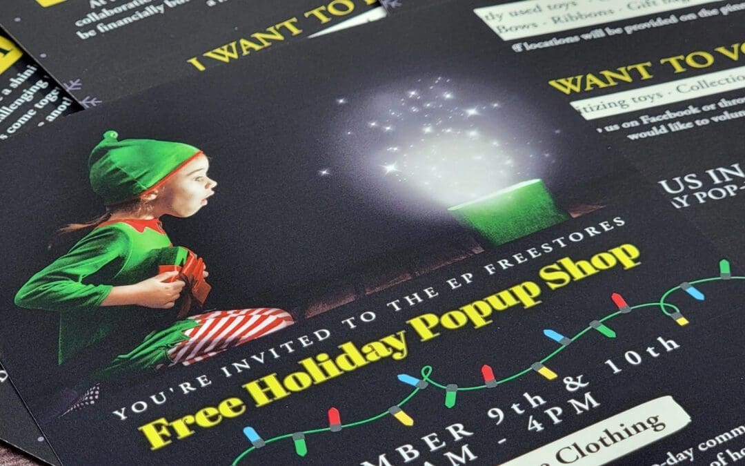
Find out how Fusion Marketing helped spread the holiday spirit in Eastpointe with their captivating flyer design and community partnership!

Discover how Fusion Marketing revolutionized Lights Out’s operations and image with a custom client estimate form. See how our innovative approach solved file compatibility issues and provided a versatile solution for the company!

Need Multipurpose Corporate Cards? See How Urban Seed Promotes Their Community Garden with These Vibrant Cards!”
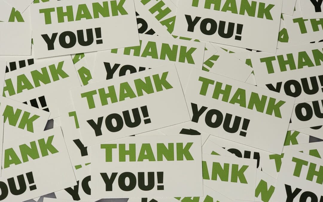
Experience the Power of Gratitude! How M&B Landscaping Transformed Client Relationships with Unique Thank-You Cards. Learn how a family-owned business enhanced loyalty and appreciation through a simple yet elegant design. Find out the surprising outcomes and the key to creating engaging client-oriented materials. Don’t miss this inspiring success story!

The Fusion team collaborated with A&E Appliance Repair to design visually-striking custom fridge magnets that aligned with the client’s brand identity while also serving as marketing tools for customers. Through expert graphic design and high-quality production, we exceeded the client’s expectations with a promotional item that bolsters brand visibility. See how Fusion excels in understanding a client’s needs and delivering creative solutions that make a lasting impact.
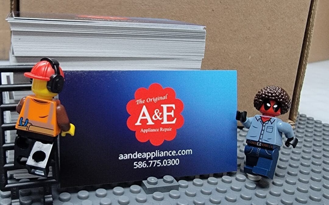
We designed vibrant and functional appointment cards for A&E Appliance Repair that reinforce their brand with each visit. Technicians can easily jot down notes on the writable surface, while the double-sided, full-color design features A&E’s branding elements. The engaging design and practicality delighted the client and customers and helped maintain clear communication.
After 20+ years of failing forward and figuring shit out for hundreds of small businesses across the nation -I'm sharing all the things that I wish someone would have told me along the way.
I'm calling it The Human Element, because that's what's missing from most marketing these days.
After 20+ years of failing forward and figuring shit out for hundreds of small businesses across the nation -I'm sharing all the things that I wish someone would have told me along the way.
I'm calling it The Human Element, because that's what's missing from most marketing these days.