First impressions matter, and when it comes to your office space, you want to make sure that you are putting your best foot forward. One way to do that is to invest in high-quality interior signage. But before you go ahead and order signs for your office, here are six dos and don’ts that you should keep in mind.
Do: Keep It Professional
Your office space is a reflection of your business, so you want to ensure that your signs are professional and in line with the image you are trying to project. Avoid using cutesy fonts or graphics; opt for something clean and sophisticated. This will give your office an air of authority and competence, leading your clients and customers to take you more seriously.
Don’t: Forget About the Details
The details matter when it comes to interior sign design, so don’t forget about things like choosing the right font size or ensuring that your graphics are high-resolution. Small details can make a big difference in the overall look of your signs! Also, be aware of the information your interior signs are conveying; for instance, ensure that your lobby signs are up-to-date and accurate and that your wayfinding signs are clear and easy to follow.
Do: Use Negative Space
Negative space is the blank space around the subject of an image. Negative space can create a sense of balance and calmness when used correctly. When designing signs for your office, be sure to use negative space wisely; too much or too little can throw off the overall look of the sign. When in doubt, less is more.
Don’t: Be Afraid of Color
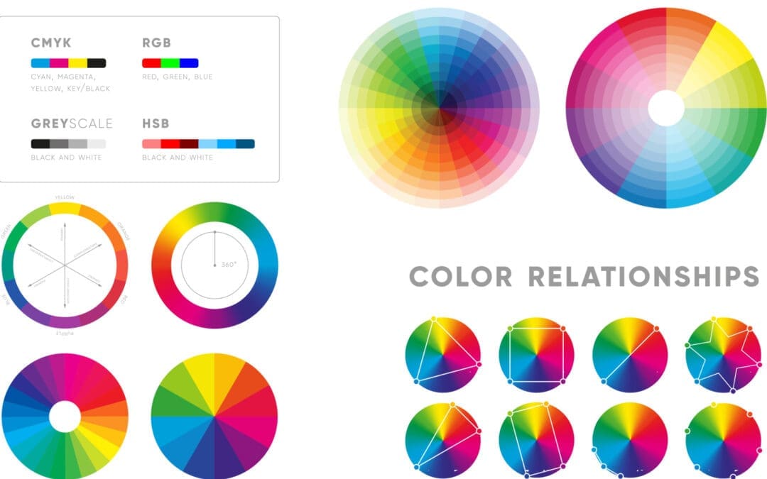
Color can be a great way to make your signs pop, but be careful not to go overboard. Choose one or two colors that complement each other and stick with those throughout the design. Too many colors will make your sign look busy and cluttered, but the right colors can really make your sign stand out. Also, make sure the colors you use for interior signs match your company’s branding so that your signs are cohesive with the rest of your marketing materials.

Inspirational quote on picture frame over a dirty brick wall. THERE WILL BE OBSTACLES. THERE WILL BE DOUBTERS. THERE WILL BE MISTAKES. BUT WITH HARD WORK, THERE ARE NO LIMITS.
Do: Keep It Simple
When it comes to signage design, less is often more. A well-designed sign should be easy to read and understand at a glance. Avoid cramming too much information onto one sign; instead, focus on making each sign clear and concise, with the pertinent information displayed in an easily digestible format.
Don’t: Overlook the Placement
Placement is vital when it comes to interior signage. You want to ensure that your signs are placed in strategic locations, so they are highly visible and easy to find. Also, be mindful of the height at which you hang your signs; you don’t want them to be too low that people have to strain their necks to see them, but you also don’t want them to be so high up that they go unnoticed. The sweet spot is usually around eye level.
By following these simple dos and don’ts, you can be sure that your interior signs will make a positive impression on everyone who sees them. Investing in high-quality signs is essential in creating a professional and inviting office space, so don’t skimp on the details!
Designing interior signs for your office space doesn’t have to be daunting; just keep these dos and don’ts in mind to be on your way to creating high-quality signs that reflect positively on your business.
Do you need help designing interior signs for your office space? Contact the experts at Fusion Marketing today! We are a full-service printing, marketing, advertising, and graphic design agency. We would be happy to help you with your sign needs. We specialize in creating custom signs that perfectly reflect your brand and help you achieve your marketing goals. Visit us online or give us a call at (586)610-0055 to get started!


