Podcasts are a great way to reach your target audience, whether through an interview or just talking about the latest news. Podcast logos have become more and more popular over the past few years to brand these online broadcasts. A good podcast logo design can go a long way in getting people interested in what you’re saying, but it’s not always easy to decide on one that suits your style and needs. If you want some tips for designing your podcast logo, keep reading!
How do I create a podcast logo?
Your podcast logo should be made up of two main parts: the title and a picture. First, think about your podcast’s called, then pick an image that matches your overall brand or style. For example, if you’re launching a new cooking show, consider using food as part of the design so it feels inviting to listeners who want to indulge in delicious recipes.
If you can’t make your title into a picture, try using an icon instead-you’ll find that this is especially good for podcasts with more abstract names like “The Daily Podcast.” You could also use the logo of another popular podcast as inspiration and do something similar to what they’ve done: changing colors here and there, mirroring the style, etc.
How much does a podcast logo cost?
A podcast logo can cost anywhere from $99 to over $500, depending on the design and complexity. In addition, some designers charge extra for revisions or customization-for example, if you want a designer who has expertise in podcast logos. Still, their prices are higher than your budget (e.g., an expert will typically charge more because they have better skills), you may want to negotiate for the cost of revisions or customization.
How do I design a logo idea?
The best way to design a logo is through sketching. It’s difficult for people to visualize what something will look like from just an idea or rough drawing. Still, the designer can work out how anything should be positioned with sketches – even if it doesn’t start off looking that good! Once you have the layout sketched and know which details to include or not, it’s a lot easier to create the final design.
What should I sketch?
The best way to design a logo is through sketches of the layout. You can use rough shapes and lines for details and only add what’s necessary, so it doesn’t take too long or cost as much.
You’ll also need to think about how you want people who see your company logo to feel. It’s a good idea to sketch some examples of different feelings and emotions that you want the design to convey, so when it comes time for the designer to work on your logo, they’ll know what emotional response you’re looking for.
What size should a podcast logo be?
The best size for a podcast logo is 300×300 pixels. The ideal file format to use is JPEG or PNG, but GIF may be acceptable with the appropriate design considerations. All logos should be designed as vector art to begin with.
Expert Tip: If you’re designing your podcast logo, you must know what platforms you will be adding your podcast to. This will give you an idea of the different types of layouts your logo will need to go on.
you should use the podcast logo for all of the following:
- social media accounts
- podcast site or blog
- free hosting sites (i.e., Soundcloud, Libsyn)
- email signature line
Where can I design a logo?
Creating a podcast logo is an important step for your show and business. A good logo can help build visibility on iTunes, Google Play Music, or Stitcher and make it easy to find you in the app stores! You can use paid or free logo-design services to design a podcast logo (i.e., Logaster, Canva). Alternatively, you could try using Photoshop or Illustrator yourself.
How do you design a logo?
Designing a podcast logo can be as easy or complicated as you want it to be. There are many free tools out there for you to use (i.e., Canva). You could also design your own from scratch using Photoshop or Illustrator, but that will take more time and experience with those programs.
Do logo designers get royalties?
Logo designers do not usually get royalties. So remember, if you are designing your own podcast logo from scratch using Photoshop or Illustrator, please don’t use any images without permission!
What do I need to start a podcast?
To start your own podcast, you need a good idea for the show’s content and some recording equipment. You will also want to invest in hosting services (i.e., Libsyn) with an affordable monthly fee. They serve as middlemen between your website and iTunes or Google Play Podcasts so that they can find it more easily.
For the first few episodes of a show, you might want to create audio-only podcasts and use YouTube for video content. You can also explore other options, such as Anchor or Podcast Generator, if your budget is tight.
What is a good logo?
A good logo is one that effectively represents the brand in a way that’s simple and memorable. While there are no complex rules for what makes a successful design, I recommend that you steer clear of logos that have too many colors or too much detail.
I also advise clients to opt for more abstract designs rather than pictures or text because this conveys the essence of a business more effectively.
What are some logo design tips?
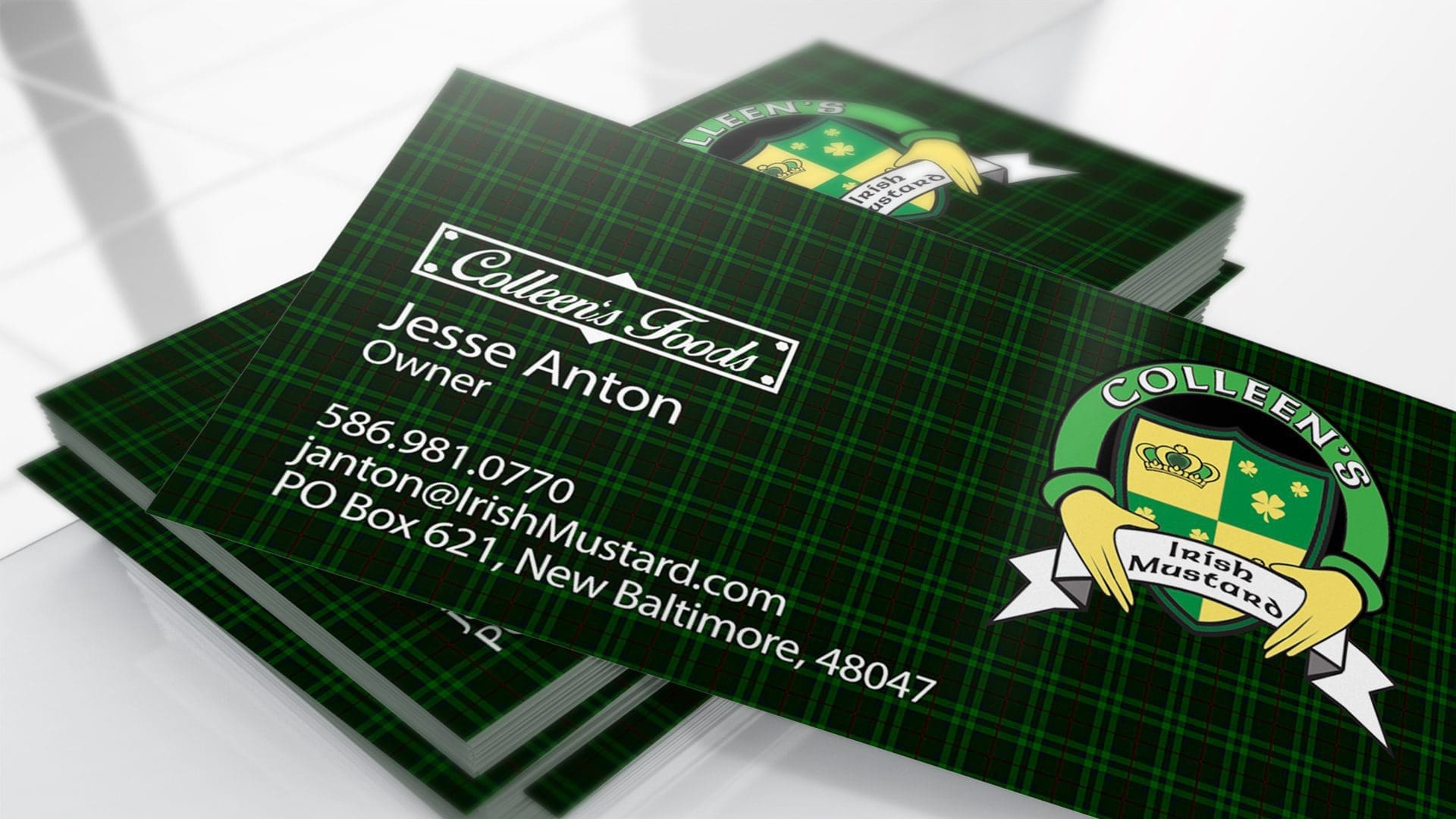
Sketches make it easier to experiment with different ideas and figure out what works best without investing too much time or money on something that doesn’t work. It’s also essential to establish a clear set of principles for your brand so you know what you’re aiming for.
What is a logo design?
A logo is a graphic representation of the brand and conveys its essence. It can be as simple or complex as you like, but it’s important not to use too many colors, shapes, or words because this makes it difficult for people to identify what your business does at first glance.
You should also try out different ideas with friends or hire a company or individual who knows the industry.
What are the golden rules of logo design?
- Be original
- Keep it simple and memorable
- Make sure the logo is scalable
- Use a font that’s easy to read at any size or color
- Avoid using too many colors, shapes, or lines
How do you make a catchy logo?
Try out different ideas until you find one that speaks to your brand. You can also get inspiration from other logos and use a similar font, color scheme, or design principle like the balance between symmetry and asymmetry in the Pepsi logo. Finally, find something unique about your company’s name to make it memorable; for example, Nike is the Greek goddess of victory.
Pepsi’s logo is a stylized version of the Pepsi lettering, with its familiar red and white color scheme – but if you look closely enough at it, there are tiny differences. For example, the lowercase “e” in Pepsi is slightly longer than the “b,” and there’s a line on the left side of the lettering to indicate that this version of the logo is not symmetrical.
Is it OK to use clipart in a logo design?
It’s not a good idea to use clip art in logo design. Clipart is typically used for decoration or when you need an icon that you can’t create any other way – but it will never work as part of the entire identity system like your business card and letterhead. Besides, there are tons of copyright issues using someone else’s work in your design, and you’ll have to use the same clip art for every application.
To avoid these problems and maximize your logo design value, we recommend you seek out a professional graphic artist. There are plenty of talented designers who can produce original artwork for logos that will authentically reflect your business’s personality without violating copyright laws.
What is a modern logo design?
A logo is a powerful visual representation of your business. It has the power to convey how you want customers or prospects to perceive your company and product. A modern logo design is clean, bold, simple, distinctive, and memorable without being too busy or complicated for viewers’ eyes.
- A modern logo design provides a memorable representation of your company
- It should be easy to read at any size or on any background color
- The font style should be clear and legible from a distance
- A modern logo design can use bold colors or subtle gradients for visual interest
How long does it take to design a logo?
The time it takes to design a logo depends on the complexity of your company’s needs. A graphic designer can design some logos in as little as one day. In contrast, others may take several weeks, depending on if you’re just looking for a basic shape or something more complicated like an illustration with color gradients and textures.
The design process starts with a general discussion of your company and how you want it to be represented in the logo. From there, we’ll narrow down your options by creating sketches that fit your needs. Once we know where the logo will start, I can give you a timeline for completion based on complexity.
Who owns a logo design?
If you’re looking for a logo design, the most important thing to decide is who owns it. You can either have us retain all copyright and ownership of your project or transfer those rights over to you– whichever one works best for you. That way, if anything changes down the line with what we originally agreed on, both parties are aware of the change.
Designing a logo is an ongoing process. It can take up to three rounds of revisions before we are both satisfied with the final product. Everything, except for the final deliverables, remains the designer’s property in most cases. It is always best to have this notated in your contract.
What is a bad logo?
A bad logo is anything that does not represent the company in any way. This can be a design that someone just threw together for the sake of having one or something with too much detail and subtlety to it when you want more pop-out characteristics.
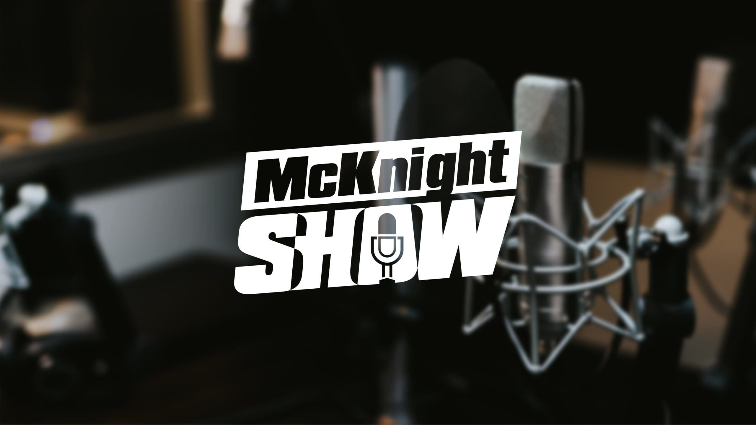
In short: A good logo needs to communicate what your business does—and a bad logo does the opposite.
How many colors should a logo have?
The answer to this is largely dependent on the business. It would be best if your logo were limited to two colors (most likely black and white) if you are selling clothes. On the other hand, a company that sells cars or plane tickets may want its logo in multiple colors to use for many different marketing strategies. The choice is up to you as the business owner, but it’s always good to get feedback from others before making this decision.
As with any design project, there are no hard and fast “rules.” What works best for me is to decide on one or two colors that I will use in my logo (usually black & white).
How do I name my brand?
Naming your podcast brand is a huge decision and will need to be done in parallel while choosing the color scheme.
If you’re a small business, the name of your company is likely also your brand. To create an identity that’s unique to only yourself and not simply “company X,” consider adding your first or last name (or both) into the branding process. This will help people remember who you are.
Is Photoshop good for logo design?
No. Photoshop is not good for logo design. Photoshop is used for manipulating photos. Instead, you should design a logo in a vector art program like Adobe Illustrator.
I do not want to use a vector art program. Can I make a logo in Word?
The answer is no. You should never use Word to design a logo. It’s best for making flyers and other simple designs like magazine ads, but it won’t give the same professional quality as Adobe Illustrator or Sketch (Mac).
A better option for a logo design for those who do not want to use a vector art program is Logo Maker. Logo maker offers some of the same features as Adobe Illustrator and Sketch, but it’s easier to learn and less expensive.
What makes a good logo 2021?
A good logo should be recognizable and simple. It shouldn’t look like a child drew it with crayons on the back of a napkin. A professional designer will know what makes for a good logo design that is aesthetically pleasing and versatile enough to work in many different contexts, from business cards to social media icons. A good logo is the same as a good design from 1990. It should be timeless and avoid trends.
What are the two types of logos?
The two types of logos are a logotype or wordmark logo and a symbol. A logotype is made up entirely of text, like the Nike Swoosh and Starbucks siren with their intertwined N’s. With this type of logo, it can be difficult to maintain consistency in its design when scaled down for smaller uses. Symbols often consist of a logo mark created from combining letters or shapes. The McDonald Golden Arches is an example of this type of symbol, which can make the company’s name and in many different contexts.
What should be included in a logo?
A good logo will have the business name, a tagline or slogan, and an image representing its brand. The text should be clear and readable at all sizes. Logos with more than one layer are typically more difficult to read because they can’t scale down well in size without compromising their legibility. Also, a single-color logo can be more difficult to balance than a logo with multiple colors.
How do I choose a good business logo?
Consider who your audience is and what you want them to think of when they see the logo. Is it an equity firm? A restaurant? The typeface should reflect this – if not, people will wonder what kind of company has that as their logo. You’ll also need a memorable design or symbol for easy recognition.
How do you make a unique logo?
1. Find a font that you like
The first step to creating a unique, eye-catching logo is finding the right font. Google Fonts are an excellent resource for free fonts that you can use in any project. Next, download and install the desired font on your computer if you don’t already have it installed. Once you’ve found a great font for your needs, be sure to set the font as your default typeface before continuing to the next step.
2. Pick a color scheme
Next, pick a color scheme for your logo and stick with it throughout all of its incarnations. This will help make sure that everything matches stylistically. It’s also important to find a specific mood or emotion you want the design to convey, whether energetic, playful, or professional. The mood will help guide you in finding the right colors and fonts to use for your logo.
3. Draw something to represent your brand, or use an existing image
Once you’ve figured out what feels right for your design, it’s time to pick a shape! Choose one that complements all of the other elements well – this is usually something geometric or abstract like circles, triangles, or squares.
4. Write down what you want the logo to say about your company and its values
For example, if you’re a podcast about cooking and gardening called “The Gourmand Gardener,” then your logo might include a green leaf representing plants, an apple for fruit or the harvest, sunflowers to represent how food can fuel us during all seasons of life. Or maybe it’s just two fingers holding up a microphone!
How do you create an effective logo?
There are three things to keep in mind when creating an effective logo: color, shape, and size. A logo’s colors should be vibrant against a white background or muted on a colored one – either way, they should pick up the brand’s personality. A company’s logo is often designed with their audience in mind, so for example, if you’re a podcast for kids, the logo might include an outline of someone holding up their hand to represent high-fives. The shape and size should be appropriate for where it’s used – a big rectangle would work well on a poster or billboard but not in email marketing, whereas small text is perfect when woven into the design of whatever you’re sending.
There are other elements to consider when designing a logo, like the font used and spacing between letters, but those details often depend on what you’re using the logo for or who your audience is. The important thing is that you create something unique that matches your brand’s personality, so people know who you are when they see your logo.
Can I make a logo on my phone?
Designing a logo on your phone may seem like an easy way to quickly put something together, but it’s not advisable. When you’re designing with the shapes and typefaces that come standard on the iPhone or Android device, they can often be limited in their ability to convey what you want – for example, if you’ve chosen a really complicated font, the shapes on your phone might not be able to make it work.
Designing a logo with just one shape or combining two typefaces that aren’t compatible can also create an unclear impression of what you’re trying to say and may give people the wrong idea about who you are as a company.
How do I make a company logo?
A company logo is a logo that represents your business. Large corporations often have their logos on everything they do, including t-shirts and uniforms for employees.
It’s important to create a professional brand identity with your logo by using it consistently across all media platforms – this includes social media sites like Facebook or Twitter, as well print materials such as business cards.
A good way to create your logo is by using a professionally designed template and modify it with colors, shapes, or fonts that represent your company’s values for free on sites like Logomakr, DesignMantic, or Logojoy. Remember that you will need to buy exclusive rights to the design if it is *your* logo. This usually ranges from a few hundred dollars to a few thousand depending on the design and the designer’s skills.
You can also hire a professional graphic designer to help you design an original logo for your company.
The cost of hiring a graphic designer to create a logo can range from $100-$2500+ depending on your business’s complexity and size, how much time you want them to spend designing it, and their level of expertise in design. For example- the average rate for graphic designers at Ad Agency is around $100. At Fusion, we charge $141, respectively.
What should you not do with a logo?
In a logo, you should not use clip art or stock images. It will look unprofessional and sloppy. You can also get into legal trouble with stock elements.
A good rule of thumb is to avoid overly popular fonts, like Comic Sans, because it may be hard for people to read the words in your company name. You also don’t want to design something too busy with many different colors and patterns. It might be hard for people to identify your company, product, or service because everything is mixed up.
You also want to avoid copying logos from other companies that are better known than you are, as it will make your design look unoriginal and lame. You should not use text in the logo unless there’s an excellent reason for it.
Finally, you want to avoid using pictures in the logo because they might not always show up correctly on different devices and browsers.
What mistakes should you avoid while designing your logo?
As I mentioned a moment ago;
- Please do not use text in your logo unless there’s a perfect reason for it.
- Avoid copying logos from other companies that are better known than you are, as it will make your design look unoriginal and lame.
- You should avoid using pictures in the logo because they might not always show up correctly on different devices.
.
What is a timeless logo?
A timeless logo is a design that will remain relevant for many years to come. The key is to make your design look clean and simple, so you don’t need to change it again in the future because of new trends coming up. You want people who see your brand, whether they know about you or not, to understand what kind of business you’re in.
- Your logo should be timeless.
- It’s okay to use text in the design if there is a good reason for it, but avoid using words like “brand,” as these are too common and generic.
- You want people who see your brand without knowing what kind of business you’re in (regardless of whether they like your content or not) to understand what kind of business you’re in.
- Please keep it simple so that you can use the logo with any color palette
- Utilize negative space for emphasis on important parts of a design (like the lettering)
- Use a font that matches your target audience
- Don’t use anything too fancy or distracting; you want it to be clean and clear.
- Take the time to make sure everything lines up properly, is centered (or not), has appropriate spacing, etc., so there’s no risk of something looking sloppy.
What is the best color for a logo?
Picking a color for your logo is one of the most important choices you’ll make. Of course, the best colors will depend on what kind of business or company you have and who your target audience is, but here are some general guidelines:
- If you’re targeting kids under 18 years old, use bright colors that pop off the page, like red and blue.
- If you’re targeting adults, use colors like green or dark purple that are more subtle.
- Don’t pick a color if your company name is widespread because it will get lost in the crowd; instead, go for brighter shades of other less popular colors, so people remember where they saw your logo before.
What is a minimalist logo?
A minimalist logo is a design that features as little detail or ornamentation as possible, relying on shapes and graphic elements like lines to convey its message.
This type of logotype aims to be less distracting than most other designs so that it can draw the eye towards more important content – such as your business name in large letters.
A good example of a minimalist design is the logo for Apple. It uses one color, white space, and bold letters to represent its brand with as few details as possible:
This type of logotype would be great if you wanted people to see your business name in large letters or focus on the product line instead of how it should look.
A good example of a non-minimalist logo is the one for Five Guys below, which uses different colors and has more detail in its shape:
This type of logotype will catch your eye first and give you all the information about what they offer – burgers!
How much do graphic designers charge?
Graphic designers can charge anywhere from $100 to tens of thousands for a single project. A good rule of thumb is the more detailed and complicated your design, the higher-priced you should expect it will be. The following are some examples:
- A logo may cost around $150-$5000 depending on how many revisions or changes are made.
- A business card design may cost around $50-300, depending on how many variations are ordered.
- An envelope design can cost anywhere from $50 to upwards of a thousand dollars for more complicated designs or if you request custom fonts that are not standard in most word processing software programs.
The cost of a project will vary depending on how many revisions are made and your design’s complexity.
There is no set price for what graphic designers charge. It varies greatly based on their level of experience and expertise in specific fields. Some factors that affect pricing include:
- the time spent working with you to come up with an idea or redesign
- the number of revisions needed to get it just right
- whether they work on-site or remotely and the cost associated with either one.
- Designers who are more specialized in certain fields, such as logo design, will charge a higher price than those with knowledge in different areas but don’t specialize.
- Availability and how quickly you need the work done.
How much should I pay a graphic designer?
Again, it’s hard to say. Fusion charges $62.00 per hour for graphic design work and $141.00 for logo design at the time of writing. Your local designers might charge less or more, so it’s best to ask them. If you don’t need a local designer, you can look at our portfolio and request a quote if you enjoy our design style.
Do I have to put LLC on my logo?
No, you don’t. However, even though LLC doesn’t actually mean anything, it can give your business a more professional look on paper documents like contracts and agreements. It’s not common for podcasts to include this in their logo, but it is one possible way to make your company look more professional.
How do I pick a good podcast name?
There are many ways to pick a good podcast name, but your listeners must know what the show is about just by looking at its title. Your name should be short and catchy, so you want something like “The Podcast With The Cool Name” or “This Week in Music.” You also need to think of how people will find your show. For example, if you sell dog food, a good name might be “Dog Talk with Manny.”
Remember, a lot goes into creating an amazing podcast logo design.
To recap, you’ll want to create an original design that is aesthetically pleasing and conveys your show’s message. It should also be easy enough for listeners to identify with them, not feel alienated by the brand or confused about what you represent. The more unique, creative, and identifiable your podcast’s branding is, the better chance you’ll have at getting people interested in listening!
I know what you’re thinking – “I don’t have any design skills!” But that doesn’t mean you can’t get the perfect podcast logo for your show. Fusion Marketing has been designing logos for podcasts since 2013, and we’ve seen it all. We’ll help you find the right fit for your show’s personality so listeners will be able to identify with it in an instant.
Here at Fusion Marketing, we’re experts in creating both professional and creative logos, which is exactly what your podcast needs to stand out from the rest of them on iTunes or SoundCloud. We’ll work closely with you every step of the way to make sure everything goes smoothly and according to plan because our goal is always 100% customer satisfaction! Check out our reviews if you haven’t yet–our clients love us!
Request a quote if you want us to design a custom logo for your podcast today!

