A logo is one of the first things potential customers will notice about your small business. Therefore, your logo must make a good impression. But what makes a good logo? A common misconception is that a logo needs to be complex and detailed in order to be effective. However, this is not the case. In fact, simpler logos are often more memorable and easier to reproduce than their more complex counterparts. So, how can you create a simple but effective logo for your small business? Read on to find out.
Keep it clean
Keep it clean and uncluttered. When it comes to logos, less is usually more. A cluttered or busy logo will be difficult for potential customers to remember. Likewise, too many colors or fonts can make a logo appear “loud” and can detract from its message. Instead, opt for a clean design with two or three colors at most. And when it comes to fonts, use one or two complementary fonts that are easy to read.
Why Less is More When it Comes to Logos
There are several reasons why less is usually more when it comes to logos. First and foremost, a cluttered or busy logo will be difficult for potential customers to remember. A well-designed logo should be immediately recognizable and should be able to be recalled easily. Secondly, too many colors or fonts can make a logo appear “loud” and can detract from its message. A logo should be simple and direct; its purpose is to communicate a message about your company, not to overwhelm potential customers with too much information. Thirdly, too many colors or fonts can also make a logo more expensive to produce. When it comes down to it, you want your logo to be memorable, not costly.
Make it scalable
Make it scalable. A good logo should be just as effective whether it’s printed on a business card or on a billboard. This means that your logo should be simple enough to work in both small and large sizes. Avoid using very small details or thin lines, as these will be lost when the logo is scaled down.
Use vector graphics.
A vector graphic is an image that can be scaled up or down without losing any quality. This is opposed to raster images, which are made up of pixels and do not scale well. When creating a logo, be sure to use vector graphics so that you can easily resize it without compromising its quality. Learn more about the difference between raster and vector art.
Avoid using intricate fonts.
An intricate font may look good at a large size, but when scaled down it will become illegible. Stick to simple fonts that are easy to read regardless of the size of the print area. And remember, less is more! Again, avoid using multiple fonts in your logo, as this will make it harder to read and scale appropriately.
Consider your audience
Consider your audience. When designing your logo, think about who your target audience is and what message you want your logo to convey. For example, if you’re targeting young families, you might want to use bright colors and playful fonts in your logo design. On the other hand, if you’re targeting businesses, you’ll want to use more subdued colors and fonts to convey professionalism and authority.
1. Do some research on your target audience. What are their demographics? What are their interests? What are their pain points? The more you know about them, the better equipped you’ll be to design a logo that resonates with them.
2. Take a look at your competitors’ logos. See what elements they’re using and consider how you can set yourself apart. For example, if all of your competitors are using blue in their logos, try using another color that will make yours stand out from the rest.
3. Use colors and fonts that appeal to your target audience. As mentioned before, if you’re targeting businesses, you’ll want to use more subdued colors like navy blue or grey. On the other hand, if you’re targeting young families, you can go with brighter colors like yellow or green. The same goes for fonts—use something that fits with the image you’re trying to convey.
4. Have someone else take a look at your designed logo from the perspective of your target audience. Ask them what they think when they see it—do they think of your business in a positive light? Do they think it looks professional? Get as much feedback as possible so that you can make any necessary changes before finalizing your design.
Be unique
Be unique… but not too unique. It’s important that your logo stands out from the competition, but you don’t want it to be so out-of-the-box that potential customers won’t be able to recognize it as your company’s logo. Use shapes, colors, and fonts that are unique but still representative of your brand identity.
Shapes
The shape of your logo is one of the most important aspects. You want it to be unique but not so unique that people can’t figure out what it is. A good way to achieve this is to use abstract shapes that represent your brand in some way. For example, if you are a florist, you could use a stylized flower as part of your logo. If you are a clothing company, you could use a silhouette of a human figure. Be creative and try to think outside the box.
Colors
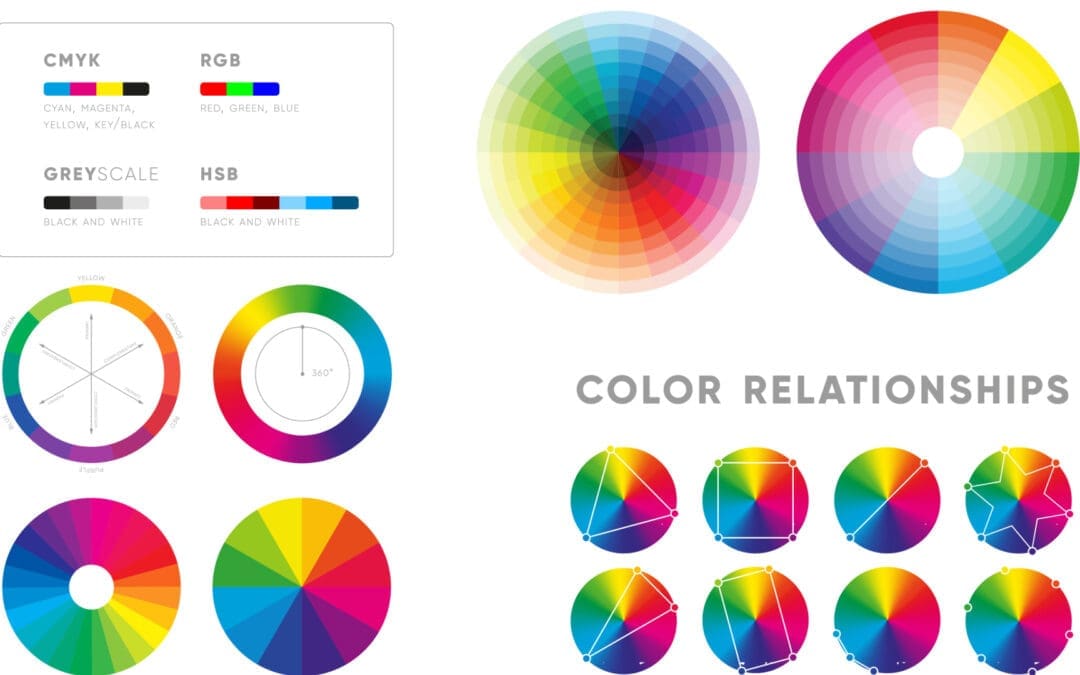
Another important aspect of your logo is color. Again, you want to be unique but not unrecognizable. Using fluorescent or neon colors might make your logo pop, but it’s probably not the best idea if potential customers can’t tell what it’s supposed to be. Stick with colors that are representative of your brand and easy on the eyes. For example, “blue” is often used for companies that want to appear trustworthy and professional. “Red” can be used for companies that are energetic and exciting. “Yellow” can be used for companies that are friendly and welcoming. “Green” can be used for companies that are environmentally friendly or natural. Think about the message you want your logo to convey and choose colors accordingly.
Fonts
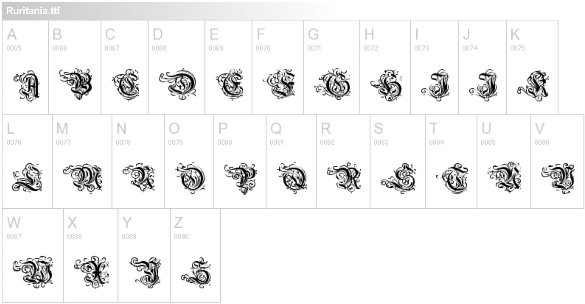
The fonts you use in your logo are also important. Script fonts might look fancy, but they can be hard to read and might not be appropriate for all brands. The same goes for decorative fonts – they might look nice, but they might not be legible at smaller sizes. When choosing fonts for your logo, legibility should be one of your main concerns. In addition, (you guessed it) try to avoid using more than two different fonts in your logo—too many fonts can make it look cluttered and confusing. Stick with simple fonts that are easy to read and representative of your brand identity. You can search for ideas on websites like Fonts1001.
Avoid Clichés
There are certain design elements that are so overused that they’ve become clichés. Steer clear of these to make sure your logo is truly unique. Some examples of clichés to avoid include:
- using concentric circles or swirls
- including flames or stars in the design
- making the entire logo one word
- using clip art or stock images
Hire a pro
Hire a professional designer. Unless you have experience in graphic design yourself, it’s best to hire a professional designer to create your logo for you. A professional designer will be able to create a high-quality and impactful logo that meets all of the criteria listed above—and they’ll also be able to help you with any other branding materials you might need for your small business.
1. A professional graphic designer will have the experience and expertise needed to create a high-quality logo.
2. A professional graphic designer will be able to help you with other branding materials you might need, such as business cards, letterhead, and even website design.
3. A professional graphic designer will be able to create a logo that meets all of the criteria listed above—and more.
Designing a Good Logo Doesn’t Have to be Hard
A well-designed logo is an important part of any small business’s branding strategy—but designing a good logo isn’t as easy as it might seem at first glance. Keep the following tips in mind when creating your own simple but effective logo: Keep it clean and uncluttered; make sure it’s scalable; consider your audience; be unique but not too unique, and hire a professional designer if possible. With these guidelines in mind, you’re well on your way to designing a strong and impactful logo for your small business!
You might be interested in reading our article “20 Tips to Find the Perfect Logo Designer for Your Small Business in Michigan”
